

XLConnect 0.2-4. R.
WebScraping with R. R-Data manipulation. Polar Histograms. Publishing. Colours. R-Studio. R-Revolution. R in the Cloud. R Shiny. R D3. Making maps. R- geo examples. R-spatial. SVGs with R. The R-Podcast Episode 8: Visualization with ggplot2. I’m happy to present this jam-packed episode of the R-Podcast dedicated to using the ggplot2 package for visualization.

This episode will have a companion screencast released in the next few days. I use data from the Hockey Summary Project to demonstrate how to create a series of boxplots of NHL regular season attendance for each team. Integrating R with other systems. A big list of the things R can do. Big Data, R and HANA: Analyze 200 Million Data Points and Later Visualize in HTML5 Using D3 – Part II. In my last blog, Big Data, R and SAP HANA: Analyze 200 Million Data Points and Later Visualize Using Google Maps , I analyzed historical airlines performance data set using R and SAP HANA and put the aggregated analysis on Google Maps. Undoubtedly, Map is a pretty exciting canvas to view and analyze big data sets. One could draw shapes (circles, polygons) on the map under a marker pin, providing pin-point information and display aggregated information in the info-window when a marker is clicked.
So I enjoyed doing all of that, but I was craving for some old fashion bubble charts and other types of charts to provide comparative information on big data sets. Ultimately, all big data sets get aggregated into smaller analytical sets for viewing, sharing and reporting. An old fashioned chart is the best way to tell a visual story! On bubble charts, one could display four dimensional data for comparative analysis. In this first graphics, the performance of top airlines is compared for 2008. Internet surveys. XLConnect 0.2-0. Mirai Solutions GmbH ( is very pleased to announce the release of XLConnect 0.2-0, which can be found at CRAN. As one of the updates, XLConnect has moved to the newest release of Apache POI: 3.8. Also, the lazy evaluation issues with S4 generics are now fixed: generic methods now fully expand the argument list in order to have the arguments immediately evaluated.
Furthermore, we have added an XLConnect.R script file to the top level library directory, which contains all code examples presented in the vignette, so that it’s easier to reuse the code. In addition, we introduced the following improvements to existing XLConnect methods: readWorksheet now returns a named list if more than one worksheet is read. Inspired by some great feedback we received from XLConnect users, we have introduced the following new features to the package: Visualizing Likert Items. Here is a Youtube Video Series on How to Write Fast R Code. Example 9.16: Small multiples. Small multiples are one of the great ideas of graphics visionary Edward Tufte (e.g., in Envisioning Information).
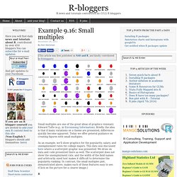
Briefly, the idea is that if many variations on a theme are presented, differences quickly become apparent. Today we offer general guidance on creating figures with small multiples. As an example, we'll show graphics for the popularity, salary, and unemployment rates for college majors. This data was discussed here where a scatterplot graphic was presented. We draw on data and code presented there as well. The graphics options in R, particularly par("mfrow") or par("mfcol"), are well-suited to small multiples.
Maximal Information Coefficient (MIC) R - Order Bars in ggplot2 bar graph. A chart for marathoners. Here's a cool application of calendar heat maps: runner Andy used R to catalogue his daily running mileage over the last 2+ years: There are lots of ways to chart data like this (a simple time-series chart, for example), but sometimes looking at data in new ways offers fresh perspectives.
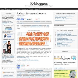
For example, Andy notes: "Apparently I missed running on a lot of Saturday’s at one point. Most likely in the fall when my college football team had a home game. " And while we're talking about calendar heat maps: here's an implementation in D3.js. ProcRun: What 5,728.986 miles look like… To leave a comment for the author, please follow the link and comment on his blog: Revolutions. R-bloggers.com offers daily e-mail updates about R news and tutorials on topics such as: visualization (ggplot2, Boxplots, maps, animation), programming (RStudio, Sweave, LaTeX, SQL, Eclipse, git, hadoop, Web Scraping) statistics (regression, PCA, time series, trading) and more... See R integrated with QlikView, Jaspersoft, Excel, and mobile apps. The R Journal Volume 4/1, June 2012. Horizon Plots in Base Graphics. How to post R code on WordPress blogs. Getting numpy data into R — Take Two.
A couple of days ago, I had posted a short Python script to convert numpy files into a simple binary format which R can read quickly.
Nice, but still needing an extra file. Shortly thereafter, I found Carl Rogers cnpy library which makes reading and writing numpy files from C++ a breeze, and I quickly wrapped this up into a new package RcppCNPy which was released a few days ago. This post will show a quick example, also summarized in the short pdf vignette describing the package, and provided as a demo within the package. Rook Tutorial at useR! 2012. Building Rook Web Applications. Rstats/RookTutorial. Importing public data with SAS instructions into R. Course: Statistical Practice in Epidemiology with R. Convenient access to Gapminder’s datasets from R. In April, Hans Rosling examined the influence of religion on fertility. I used R to replicate a graphic of his talk: > library(datamart) > gm <- gapminder() > #queries(gm) > # > # babies per woman > tmp <- query(gm, "TotalFertilityRate") > babies <- as.vector(tmp["2008"]) > names(babies) <- names(tmp) > babies <- babies[!
Is.na(babies)] > countries <- names(babies) > # > # income per capita, PPP adjusted > tmp <- query(gm, "IncomePerCapita") > income <- as.vector(tmp["2008"]) > names(income) <- names(tmp) > income <- income[! One of the points Rosling wanted to make is: Religion has no or very little influence on fertility, but economic welfare has. I wonder if demographs agree and take this economic effect into account. If you want to know more about that gapminder function and that query method, read on. Read more » To leave a comment for the author, please follow the link and comment on his blog: factbased. Using R in/for Governments. Using R — Standalone Scripts & Error Messages. Open-source R is an amazing tool for statistical analysis and data visualization.
Serious R gurus have found ways to do just about anything entirely within the R environment. Nevertheless, there are many of us who wish to plug R into larger, multi-language frameworks where business logic will be handled by another language and R will be primarily responsible for analysis. This can be an excellent division of labour but requires that you first get a handle on R’s warnings and errors and how they are passed upstream. Rscript The easiest way to encapsulate blocks of functionality for use by other programs is to create Unix-style, independent executables that can be invoked by other programs. Will 2015 be the Beginning of the End for SAS and SPSS?
Learning to use a data analysis tool well takes significant effort, so people tend to continue using the tool they learned in college for much of their careers.
As a result, the software used by professors and their students is likely to predict what the next generation of analysts will use for years to come. I track this trend, and many others, in my article The Popularity of Data Analysis Software. In the latest update (4/13/2012) I forecast that, if current trends continued, the use of the R software would exceed that of SAS for scholarly applications in 2015. A view on R Capabilities. Experience on using R to build prediction models in business applications. By Yanchang zhao, RDataMining.com Building prediction/classification models is one of the most widely-seen data mining tasks in business applications.
To share experience on building prediction models with R, I have started a discussion at RDataMining group on LinkedIn with the following questions. And my experience can be found at the end of question list. Pls join our discussion if you are interested. 1. Below are my experiences in a business application. It was an application to model risk of customers. I used decision tree, because the tree is easy to understand by business people and managers, and the rules are simple and easily to be accepted by business, as compared to SVM or neural networks. I used ctree() in package party. The data was a mixture of numerical and categorical attributes, and ctree() handles that very well. There were many missing values. Safely Loading Packages in R. Using R snippets written by other developers can be unendingly maddening.
There are a variety of reasons for this, most of which boil down to a simple issue: most code is written such that a system must be configured in precisely the same way as the code’s author’s machine. Anyone who’s ever seen a line like this: read.xls("C:/Users/MCaine/code/R/projecteuler/someotherdirectory/data.xls") knows what I am talking about. To use this without modification, you must: Use Windows.Have exactly the directory structure specified by the address (which is highly unlikely, unless you were the one who wrote it).Have the gdata package installed and included in the project (which is both unlikely, and difficult to know without already being a regular user of the package).
You can see how it would already be easier to just change the address to whatever works on your machine.