

Use GBIF and googleVis to Make Maps with Species Occurrence Data. Blue Jay and Scrub Jay : Using rvertnet to check the distributions in R. As part of my Google Summer of Code, I am also working on another package for R called rvertnet.
This package is a wrapper in R for VertNet websites. Vertnet is a vertebrate distributed database network consisting of FishNet2, MaNIS, HerpNET, and ORNIS. Out of that currently Fishnet, HerpNET and ORNIS have their v2 portals serving data. rvertnet has functions now to access this data and import them into R data frames. Some of my lab mates faced a difficulty in downloading data for Scrub Jay (Aphelocoma spp. ) due to large number of records (220k+) on ORNIS, so decided to try using rvertnet package which was still in development that time. The package really helpe and got the results quickly. The final output of the code snippet is as following. Now let us put Blue Jay and Scrub Jay side by side on the map to see how they are distributed in North America. John Snow’s famous cholera analysis data in modern GIS formats.
Coming of Age: R and Spatial Data Visualisation. I have been using R (a free statistics and graphics software package) now for the past four years or so and I have seen it become an increasingly powerful method of both analysing and visualising spatial data.
Crucially, more and more people are writing accessible tutorials (see here) for beginners and intermediate users and the development of packages such as ggplot2 have made it simpler than ever to produce fantastic graphics. You don’t get the interactivity you would with conventional GIS software such as ArcGIS when you produce the visualisation but you are much more flexible in terms of the combinations of plot types and the ease with which they can be combined.
Mapping the World’s Biggest Airlines. The map above shows the routes flown by the top 7 airlines (by international passenger distance flown).

The base map shows large urban areas and I have attempted to make it look a bit like the beautiful “Earth at Night” composite image produced by NASA. You can clearly see a relationship between where people live and where the big carriers fly to across Europe and the US but India and much of China have relatively few routes. I expect much of the slack is picked up by smaller airlines in these countries but they must represent key growth areas the world economy becomes increasingly driven by the east. Mapped: British and Spanish Shipping 1750-1800. I recently stumbled upon a fascinating dataset which contains digitised information from the log books of ships (mostly from Britain, France, Spain and The Netherlands) sailing between 1750 and 1850.

The creation of this dataset was completed as part of the Climatological Database for the World’s Oceans 1750-1850 (CLIWOC) project. The routes are plotted from the lat/long positions derived from the ships’ logs. I have played around with the original data a little to clean it up (I removed routes where there was a gap of over 1000km between known points, and only mapped to the year 1800). Spatial Data with R. Where the Worlds of Dentistry and Cartography Collide. As I was getting a root canal last week, my dental X-Rays reminded me anew of an optical illusion that stumped us for a short time recently when we were developing our heatmapping engine.

My X-Rays, before during and after a recent root canal. They reminded me, of course, about cartography. Dentists, or at least dental radiologists looking at dental X-Rays, are probably familiar with the pesky phenomena of Mach Banding. It is an optical illusion that presents itself when contrasting tones are viewed right next to each other in the context of lightness gradients. The intersection appears to have a spike in contrast -the light side gets an even brighter stripe and the dark side appears to have a darkened stripe. Plot maps like a boss. Creating web applications for spatial epidemiological analysis and mapping in R using Rwui. Creating web applications with Rwui The information that Rwui needs in order to create a web application for running an R script is entered on a series of web forms.
Using these forms the statistician designs the web application they wish to construct. After entering a title and introductory text for the application, the input items that will appear on the application's web page are selected. Input items may be, for example, Numeric or Text entry boxes, Checkboxes, Drop-down lists, Radio Buttons and File Upload boxes. R-NOLD. PostGIS Quickie. Today I needed to cut out a rectangle of geologic data from a state-wide map in an AEA coordinate system, using a bounding box from a UTM zone 10 region, with the output saved in UTM zone 10 coordinates.
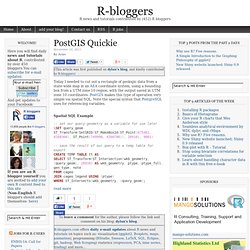
PostGIS makes this type of operation very simple via spatial SQL. Note the special syntax that PostgreSQL uses for referencing variables. Spatial SQL Example. Create a user friendly web interface for an R script. Retrieve GBIF Species Occurrence Data with Function from dismo Package. Producing Google Map Embeds with R Package googleVis. - Frank Davenport's Research Blog - Notes from A Recent Spatial R Class I Gave. Change in life expectancy animated with geo charts. Geo-Trick for GMaps in R (using dismo) R tells you where weapons go. GoogleVis 0.2.13: new stepped area chart and improved geo charts. On 7th December Google published a new version of their Visualisation API.
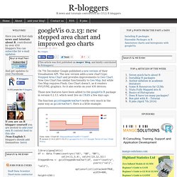
The new version adds a new chart type: Stepped Area Chart and provides improvements to Geo Chart. Now Geo Chart has similar functionality to Geo Map, but while Geo Map requires Flash, Geo Chart doesn't, as it renders SVG/VML graphics. So it also works on your iOS devices. Some Fun with googleVis – Mapping Blog Visits on Google Map. Big Data, R and HANA: Analyze 200 Million Data Points and Later Visualize Using Google Maps. For this fun exercise, I analyzed more than 200 million data points using SAP HANA and R and then brought in the aggregated results in HTML5 using D3, JSON and Google Maps APIs. The 2008 airlines data is from the data expo and I have been using this entire data set (123 million rows and 29 columns) for quite sometime.
See my other blogs The results look beautiful: Each airport icon is clickable and when clicked displays an info-window describing the key stats for the selected airport: I then used D3 to display the aggregated result set in the modal window (light box): D3 made it looks ridiculously simpler to generate a table from a JSON file. Unfortunately, I can't provide the live example due to the restrictions put in by Google Maps APIs and I am approaching my free API limits.
Fun fact: The Atlanta airport was the largest airport in 2008 on many dimensions: Total Flights Departed, Total Miles Flew, Total Destinations. Airports.2008.hp.summary <- airports.2008.hp[major.airports, GoogleVis 0.2.14 is released. Use case: combining taxize and rgbif. R Spatial Tips. Global Volcanic Eruptions. Global Fires, the Amazon and Humans. Natural Global Fires Many plants and animals have evolved to depend on fires periodically occurring in certain parts of the world.
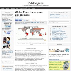
This phenomenon has been occurring for millions of years, successfully replenishing and rejuvenating the areas in which it is allowed to happen. The ashes enrich the soil, animal populations are re-balanced and new life springs into existence. Additionally, these fires do not reduce the amount of land on which forests grow, thereby preserving the ecosystems contained within (with no loss of forest land).
Unnatural Global Fires Using the word 'unnatural' is always risky, but here it is meant to convey control by humans - which in itself is 'natural', but introduces many variables not before seen in history. Carbon Dioxide Carbon dioxide is a major product of wood combustion. Using R to Analysis Tourism Data – Part 1: Visual Tourist Profile. PubMed publications in 2011 by 202 world countries: who’s the winner? PubMed publications in 2011 by 202 world countries: who’s the winner? Colored 3D Map.
Map biodiversity records with rgbif, maps and ggplot2 packages in R « Vijay Barve. 9 Jul Global Biodiversity Information Facility or GBIF is an international consortium working towards making Biodiversity information available through single portal to everyone.
UK house prices visualised with googleVis-0.2.16. ## Load required packages library(utils) library(XLConnect) library(googleVis) ## Version >= 0.2.16 required.

Organic Farming Operations by State. With data from the USDA on certified organic farms for 2008. I created a map using the Geo Map function from the googleVis API package available in R. I’ve copied and pasted the image below as WordPress.com sites don’t support scripting so the rollover functionality is, unfortunately, lost. But because this is really the easiest way to create a choropleth map i went with it and did some of my own editing.
Maine and Vermont top the list of the highest proportion of certified organic farming and livestock operations with a huge total of 8% each with California coming in a distant second at 4%. The fewest such operations as a fraction of the total number of farms is found in across the South with Mississippi, Arkansas, Louisiana, Tennessee, West Virginia and Alabama all below .06%. click to enlarge: To leave a comment for the author, please follow the link and comment on his blog: datum » R. FAO statistical areas in Google Earth. Berkeley Earth Surface Temperature: V1.5. My R package designed to import all of the Berkeley Earth Surface temperature data is officially on CRAN, as BerkeleyEarth. The version there is 1.3 and I’ve completed some testing with the help of David Vavra.
The result of that is version 1.5 which is available here at the drop box. Mapping US Radiation Levels in R. Function to Collect Geographic Coordinates for IP-Addresses. I added the function IPtoXY to theBioBucket-Archives which collects geographic coordinates for IP-addresses. # System time to collect coordinates of 100 IP-addresses:> system.time(sapply(log$IP.Address[1:100], FUN = IPtoXY)) User System verstrichen 0.05 0.02 33.10 To leave a comment for the author, please follow the link and comment on his blog: theBioBucket*. Spider: an R package for species identity and evolution. Spider: Species identity and evolution is an R package developed by the Lincoln University molecular ecology lab group to do a range of analyses that various lab members wanted to run that were not yet implemented in R.
In particular, the package provides functions for conducting sliding window analyses on DNA sequences, the calculation of identification efficacy of a library of reference DNA sequences, and the segregation of distance matrices into their inter- and intra-specific components. Osmar – Don’t Miss this New R-Geo-Package! Weecology can has new mammal dataset. # setwd("/Mac/R_stuff/Blog_etc/Mammal_Dataset") # URLs for datasets.