

Geographical data charted right. The following chart by the Financial Times reminds me of the famous Napoleon Russian Campaign map: I also love it when geographical data, in this case average house price data by region, are plotted without a map.
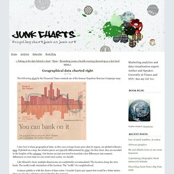
If plotted on a map, the relative prices are typically differentiated by color. On this chart, they are encoded in the heights of the columns. Our brains are just not wired to translate color differences into numeric differences so every time we can avoid color scales, we should. Like Minard's chart, multiple dimensions are comfortably accommodated. Junk Charts: Bumps chart. One of the dangers of "Big Data" is the temptation to get lost in the details.
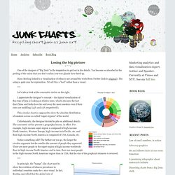
You become so absorbed in the peeling of the onion that you don't realize your tear glands have dried up. Hans Rosling linked to a visualization of tobacco use around the world from Twitter (link to original). The setup is quite nice for exploration. I'd call this a "tool" rather than a visual. Let's take a look at the concentric circles on the right. I appreciate the designer's concept -- the typical visualization of this type of data is looking at relative rates, which obscures the fact that China and India have far and away the most smokers even if their rates are middling (24% and 13% respectively).
Light entertainment: Spinning wheel at the fun fair. The importance of explaining your chart: the case of the red 118. Reader Jim S. was rightfully mystified by the following map that appeared on the Ars Technica blog (link), and purported to demonstrate that high temperatures of March 2012 across most of the U.S. were of historical significance.
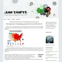
I must say the production values of this map, produced by the people at NOAA, are superb. I love, love, love the caption that the Ars Technica editors added to the map. I wish they had blown it up to 20-point font, and made it shiny :) Besides that, the colors are well-chosen, and it doesn't feel cluttered despite having 48 numbers printed on it. Like Jim, I'm hypnotized by the drumbeat of 118, 118, 118, ... all over the red area. What could the numbers mean? Not so soon, Jim. If not Fahrenheit, what could the numbers mean? Too bad this map is produced by specialists for specialists, leaving us commoners guessing. But this isn't very helpful either. I finally found my way to this page, which explains what NOAA calls "climatological ranking". Popularizing public data. Dona Wong, whose graphics book I reviewed two years ago (link), has recently joined the New York Fed to lead an effort to visualize data.
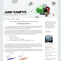
This is exciting because consumers are unlikely to learn anything from Excel spreadsheets, HTML tables, etc. which are the typical formats of public data. One of their efforts is visualization of mortgage delinquency data in the Tri-state and Long Island regions (link). This animation reminds me of the CDC obesity map, to which I gave a positive review in 2005 (link). This type of chart is great for revealing the evolution of a metric over time and over space. The sliding control is a very nice extra touch. I sent Dona a few comments: A speed control would be niceRemove the word "quintiles" from the legendAdd some cumulative measures, such as "90-day delinquency or worse"
Breaking up a time series. My friend Augustine sends me to this press release by Kantar Research, via PaidContent (link).
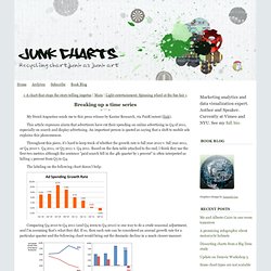
This article expresses alarm that advertisers have cut their spending on online advertising in Q4 of 2011, especially on search and display advertising. An important person is quoted as saying that a shift to mobile ads explains this phenomenon. Throughout this piece, it's hard to keep track of whether the growth rate is full year 2010 v. full year 2011, or Q4 2010 v. Q4 2011, or Q3 2011 v. A matter of compactness. Andrew Gelman may have nominated himself the graphics advisor for the World Happiness Report (link).
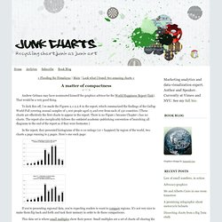
That would be a very good thing. To kick this off, I re-made the Figures 2.1-2.2.8 in the report, which summarized the findings of the Gallup World Poll covering annual samples of 1,000 people aged 15 and over from each of 150 countries. (These charts are effectively the first charts to appear in the report. There is no Figure 1 because Chapter 1 has no charts. The report also inexplicably follows the outdated academic-publishing convention of banishing all diagrams to the end of the report as if they were footnotes.) In the report, they presented histograms of the 0-10 ratings (10 = happiest) by region of the world, two charts a page running to 5 pages.
If you're presenting regional data, you're expecting readers to want to compare regions. Flooding the Himalayas. No sorting and lack of structure undermine a chart. Reader Daniel L. isn't impressed with this page of charts about gay rights in the U.S., from the Guardian paper (London).
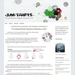
(link) The use of circles to organize data has a long history, stretching back at least to the Nightingale rose, which turns the time dimension into a circle.