
Anne Holland's Which Test Won – A/B Test & Multivariate Testing Education for Marketing Professionals. Pure Awesomeness. In making the move to responsive web design, one of the potential hurdles is the rather awkward maths for calculating the percentage-based widths necessary for fluid layouts.
If, for example, you’re designing with a 960px grid in Photoshop and you have six columns, each 140px wide, you divide 140 by 960 to get your percentage-based width: 14.583333%. Now, I don’t know about you, but numbers like that look a little scary. It doesn’t matter that there are great calculation tools built into TextMate to do the maths for you; the point is that the final figure looks like an arbitrary number with no immediate relation to either the container’s pixel width (960) or the element’s pixel width (140).
Compare that to a container that has a width of 1000px. 1000 is a nice, easy, round number. Dividing by 1000 results in clean percentages and better still, dividing by 1000 is something we can do in our heads: just remove the zero. Here’s the PSD. Untitled. Use Photoshop CS6 to Create an Admin Dashboard Interface. Photoshop CS6 is packed with new features that will help you create better interface designs.
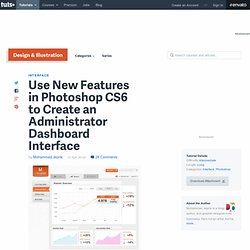
In this tutorial we will utilize Photoshop's new vector editing and stroke capabilities to create an administrator dashboard interface. We will also take advantage of Photoshop's new snap to pixel grid feature to help create crisp and clean web graphics. Let's get started! Tutorial Assets The following assets were used during the production of this tutorial.
Step 1: Preparing Canvas We are going to use 960 grid with 12 column layout from 960.gs as framework for our design. Step 2 Click black and white circle icon to add new Adjustment Layer. Step 3 Make new layer. Step 4 Tone down the layer Opacity to 4%. Step 5 We want to sure that all the layers area organized carefully. Step 6 We don't need Background layer, so delete it by dragging it onto delete icon. Step 7 Select group layer. Step 8: Logo Activate Rounded Rectangle tool. Step 9 Step 10 Make new layer above the shape. Step 11 Step 12. Pastel Dashboard — Admin Template + iPhone web app Preview. GUI / #ui. GUI / ipad app gui. GUI / Navigation bar. Creative UI Design Examples for Great UX. UX (User Experience) is all those elements and factors related to the user's interaction with a particular environment or device which generate a positive or negative perception of the product, brand or device.
UX is subjective and focused on use. The standard definition of UX is "a person's perceptions and responses that result from the use or anticipated use of a product, system or service". These factors are related to design and usability, but also to the emotions and feelings generated in the user, accessibility, brand trust... In the case of the web, the user's experience with the device is not a matter of concern to web designers: big hardware companies do the job of building our machines and computers.
Why Do We Need Navigation At All? In Designing Web Navigation, James Kalbach starts out by asking why we need navigation at all. Technically, it’s possible to put all the content on the same page. You can show and hide the content through Javascript or other techniques. Although he doesn’t mention it, technical writers are probably familiar with twisties, or drop-down hotspots. You click the link and a lot of text expands below it. You could essentially do this with your entire help system, putting all the content on one page. Kalbach points out that Alan Cooper, a long-time usability expert, says websites might be better without any navigation at all.
The artless web sites created during the Web’s infancy were of necessity built only with simple HTML tags, and were forced to divide up their functionality and content into a maze (a web?) Cooper.com homepage. Cooper. 54 Quotes from Startup Leaders on How to Improve Conversions. Large and small companies alike invest a lot of time and money working on improving their conversion rates.

And as we all know, there are countless “experts” and websites all trying to sell you their advice on how to improve conversions. In this blog post, I'm going to take a different spin on this conversion topic... I surveyed 54 companies and asked each of them one question: "What is the one thing that you did that had the strongest positive impact on conversions? " 54 companies below share with us what has worked for them. Backblaze "Backblaze is an online backup service where we backup all data on laptops/desktops for $5/month. To do this, our homepage previously had "Download" or "Start Backing Up" as the call-to-action. However, we found that after people downloaded the application, many people seemed to lose the file and not run the installer...or to run the installer but not enter an email/password, thus not creating an account and backing up data.
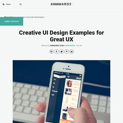
Icon Search Engine. The Original Logos of Tech Companies Were All Terrible. Websites with Excellent Font Usage and Guidelines for Your Site. Designing a website involves making a lot of choices.
Picking a domain host, finding the right color scheme, not to mention filling up all that empty space with the right content. Selecting the right fonts for your website is another one of these important decisions. But fear not! These professional pointers and principles will match your website with the right fonts in no time. Websites with Excellent Font Usage and Guidelines for Your Site.