
Bloom-verbs.jpg (JPEG Image, 800 × 2160 pixels) - Scaled (46%) Infographic: Canadian Internet Usage Statistics. Update: see recent social media usage statistics for British Columbia, as well as detailed Facebook usage statistics for Alberta!
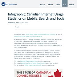
In September of 2012, I had the pleasure of attending the one-year anniversary of the Google Engage Canada Conference in Vancouver. For part of the conference, I sat on a panel with representatives from two other digital marketing agencies and we shared our experiences with using Google products from an agency level. It was a remarkable event to exchange ideas with industry experts and learn more about how Canadians are using the internet. Google shared detailed Canadian Internet statistics in search engine usage, mobile and social media which we have turned into the infographic below. For a list of stats in text format, scroll down below the infographic. The Ultimate Guide to Healthier Baking [Infographic] Google Search tips. A continuous stream of social micro-learning activities. What Makes the Best Infographics So Convincing - Andrea Ovans. A great infographic is an instant revelation.

It can compress time and space. (Good gosh – Usain Bolt is that much faster than all the other 100-meter gold medalists who’ve ever competed?) It can illuminate patterns in massive amounts of data. (Sure, we’re spending much more on health care and education than our grandparents did. But look how much less on housing.) These intriguing revelations come from a short trip around The Best American Infographics, 2013. The most compelling infographics, he says, mine relationships among overlooked variables to tell you something unexpected and get you thinking. What’s special about the way infographics make their case? Infographics have an emotional power because they can show you an idea — or a relationship, or how something works — very quickly.
Did you see commonalities in the ones you found most convincing? Effective-Vocab-Instruction1. GS-DLinfographic_12-10-2012-REVISED. Media Creation; Unchained. Blogging-classroom-infographic.png (PNG Image, 600x1000 pixels) - Scaled (64%) Undergrad-tech.jpg (JPEG Image, 800x3017 pixels) - Scaled (21%) Video-SEO-Infographic. National Prevention Strategy. Generation Y in Canada. Christmas Around the World. The best way to make a great first impression.
Google Yourself. Teacher-Guide-Social-Media-800.png (PNG Image, 800x3071 pixels) - Scaled (20. Mavenlink Infographic: Are We Brainstorming the Wrong Way? Kno-info-575-120711-02. Google and Your Memory. Free Wi-Fi: Friend or Foe? Infographic. Did you know that during the course of this year, the number of Wi-Fi connected devices will exceed the world’s population?

This incredible statistic highlights the ubiquitous nature of Wi-Fi. However, the convenience of having public Wi-Fi available practically everywhere comes at the cost of greater risk to users. Type-of-Learner-800.png (PNG Image, 800x3014 pixels) - Scaled (21. CollegeStudentIG. State-of-the-internet-2012. What's an Infographic? Infographic Website Offering Infographics and Data Visualization. Adobe-State-of-Create-Infographic. Prohibition. How common is your birthday? Find out exactly with an interactive heat map. Matt Stiles posted a heat map on his blog yesterday that I thought was pretty well done.

I decided to get the data from NYTimes.com and recreate it in Tableau. It takes under 20 seconds and under 10 clicks to create it in Tableau, more like 15 seconds if you’ve been using Tableau longer. Matt chose a brownish color palette, but I wanted to try lots of different colors. Tableau makes is incredibly simple to try out many options very quickly. I tested green, blue, gray and orange-blue palettes before settling on an orange palette.
Creating this as an interactive viz in Tableau allows you to provide the reader/viewer/interactor with more information. In a static version, you’re left to guess at the approximate range in which it falls. Check out Matt’s post and the comments. Matt struggled with getting the colors just right using Illustrator. 99_Execution_Audit_2012. Information-literacy_elliot_easybibala1. Data Visualizations, Challenges, Community. Digital-stress. 5 Great Infographics for Language Teachers and Learners. Infographics are great learning materials.
The colourful graphics, clear text and their size make them ideal for classroom integration. I have been posting some of the ones I deem educationl to help teachers leverage this resource to create engaging, relevant and personalized learning experiences in their classes. In this regard, I am introducing you today to a series made up of four parts all containing the best infograpgics about English language teaching and learning. Due to their size we could not embed all the infographics in one post instead we distributed them on four posts with each one of them containing links to other posts to make it easy for you to navigate the four posts without having to move away. Teachers can print them out and pin them on the class wall for students to access throughout the whole year.
Part One ( scroll down to read the content of this part) Definite and indefinite articlesAll about AdjectivesPunctuation Passive VoiceWhen to use e.g and i.e. 55 Striking Data Visualization and Infographic Poster Designs. Reduce Stress & Avoid Burnout. WorkplaceworkoutIG. Distance Education Timeline. 5 Great Infographics for Language Teachers and Learners. Marketo-true-colors-918x3235. Mindflash Infographic: How To Train Yourself to Speed Read. The History Of Learning Tools [Infographic] The 90-Second History Of Education 9.95K Views 0 Likes Well here's an insanely detailed infographic to peruse. It's the history of education and details the past, present, and future. Why It Pays To Be Bilingual.
Being bilingual provides a variety of perks.

Aside from giving you the ability to impress your latest love interest by reciting foreign poetry, being bilingual also pays dividends – monetarily, cognitively, and culturally. See the graphic below to find out why. Exercise accelerates academic performance. Share-ends-posts-june-post. Infographipedia, the world of infographic. Information aesthetics - Data Visualization & Information Design. How animals see the world. Your Desk Job Makes You Fat, Sick and Dead [INFOGRAPHIC] The productivity of the average worker has skyrocketed thanks to technology, but it comes at the price of a sedentary lifestyle.
![Your Desk Job Makes You Fat, Sick and Dead [INFOGRAPHIC]](http://cdn.pearltrees.com/s/pic/th/your-desk-makes-infographic-117866792)
And mounting research suggests that sitting at your desk for eight hours a day can have a dramatic impact on your health. Don't get me wrong. I burn plenty of calories typing emails. And I make a point to always click and drag through long websites and documents — scroll wheels are for lazy people. But all that strenuous activity pales in comparison to the exercise my forebears did on the job 50 years ago (killing dinosaurs). Digital-Classroom-972. Technology-Enhances-Learning-Infographic.jpg (JPEG Image, 1500x938 pixels) - Scaled (67%) The Sad State of Social Media Privacy [Infographic] Privacy issues are a very hot topic for anyone using social media.
![The Sad State of Social Media Privacy [Infographic]](http://cdn.pearltrees.com/s/pic/th/social-privacy-infographic-24064478)
As educators, I believe it is our responsibility to teach our students the ins and outs of how to responsibly use social media. Just in the past few weeks very important issues concerning online privacy have surfaced and must be addressed. For instance, are you aware of Google’s new privacy policy? If not, one of the big issues is that starting March 1, 2012, Google will share your web search history! In order to address this issue and clear your history, please read this article. In addition, it has just been reported that Facebook is reading text messages of people who use their smartphone apps. I recently wrote “Facebook Doesn’t Care One Bit About Your Reputation” with the intent being that even if you do all you can to protect your privacy, the use of social media is sometimes out of your control. I believe social media is important for educators and students. The Best…Lists On Infographics. The New York Times Learning Network just published a great post, Data Visualized: More on Teaching With Infographics.

Their post will certainly be on this year’s list “The Best…” list of infographics. In addition, it prompted me to think it might be useful if I put all my infographic-related “The Best…” lists together (I also post weekly collections). So, here is A Collection Of “The Best…” Lists On Infographics: The Best Infographics — 2010 The Best Interactive Infographics — 2009 The Best Sources For Interactive Infographics. Flipped Classroom Infographic #flippedclassroom #blendedlearning #edtech. The Internet Is Ruining Your Brain [INFOGRAPHIC] Admit it: As you're reading this, you have tunnel vision — that feeling that the world is closing in on you after surfing the Internet for eight straight hours.
Web dead head (yes, I made that up) is a growing concern for today's connected generation, which collectively spends 35 billion hours on the Internet every month. But we're not just talking one online shopping experience at a time. Often, we have four tabs open, cycling between emails and shopping, tweeting and word processing. Such multi-tasking actually raises stress levels and lowers creative thinking overall, according to the research compiled by ForensicPsychology.net.
A List of Great Educational Infographics. 22inShare I see there is a lot of interaction with the infographics I post here and that proves that you like the visually appealing posts.

I do too and I think most of the people like to learn visually. Your students would love to have visual aids integrated into their classroom . It will drive off some of the boredom that looms around and would give life to group work activities. Infographic: Write It Down. The Neurology of Gaming. Colours In Cultures. Apples to Apple: The Goofiest Infographic You'll Ever See?
Apple the company may be one of the largest on the planet, with more cash on hand than the U.S. government. But have you ever wondered about how it compares to the fruit of the same name? Of course you have. Incredible Things That Happen Every 60 Seconds On The Internet. History-of-advertising.jpg. Digital-divide. Use Infographics to help students build evidence for essays. The argument for using infographics is simple. They’re cool. Data and statistics never looked so good. Focus in age of distraction.
Zoho:Lab - Interactive Colours in Culture = Interactive Data Example. CoffeeInfo. The Big Problem With Infographics. Why TED Talks Have Become So Popular 5.66K Views 0 Likes TED talks are useful and free ways to bring high-level thinking and through-provoking ideas into the classroom and your home. 5 Things To Know About SXSWedu 5.65K Views 0 Likes The real story for anyone reading this is SXSWedu, the education-oriented version of the conference that's turning into a force of nature. How Social Media Is Used Around The World 8.03K Views 0 Likes In a fascinating infographic, we get a look at how social media is used around the world by a variety of countries.
Infographics - examples. Helping students interpret visual representations of information. Update: Feb. 29, 2012 Please note: The original video we used for this post was a video podcast by Gestalten TV in which New York Times Graphics Director Steven Duenes and Graphics Editor Archie Tse describe how their team works with breaking news to create clear, concise visualizations of data for readers. Since that has now been taken down, we have substituted a classic TED talk by David McCandless that we refer to in the post.
Baking. Charting the Euro Zone Crisis. Timeonearth. Infographic. USDA dietary guidelines recommend that 50 percent of our daily food intake should be fruits and vegetables. The growing obesity epidemic in the U.S. and it’s impact on the economy and public health, underscores the importance of these recommendations. But there is clearly a disconnect between the guidelines and the mere 2 percent of U.S. farmland actually growing such foods, according to a new report from the Union of Concerned Scientists. The report, Ensuring the Harvest: Crop Insurance and Credit for a Healthy Farm and Food Future, outlines the obstacles for farmers that want to plant fruits and vegetables, and policy changes to remove the. Top 10 Most Expensive Cities to Live in 2010 [Infographic]
Cool Infographics - Blog. Digital Divide. EngagedAudienceIG. Fruits in Season. Infographic: The Generation That Doesn't Power Down. Untitled. Educationhour4. The Best Multimedia Resources For Introducing Students To The Advantages Of Charts, Graphs & Infographics. Is a short and simple list of multimedia resources that would be useful for introducing students to the value of charts, graphs and infographics and what they mean. I’m hoping readers will suggest other resources.