

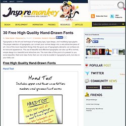
The Web Font Combinator. 30 Free High Quality Hand-Drawn Fonts. Typography is the art and technique of arranging type, type design, and modifying type glyphs.
The proper selection of typography can convert your normal design into a very attractive piece of art. Responsive Typography. By Oliver Reichenstein With the chaos of different screen sizes and a new generation of web browsers, the design paradigms of layout and typography have shifted away from static layouts and system fonts to dynamic layouts and custom web fonts.
Now, screens are changing not just in size, but also in pixel density. In other words: we do not just need responsive layouts, we also need responsive typefaces. To test that assumption, iA has created its new website with responsive typography and a custom-built responsive typeface. Between just a MacBook Air, a Nokia Lumia 900, a Samsung Galaxy, and an iPad3 alone we have four screen sizes and resolutions. Goodbye Georgia? Georgia works perfectly as body text up until 16 pixels. How Fonts Take a Starring Role in Your E-Learning Courses. The video below shows how graphic designer, Brian Hoff, selected the right font for one of his projects.
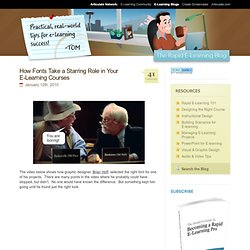
There are many points in the video where he probably could have stopped, but didn’t. No one would have known the difference. But something kept him going until he found just the right look. Click here to view video. Type study: Techniques for using novelty fonts. Type study is an ongoing series of guest posts about typography on the web. In this article, Meagan Fisher dishes up advice on novelty fonts. Ah, novelty fonts. They make up the majority of free fonts available on the web; usually they are pre-grunged-up and have exciting names like “fallen angel” or “cowboy whisper.” You used them liberally on your LiveJournal, but now that you’re a real designer you avoid them like the plague.
Right? Maybe not. The case study I have a confession to make: I am a huge fan of dribbble. I whipped up this mockup rather quickly, and felt pretty good about it as an early design. Technique 1: A logo that isn’t really a logo There have been plenty of times when I’ve wanted to give the title of a site a little added flair, while also ensuring that the text remained dynamic. You’ll notice the site title has a subtle embossed effect; this detail is added using CSS3’s text-shadow property. Latest High-Quality Free Fonts for Professional Designers. Typography is the art and techniques of arranging type, type design, and modifying type glyphs.
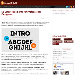
Display typography is a potent element in graphic design, where there is less concern for readability and more potential for using type in an artistic manner. The proper selection of typography can convert your normal design into very attractive piece of art. Among other things, effective typography manages to achieve three necessary objectives of web designing are Look, Appearance and Outcome which helps you to keep apart from normal wave. Below you’ll find Collection of Fresh High-Quality Free Fonts to Enhance Your Designs by which you can save money and focus on making great applications. The basic purpose behind this post is to show you Popular, Artistic and most importantly Free Downloadable font types to save your time searching them online.
You can also find some related free references at the end of the post. You may be interested in the following related articles as well. Typography and 7 websites to find good fonts. TweetTweet “Content is king”, but can it be read?
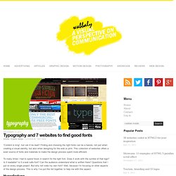
Finding and choosing the right fonts can be a hassle, not just when creating a visual identity, but also when designing for the web or print. This collection of websites offers a wast source of fonts and materials to make the design process spent more efficient. To many times I had to spend hours in search for the right font. Does it work with the symbol of that logo? Hyperfortype HypeForType is a growing hotbed of top typographic talent.
Fontfabric Fontfabric is an independent type foundry , which was launched at the close of 2008 by designer Svetoslav Simov who is based in Sofia, Bulgaria. Myfonts MyFonts is a division of Bitstream Inc., located in Marlborough, Massachusetts, USA. Fontshop Founded by Erik Spiekermann and Neville Brody in 1989, FontShop is the original independent retailer of digital type with 100,000 fonts from dozens of expert-selected foundries, incur house brand: FontFont. Free Scrapbook Fonts. New High-Quality Free Fonts (2012 Edition) - Smashing Magazine. Advertisement Every now and then, we look around, select fresh free high-quality fonts and present them to you in a brief overview.

The choice is enormous, so the time you need to find them is usually time you should be investing in your projects. We search for them and find them so that you don’t have to. In this selection, we’re pleased to present Homestead, Bree Serif, Levanderia, Valencia, Nomed Font, Carton and other quality fonts. Please note that while most fonts are available for commercial projects, some are for personal use only and are clearly marked as such in their descriptions.
Free Fonts HomesteadHomestead is a very distinctive Slab Serif typeface that leaves a lasting impression with its geometric forms and a modern, progressive look. Bree Serif RegularThis typeface is the serif cousin of the playful, charming and versatile type family Bree which was designed by Veronika Burian and José Scaglione back in 2008. Font Generator - Make Your Own Handwriting Font With Your Fonts. How to Use a Simple Font Style Guide for Consistent Course Design. I was reviewing an elearning course recently.
About twenty screens into the course, I noticed that the developer changed the title font from a solid bold type to one that was curly and much more informal. There was so much contrast to the two titles that I asked why she changed fonts from bold to curly. She responded that the course seemed a little dull at that point, so she decided to add the curly font to liven it up. Imagine the elearner almost asleep but then jolted to consciousness with the appearance of the curly font on slide 20.