
30 Templates & Vector Kits to Design Your Own Infographic. Infographics are always fun to read.
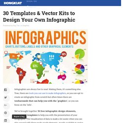
Making them, it’s something else. True, there are tools you can use to make infographics, or you can opt to create an infographic from scratch but often times there are workarounds that can help you with the ‘graphics’, so you can focus on the ‘info’. We’ve brought together 30 free infographic design elements, vectors and templates to help you with the presentation of your infographic.
The visualization of data is made a lot easier when you can play around with these ready-made elements, mostly available in vector and Photoshop format. Tips, tricks and resources to make your own gorgeous infographics. Infographics (or Information Graphics) are graphic visual representations of data or information, presented in a way to make it easier to consume information.
Infographics gained popularity in the mid-2000′s with the advent of sites like Digg and Reddit, and have quickly become one of the most popular methods to display researched data. There are three main types of infographics – where data is presented in a timeline, where statistical data is presented in graphs or with icons, or where data is presented on a map. In order to create an infographic which will be widely shared, think about your typography, colours, and layout. Getting started with Infographics 1 – Advice on Web Design, Graphic Design, and Social Media. 14 Apr Tweet This past weekend I got to work with some really talented photographers for the first time.
George from D&D Photography and Jimmy from Clickr Photography. I’ve done a bunch of photo shoots before but never at a beach. Saving the Infographic. What About Me? A Few Rules for Making Homemade Infographics. Like many other fans of infographics, we were excited about today's launch of Visual.ly, a site that helps normal folk create infographics.
The program just requires users to upload data, and it generates a pretty JPG with charts, graphs, and icons -- no PhotoShop skills required. Given the service's ease and availability -- it's free to join -- it will probably mean the proliferation of more infographics. The definition of what an infographic is can be pretty broad. (Wikipedia's history of the form starts out with cave paintings.) The Best Resources For Creating Infographics.
Infographics are visual representations of data design to help communicate information clearly.
They are great for English Language Learners, and the rest of us, too! The information can also be either serious or humorous. To see examples of some of the best ones, you can visit: The Best Infographics — 2010 The Best Interactive Infographics — 2009. Tools And Resources For Creating Infographics. Infographics.
You have probably seen them before. Infographics as a Creative Assessment. Easel.ly. Teaching With Infographics. Earlier this week I learned from Larry Ferlazzo that The New York Times Learning Network was doing a series of posts about teaching with infographics.

The last installment of the series went live today with a post by Diana Laufenberg. Diana's post includes ten steps for designing lessons in which students create infographics. Her post also includes links to some valuable information concerning the actual infographic design process. The entire Teaching With Infographics series contains a lot of very useful information for teachers who are considering using infographics in their classrooms. Infographics for Language Arts and Fine Arts can be found here, infographics for Science and Health can be found here, History and Economics infographics can be found here, and "getting started" resources can be found here.
Not an Infographic. Piktochart. Wild Apricot. Infographics are to data what storytelling is to an annual report: a more engaging way to help bring attention and understanding to your nonprofit’s cause.
Yesterday we looked at an interesting infographic that suggested a new way to view your volunteers. Today, let’s look at infographics in general – and resources to help your nonprofit get started on making your own. As Wikipedia explains, “Information graphics are visual devices intended to communicate complex information quickly and clearly”: Information graphics or infographics are visual representations of information, data or knowledge.
These graphics are used where complex information needs to be explained quickly and clearly, such as in signs, maps, journalism, technical writing, and education. ... 6 Reasons Most Infographics Don't Cut It. You might have noticed that there's been an explosion of infographics over the last year or two.
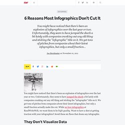
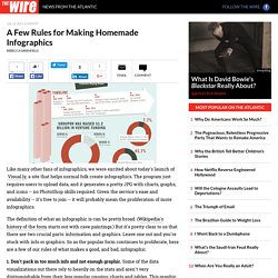
Unfortunately, they seem to have jumped the shark a bit lately with companies cranking out any old thing and sticking the "infographic" title on it. We get tons of pitches from companies about their latest infographics, but only a small fraction actually make the cut. Venngage. Blowing the whistle at bubble charts. The bubble chart is one of the most hopeless data graphics ever invented.
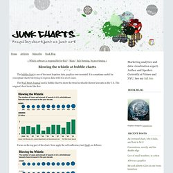
It is sometimes useful for conceptual charts but trying to express data with it is a lost cause. The Wall Street Journal used a bubble chart to show the trend in whistle-blower lawsuits in the U.S. The original chart looks like this: Focus on the top part of the chart. Now apply the self-sufficiency test (link), as follows: First, cover up the data labels.
Second, give yourself a hint. Third, give yourself two hints. Thus, the conclusion about bubble charts is: That is to say, it fails the self-sufficiency test (link).