
50 Beautiful Color Palettes for Your Next Web Project. Choosing the right color scheme is essential to your website’s success. Your layout and other design choices — including font — should be developed in concert with your color scheme, which can ensure readability, cohesiveness, and beauty in the final product. Unfortunately, making that choice or creating a color palette from scratch can be quite the challenge. That’s why for today’s post I’ve put together a collection of 50 beautiful color palettes that are ready to use for your next web project. If you like these, check out another 24 palettes I’ve recently rounded up. Getting the Most Out of This Post Before diving into the color palettes I’ve collected, I want to mention a few tools that can help you get the most out of this post. Editor’s Note: Want to make your own palettes even better?
Remember that Photoshop will display certain colors far more vibrantly than they will look on the web when you use hex codes. That’s all. Pick Your Palette Bonus Resources! Designing in the Dark: 10 Dark Sites and Their Color Schemes. Designing in the Dark: 10 Dark Sites and Their Color Schemes What goes well with a black website?
Today we’ll find out but taking a look at some excellent examples of dark web design along with their primary color palettes. Each website will have a screenshot along with a brief description, a visual representation of the color scheme, and a link to download the Photoshop color swatches from Pictaculous.
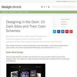
Notio Web Design Here the page itself has very little color and serves as more of a black matte to show off the designer’s work. Download Photoshop Swatches Sofasurfer is now Digitallabs When designing with a dark theme, it can often be quite powerful to mix in a single bold color (primarily) and use it repeatedly as the designer did with orange below. Webdesign.tutsplus. Colors - A nicer color palette for the web. Website Color Schemes: The Palettes of 50 Visually Impactful Websites to Inspire You.
Did you know that Facebook is blue because Mark Zuckerberg is red-green color blind?
“Blue is the richest color for me; I can see all of blue” says Zuckerberg. While this choice of color doesn’t seem very scientific, it still proves that a lot of thought is put into the choice of color. As Buffer writes, over 90% of our assessment of a product is made on color alone, so it makes sense that color should be considered with care for every design decision, particularly on websites. Chances are, if we don’t like the color palette, we’re not going to stay on the site for very long. Did you know color is linked to pyschology? To get you started on your own palette, we’ve gathered 50 beautiful websites with versatile color schemes you can take inspiration from. 01. Mark Dearman This clean, vibrant palette by Mark Dearman perfectly combines warm accent colors with a clean blue background to make for a crisp and professional, but very welcoming palette. Like this? 02. Fabrique 03. The Martin Agency. The Color Scheme Designer.
Trendy Web Color Palettes and Material Design Color Schemes & Tools. A few weeks ago, Matt DesLauriers @mattdesl, a graphics programmer working at Jam3, showed us an interesting development carried out on our platform.

As you already know, Awwwards has been collecting information on the most noteworthy websites since 2009 – something which makes us an essential source for web design trend analysis. The project started as an experiment, I was just learning Node at the time and decided to see if I could scrape Awwwards for some data visualization. Matt developed a tool which requests each page of the Awwwards winner gallery, then searches the HTML for all the available metadata like site name, author, date, URL, thumbnail, etc.
The RGB pixels of each thumbnail are analyzed to get a rough color palette of the 3 primary colors. The result is this brilliant data visualization in which each site is represented as a pie graph showing the distribution of its 3 primary colors. 1. 20 Sites of the Day with Great Color Schemes #c0dfd9 #e9ece5 #b3c2bf #3b3a36 Brdr. 2.