
Get started with CSS animation. Knowledge needed: Basic HTML and CSSRequires: HTML/CSS editor, modern browserProject Time: 1-2 hoursSupport file "Animating" with CSS used to be limited to hovering effects.

With :hover and :focus pseudo classes we've been able to change color, size, background-color, position, and many other CSS properties based on user action. The :hover trick provides only two states - hovered and non-hovered - with only two keyframes: start and end, and no tweening between these states, creating a harsh and sudden transition. This isn't really animation.
CSS3 transitions solved the tweening issue, enabling transitioning from non-hovered to hovered style (and back) over a period of time. In this article you'll learn what you need to know to get started with CSS3 animations. 01. To animate elements you first need to define a keyframe animation.
In the above code, we've declared the animation name, a starting keyframe and an ending keyframe. Absolute Horizontal And Vertical Centering In CSS. Rethinking Mobile Tutorials: Which Patterns Really Work?

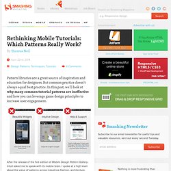
Pattern libraries are a great source of inspiration and education for designers. But common practice doesn’t always equal best practice. In this post, we’ll look at why many common tutorial patterns are ineffective and how you can leverage game design principles to increase user engagement. After the release of the first edition of Mobile Design Pattern Gallery, Intuit asked me to speak with its mobile team. I spoke at a high level about the value of patterns across industries (fashion, architecture, software and others) and how they are a useful teaching tool. Read more... After Editorially: The Search For Alternative Collaborative Online Writing Tools I’m going to let you in on a little secret: the best writers, be it your favorite authors or those that write for Smashing Magazine, don’t do it alone.
Read more... What You Need To Know About WordPress 3.9 Read more... Understanding CSS Timing Functions Read more... Adapting To The Ink — Tips And Tricks For Print Style Sheets. Advertisement Print continues to be treated somewhat cursorily by most Web designers, who tend to be obsessed with pixels rather than printers.

In the real world, a significant portion of people rely on pages printed from websites for reference: there’s still something about having a physical sheet of paper in one’s hands, even in this age of digital saturation. Web developers can take several steps to bridge the gap between the worlds of printers and LCD screens: Treat print as an equal partner in adaptive and responsive design1.Print background images and colors, where appropriate.Add visible URLs or scannable links for easy reference from the printed page.Use CSS filters to improve the result of printed graphics. Design For Print, Not Screen First, let’s cover the basics. @media print { } Recreating the entire CSS for your website is not necessary because the default styles will, on the whole, be inherited by the print query; only the differences need to be defined.
For WordPress: (al) Killer Responsive Layouts With CSS Regions. Advertisement As Web designers, we are largely constrained by the layout features available to us.

Content placed inside a container will often naturally extend the container vertically, wrapping the content. If a design requires elements to remain a certain height, then our options are limited. In these cases, we can only add a scroll bar or hide the overflow. The CSS Regions specification provides a new option. Support Regions are a new part of the CSS specification, so not all browsers have implemented them, and in some cases you might have to enable a flag to use them.
Regions 101 CSS regions enable us to disperse content across multiple containing elements. To use regions, start by creating a named flow; simply add the CSS property flow-into to your content element, with the value of your flow’s name. Your HTML would contain a content element and the scaffolding of all of the regions that this content will flow through. Responsive Design With Regions Regions And Events Debugging (al, il)