
Opinion meter. History - British History in depth: British History Timeline. Map of Metal.
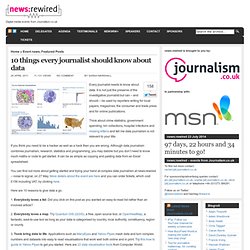
Data journalism. Influence Networks: The six degrees of investigative journalism. In October, 2010, during the Personal Democracy Forum in Barcelona, several investigative journalists explained how they managed to uncover corruption using network analysis. One of them, Dejan Milovac, wrote a story about a construction project on the Montenegrin coastline. He deconstructed the financial networks around the resort, and showed how local politicians were involved in an enterprise that was ostensibly going against all environmental rules. Below is the image illustrating result of the investigation: This diagram holds some margin for improvement, beginning with readability. What’s more, the relationships exposed in this investigation could be useful to other journalists working on similar subjects.
Network analysis has become a popular topic in several newsrooms. More free Web tools. It’s quite possible to find something useful and free online every day.

Here are a few sites that might come in handy when you’re looking to send off big files, you need audio or images that won’t get you in copyright trouble or you’re looking to build a portfolio site quickly. 1. Blog Archive » 10 things every journalist should know about data. Every journalist needs to know about data.
It is not just the preserve of the investigative journalist but can – and should – be used by reporters writing for local papers, magazines, the consumer and trade press and for online publications. Scraping for Journalism: A Guide for Collecting Data. Photo by Dan Nguyen/ProPublica Our Dollars for Docs news application lets readers search pharmaceutical company payments to doctors.
We’ve written a series of how-to guides explaining how we collected the data. Most of the techniques are within the ability of the moderately experienced programmer. The most difficult-to-scrape site was actually a previous Adobe Flash incarnation of Eli Lilly’s disclosure site. Lilly has since released their data in PDF format. These recipes may be most helpful to journalists who are trying to learn programming and already know the basics. How to: get started in data journalism using Google Fusion Tables. An intensity map showing the population density for different ethnic groups in Texas What is it?
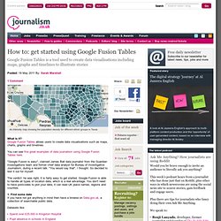
Google Fusion Tables allows users to create data visualisations such as maps, charts, graphs and timelines. You can see five great examples of data journalism using Google Fusion Tables here. "Google Fusion is easy", claimed James Ball data journalist from the Guardian investigations team and former chief data analyst for Bureau of Investigative Journalism, during a recent talk. "You would say that", I thought. The verdict: he was right, it is fairly easy to get started. Journalists' Toolkit. Many Eyes. Data Visualisation Stuff. Ddo. Ideas, issues, knowledge, data - visualized!
Mapize.com : Data Visualization & Mapping. Power of Data Visualization - An infographic inspiration site. Data Visualization Platform, Weave, Now Open Source. With more and more civic data becoming available and accessible, the challenge grows for policy makers and citizens to leverage that data for better decision-making.
It is often difficult to understand context and perform analysis. “Weave”, however, helps. A web-based data visualization tool, Weave enables users to explore, analyze, visualize and disseminate data online from any location at any time. We saw tremendous potential in the platform and have been helping open-source the software, advising on community engagement strategy and licensing. This week, we were excited to see the soft launch of the Weave 1.0 Beta, which went open-source on Wednesday, June 15. Weave is the result of a broad partnership: it was developed by the Institute for Visualization and Perception Research at the University of Massachussetts Lowell, with support from the Open Indicators Consortium, which is made up of over ten municipal, regional, and state member organizations.
Corning. TimelineSetter: Easy Timelines From Spreadsheets, Now Open to All. Talking Points Memo used TimelineSetter to create a timeline featuring events in Wisconsin’s public-sector union struggle.
Last week we announced TimelineSetter, our new tool for creating beautiful interactive HTML timelines. Today, after a short private beta with some of our fellow news application developers, we’re opening the code to everyone. How to Install If you’ve got Ruby and Rubygems installed, you can get the package by running: sudo gem install timeline_setter You can also check out the source code from Github.
Documentation. 20 Essential Infographics & Data Visualization Blogs. In the tradition of Inspired Mag’s huge lists, here goes a new one – all the blogs with cool data visualization eye candy in the same place! Enjoy and leave some comments with suggestions, questions and so on. Information is Beautiful Visual Compelxity. 2010-Narrative-InfoVis.pdf (application/pdf Object) 14 examples of data visualization on the web. Trend spotting A series of websites use APIs and scrape pages to spot and analyze trends: Fan page analytics – Facebook fan page analytics Zoofs – Most talked about YouTube videos on twitter Fflick – Most tweeted movie titles Politics Ushahidi – creates a dynamic map of the flood emergency and where help is needed after the Haiti earthquake.

The worlds best countries – a comparative study of health, educuation, economy, and politics in the countries of the world. We Feel Fine. 3 Tips for Engaging Online Communities with Data Visualization. Data visualization is a medium for understanding information that had previously been the domain of scientists and researchers.
Today, due to the amount of data available, there is an increasing need to find new ways of understanding what information means that is available through social networks and throughout the Web. Engaging Online Communities is a report we published this week that explores ways to engage with customers. It looks at the tools available to engage, collect and analyze information. A logical next step beyond analysis is to engage communities in ways that helps them understand information. Dipity - Find, Create, and Embed Interactive Timelines.
5 Tools for Online Journalism, Exploration and Visualization - ReadWriteCloud. In our last post on data journalism, we ran across a number of tools that would be helpful for anyone who is interested in how to make sense of data.
The tools represent a renaissance in how we make sense of our information culture. They provide context and meaning to the often baffling world of big data. This is a snapshot of what is available. We are relying on the work done by Paul Bradshaw, whose blog is an excellent source about the new world of data journalism. Factual Factual provides simple APIs for building Web and mobile apps.