
Index des balises HTML. Structure Sections Références Cadres Listes Liens Multimédia.
Tutoriels HTML5, CSS3, Accessibilité, JavaScript, AJAX, jQuery. Proposez votre tutoriel Niveaux : Débutant Confirmé Expert Langages hypertexte (HTML, HTML5, XHTML), balises, structure des pages web et validation W3C Feuilles de style CSS (Cascading Style Sheet) Accessibilité Accessibilité des sites internet, bonnes pratiques, ergonomie, utilisabilité Javascript Langage de script pour le web dynamique exécuté par le navigateur Développement Langages et technologies du web tels que PHP, MySQL, Ajax Responsive web design.

Start Your Dev - Accueil : html css javascript xml xsl. Password_hash. HTML5 & CSS3 Support, Web Design Tools & Support - FindMeByIP - CSS3 & HTML5 Browser Support. How to create animated tooltips with CSS3. How to create some simple, animated tooltips using CSS transitions and the pseudo-classes :before and :after View demo Download source In today’s tip we’ll show you how to create some simple, animated tooltips using CSS transitions and the pseudo-classes :before and :after.

The idea is to have a list with links or in our case, social icons, that reveal a little tooltip on hover. The unordered list will look like this: <ul class="tt-wrapper"><li><a class="tt-gplus" href="#"><span>Google Plus</span></a></li><li><a class="tt-twitter" href="#"><span>Twitter</span></a></li><li><a class="tt-dribbble" href="#"><span>Dribbble</span></a></li><li><a class="tt-facebook" href="#"><span>Facebook</span></a></li><li><a class="tt-linkedin" href="#"><span>LinkedIn</span></a></li><li><a class="tt-forrst" href="#"><span>Forrst</span></a></li></ul> The list elements will be floating left and the anchors will have the following style: Each anchor will have a different background position for the background image:
Bootstrap, from Twitter. Creating Different CSS3 Box Shadows Effects. In this tutorial we are going to be creating box shadow effects with just CSS.
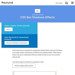
Below is an image created in photoshop of different box shadows effects. These used to be the only way of creating this effect but thanks to CSS3 we can now do all this with just CSS. View Demo page to see what we are going to create CSS Box Shadow Effects Demo CSS Box Shadow We are going to be using the CSS box shadow property which is one my favourite CSS properties which you will see in this tutorial how easy you can use it.
The box-shadow property allows you to easily create multiple drop shadows on box elements by specifying values for colour, size, blur and offset. The box-shadow property accepts 2-6 options, the required options are horizontal offset and vertical offset, the two optional options are spread distance and colour. box-shadow: inset horizontal vertical blur spread colour; Examples Browser Support All of the major newest browsers support box-shadow property. The box-shadow property is no different.