
These two maps show the shocking inequality in Baltimore. "Baltimore is not Ferguson and its primary problems are not racial," my colleague Mike Fletcher wrote today.
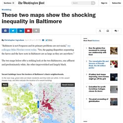
"Yet, the gaping disparities separating the haves and the have nots in Baltimore are as large as they are anywhere. " The two maps below offer a striking look at the two Baltimores, one affluent and predominately white, the other impoverished and largely black. The map on the left shows one very tiny dot for each person living in Baltimore. It was made by the Cooper Center for Public Service at the University of Virginia. White people are blue dots, blacks are green, Asians are red and Hispanics yellow. 12 data maps that sum up London. Image copyright James Cheshire/Oliver Uberti A new collection of data maps of London reveals a city heaving with information.
A quick quiz question for you. How many football pitches could fit inside the Greater London boundary? Well, 220,000 of them would fill the space between Cockfosters and Croydon, Heathrow and Hornchurch. That statistic is just one of thousands of facts and figures contained in a new book about London, which according to its creators is the most data-heavy capital of the world. Geographer Dr James Cheshire and visual designer Oliver Uberti say their book - London: The Information Capital - is not an atlas, but instead a series of data portraits. Scroll down to take a look at a few of their colourful and imaginative maps and infographics. Ethnicity. Are the super rich getting even richer? The charity has highlighted growing inequality ahead of the World Economic Forum in Davos this week.
An Oxfam research paper suggests the wealthiest 1 per cent have seen their share of global assets rise from 44 per cent in 2009 to 48 per cent last year - with an average worth of £1.8m each. The figure is on track to exceed 50 per cent this year. Below the richest fifth, 80 per cent of the world's population own just 5.5 per cent of wealth - an average of £2,500 each. Oxfam International executive director Winnie Byanyima said: "Do we really want to live in a world where the 1 per cent own more than the rest of us combined?
Conrad Hackett (@conradhackett) Conrad Hackett sur Twitter : "Share of world's extreme poor 33% India 13% China 9% Nigeria 5% Bangladesh 5% DR Congo. Conrad Hackett sur Twitter : "Share of world's extreme poor 33% India 13% China 9% Nigeria 5% Bangladesh 5% DR Congo. Conrad Hackett sur Twitter : "Where to be born 1 Switzerland 2 Australia 9 Canada 16 US 18 UAE 49 China 51 Turkey 80 Nigeria. Joe Sarling sur Twitter : "@ElectricRayTV @paulmasonnews @richardpbacon Thought you'd like to see some of my charts ready for #howrichareyou. Ridela sur Twitter : "So you think @Ed_Miliband 0 0 message wont resonate @GuidoFawkes @adamboultonSKY @bbcnickrobinson @afneil. Stephen Matthews sur Twitter : "MT @Oxfam: Why #inequality is 2015’s most worrying trend via @wef #geographyteacher"
The economic threat to cities isn't gentrification; it's the opposite. American cities are growing, and as they grow, they're adding lots of high-poverty neighborhoods.
Nearly three times as many "high-poverty" census tracts existed in 2010 as in 1970, according to a new study by the Portland-based think tank City Observatory. That's unsettling on its face but even more so when you see the havoc a poor neighborhood can wreak on a resident's chances at a good life. Forget gentrification — this is a bigger problem The below chart from the study tallies up the people living in these neighborhoods in 1970 and 2010. What it shows is that the number of people living in high-poverty neighborhoods — those with poverty rates of 30 percent or more — has roughly doubled since 1970. Source: City Observatory That share of people living in high-poverty neighborhoods isn't huge — around 8.9 percent of all Americans living in poverty in 2010, according to US Census Bureau data.
These Amazing Maps Show the True Diversity of Africa. Africa is not a country.
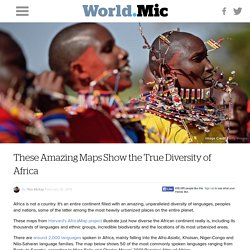
It's an entire continent filled with an amazing, unparalleled diversity of languages, peoples and nations, some of the latter among the most heavily urbanized places on the entire planet. These maps from Harvard's AfricaMap project illustrate just how diverse the African continent really is, including its thousands of languages and ethnic groups, incredible biodiversity and the locations of its most urbanized areas. There are around 2,000 languages spoken in Africa, mainly falling into the Afro-Asiatic, Khoisan, Niger-Congo and Nilo-Saharan language families.
The map below shows 50 of the most commonly spoken languages ranging from Bantu to Songha, according to Marc Felix and Charles Meurs' 2001 Peoples' Atlas of Africa: African countries are also quite diverse from an ethnic standpoint. Far from being the rural backwater it's often stereotyped as, many African countries are rapidly urbanizing. What Everyone Needs To Know About Wealth In The UK.