Create a Swish CSS3 Folded Ribbon in Five Minutes. Take one line of markup, a couple of CSS3 rules (no images), and you can have yourself a swish folded ribbon effect in five minutes.
Let's see how.. Step 1: Markup We'll begin with an empty HTML document; doctype, charset declaration, head, body, the usual suspects. You'll also notice we're linking to the Google Web Fonts API so we can make use of the pleasantly decorative Montez typeface. Now we'll add our ribbon element. Step 2: Stir in Some Style Open up a new CSS file, link to it in the head of your document, then jump into adding some styles. We've started by styling the html and the body, just for the purposes of the demo (and yes, I've used an image for the background, but the ribbon itself is 100% image free).
Then, we turn our attention to our ribbon element. Note: If, for whatever reason, you don't want to float your ribbon, give it a display: inline-block;. Looks nice enough already, eh? Step 3: The Fold See it? How our element is constructed Step 4: Tables Turn So, how's it looking? Creating Polaroid Style Images with Just CSS - ZURB Playground - ZURB.com. Through a combination of browser-specific CSS (2 and 3) integration and some basic styling, we've turned regular old images into cool looking polaroid style images—with no additional markup to show the text.
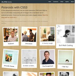
Using the Title Attribute Instead of adding additional markup (more headings or paragraphs), we've opted to reuse the content within the title attribute of the surrounding anchor tag. Since it's good practice to use proper title text, and it's really freaking cool to do stuff with just CSS. Note: this is from the CSS2.1 spec, but browsers haven't implemented it fully. Read up on it here. We have to use the title attribute for the anchor because the alt attribute isn't fully implemented by Safari or Firefox.
Adding "Random" Tilts Safari 4 and Firefox 3.5 both have support for the :nth-child pseudo-selector (this is CSS3). Read about :nth-child and it's usage here. Although this seems like a bit much, this works to our advantage. Making Them Scale Final Details. Subtle CSS3 Typography that you’d Swear was Made in Photoshop. Text shadow box. Getting to Work with CSS3 Power Tools. CSS3 is one of the coolest new web technologies available to web developers right now.
Using some of its many features, it is possible to reproduce the effects that you might have previously done in Photoshop, with CSS code that is more maintainable, faster to load, and hip with the latest trends. Read on to learn about the power tools available to you and how to combine them to produce the ultimate graphical effects. CSS3 has many features, but some of them are imperative to learn if you are going to be reproducing Photoshop-like effects. I call these my "power tools. " They include the following: Border RadiiBox ShadowsText ShadowsGradientsMultiple Backgrounds Each of these features can help replace some of the images that you might have created in Photostop in the past. Browser Support: Safari: 3.2+Firefox: 3.0+Chrome: 3.0+Opera: 10.5+Internet Explorer: 9.0+ By now, you've probably heard about border-radius a million times. There are three syntaxes that you will need to use.
OK, easy! CSS (Cascading Style Sheets) in one page : CSS.SU. Perfect Full Page Background Image. Learn Development at Frontend Masters This post was originally published on August 21, 2009 and is now updated as it has been entirely revised.

Both original methods are removed and now replaced by four new methods. The goal here is a background image on a website that covers the entire browser window at all times. Let’s put some specifics on it: Fills entire page with image, no white spaceScales image as neededRetains image proportions (aspect ratio)Image is centered on pageDoes not cause scrollbarsAs cross-browser compatible as possibleIsn’t some fancy shenanigans like Flash Image above credited to this site. Awesome, Easy, Progressive CSS3 Way We can do this purely through CSS thanks to the background-size property now in CSS3. Works in: Safari 3+Chrome Whatever+IE 9+Opera 10+ (Opera 9.5 supported background-size but not the keywords)Firefox 3.6+ (Firefox 4 supports non-vendor prefixed version) View Demo CSS-Only Technique #1 Big thanks, as usual, to Doug Neiner for this alternate version.
Essential cross-browser code, information and discussion. Introduction to CSS3 Animations. CSS Tucked Corner Effect. Body { margin: 0; padding: 0; div.tucked-corners {