
Dan Steer sur Twitter : "9 simple #PowerPoint tips for your #presentation .. if you insist on using it... Free Content You Can Use from Creative Commons – Michelle Lentz at ATD TK15. One of my clients is very serious about intellectual property and copyright.
As a research-driven company creating innovative products, this is their whole business. When I have to make some training materials for this client, they almost always get sent back (you would think I would learn!) For an update. Why? Because I shamelessly steal and use everything I find on the internet. So Michelle Lentz‘s ATD TK15 session on “Finding Free Stuff For Your Training With Creative Commons” seemed interesting to me. Note: having trouble with my WordPress app putting in links right now … all reference links at end of this post Tip 1 If you want to make it clear what people can and can’t do with your own work, materials, images, blogs etc.. add the right Creative Commons license information. Tip 2 If you want to help other people find your shareable Creative Commons licensed work via the Internet (blog, images, sound etc) you need add the right license code.
Thanks for reading! Turn horrible text driven PowerPoint slides into awesome big bold visual messages. During Presentation Skills training, we learn all about the 4 pillars of an effective presentation: Message, Structure, Content and Style.
In content and style, we also look at how visual supports are used to support and message and speech: What would be the minimum effective dose when it comes to discussing a certain topic? Is a chart a better way of showing growth than a table? Should I add some images to my PowerPoint? And what kind of visual style should I use?
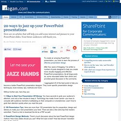
In my other post “9 PowerPoint Essentials for Real Business People”, I listed some very simple pointers for fixing PowerPoint slides. First, let’s look at the original slide in question: This slide comes from a PPT deck in support of a presentation explaining how a particular bandage is better than another. What’s wrong with this slide? If you appreciate the 9 PPT Guidelines then its clear: There’s too much textThe title is badThe colour contrast is not effectiveIts not very visual Let’s see what we can do. Ryan Coleman: Facilitation, Information Design & Speaking. 7 Tips to Beautiful PowerPoint by @itseugenec.
20 ways to jazz up your PowerPoint presentations. To create an amazing PowerPoint presentation, you have to learn the process of effective presentation design.
After four years of blogging, I've written a number of posts designed to help you create more visually engaging and effective PowerPoint presentations. As all blogs posts do, some resonated better than others and provided great discussion in the comments. I aggregated 20 of the best posts to help you become a better PowerPoint presentation designer. They cover specific presentation design techniques, book reviews, tips, methods and more. Without further ado, here they are: 1. 5 Ways to Start Your Presentation Off Strong: You have seconds to grab your audience's attention, and only a few minutes to keep it. 2. 100 Presentation Tips: Here are more than 100 presentation tips for preparation, design and delivery to make your next presentation your best. 3.
There isn't one right PowerPoint method. 5. 6. 7. 8. 9. 10. 12. 13. 14. 16. 18. Creative Presentation Ideas with Custom Slide Layouts. If you are looking for professional PowerPoint templates with custom slide layouts for PowerPoint or presentations in general, then this collection of free creative PowerPoint templates and free slide layouts for PowerPoint can help you to speed the design process.
Download free creative presentation templates with custom slide layouts Free Quote PowerPoint Template to cite authors in your presentations is a nice and creative slide layout with balloons and quote bubble that you can use to cite your authors in a creative way. This make your slides more catchy and you can add the author photo below the bubble to make it more awesome. How to Create a Dynamic PowerPoint Presentation for Your Next Meeting. Colour Theory: Contrast & Readability - Do You Want Your Web Pages Like Police Tape? If the research was done many years ago, it may well have been with the older monitors that were essentially a television screen, with the interlaced lines and resolution 1/4 that of a modern computer monitor.
If this is the case, then the research may be more relevant to WebTV than to modern monitors with continuous (non-interlaced) display, small dot pitch, and high refresh rate. I well remember the eyestrain I suffered from some older computer monitors even as late as 1991: without special mesh screens to filter out the brilliance of the phosphor dots, it was difficult to avoid headaches.
Under these circumstances, the text would probably have consisted of a small number of very brilliant green dots against a black background. Also, the shade of green would be very important to the overall effect. As I mentioned earlier in the article, one wants just enough contrast for clarity when reading close-up, but not so much contrast as to cause vibration, and thus, eyestrain.