
Make Effective Tables for your Presentation – 8 Simple Tips. Too many numbers, lack of focus and bad formatting make tables impossible to understand and energy consuming for your audience.
5 Secrets to Better Presentation Charts and Graphs. Storytelling, POV, & the power of first-person narrative. I have long thought that 21st-century presenters can learn as much about communicating ideas from filmmakers—especially documentary filmmakers—as they can from traditional speech-communication resources.
Filmmakers are master storytellers and they have much to teach us about engaging an audience. A great story can do many things to an audience, but one thing it must do is make the audience feel. Your story does not have to make people feel good, but it must make them feel something. Now, like a filmmaker, 21st-century presenters/storytellers have many tools at their disposal including motion pictures (i.e., digital video for most of us), photography, sketches, data visualizations, and audio including narration, first-person interviews, music, sound effects, etc.
In a live talk, short video clips of first-person interviews can be highly effective if woven into your narrative with purpose. When it comes to film, I'm rather keen on the first-person narrative approach. World's most accurate pie chart... Make Effective Tables for your Presentation – 8 Simple Tips. Too many numbers, lack of focus and bad formatting make tables impossible to understand and energy consuming for your audience.
Follow these 8 simple tips to make effective tables that you can use with pride in your presentation. If you need to present numbers, you may believe (like me and Gene Zelazny) that graphs and visuals are the best way to go. But if you (your company or audience) are number-hungry, maybe you’ll still need to include a table in your presentation from time-to-time. But PLEASE: Don’t let it look like this… This is the kind of table that might drive Don McMillan mad in “Death by PowerPoint” . If you insist upon including such a “raw-data” table somewhere in the appendices or giving it as a hand-out for the finance guys, then at least make it look like this: …or this, if you like a bit of colour … To achieve an effective raw-data table like the ones above, consider the following 5 tips: The Credible Hulk.
PPT. VAK - representation systems. The VAK learning style uses the three main sensory receivers: Visual, Auditory, and Kinesthetic (movement) to determine the dominant learning style.

It is sometimes known as VAKT (Visual, Auditory, Kinesthetic, & Tactile). It is based on modalities—channels by which human expression can take place and is composed of a combination of perception and memory. VAK is derived from the accelerated learning world and seems to be about the most popular model nowadays due to its simplicity. While the research has shown a connection with modalities and learning styles (University of Pennsylvania, 2009), the research has so far been unable to prove the using one's learning style provides the best means for learning a task or subject.
This is probably because it is more of a preference, rather than a style. Learners use all three modalities to receive and learn new information and experiences. According to the VAK theorists, we need to present information using all three styles. Say It WIth Charts (book) Minimum Effective Dose. Develop content in order to deliver the minimum effective dose Now it is time to create the content for your presentation – if you are like most people, this will either mean copy/pasting from previous presentations or putting in everything you know about the topic and then cutting out as much as necessary to make it fit into the time slot you have been given.
Try applying the lessons in this blog-spot instead! First of all: Don’t grab everything and then cut out in order to be on time or be less boring – you have to think about BUILDING your presentation up instead of cutting down from your 100% knowledge of the topic. Concentrate on the minimum effective dose! The minimum effective dose is a concept I first read about in the book “The 4 Hour Body” from Tim Ferriss .
The basic principle of the minimum effective dose is this: .
How contrasts make your sales presentations more impactful? Contrast is one of the most effective ways to add visual interest to your sales presentations.
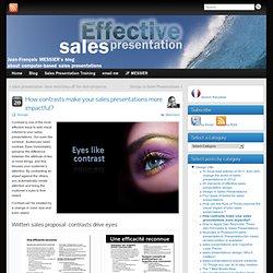
Our eyes like contrast. Audiences need contrast. Eyes immediately perceive the difference between the attribute of two or more things, and this focuses your customer’s attention. By contrasting an object against the others, you automatically create attention and bring the customer’s eyes to that object. Contrast can be created by a change in color, size and even object. The source of the contrast is obvious. Very often sales reps are shy with the contrasts of font sizes: if they consider that 18 pts is a small font, a big one will be 24pts.
Establishing a relationship between slide elements is an important first step. Contrast on a page draws customer’s eyes on it. 5 second rule by @vkhosla.