
iFontMaker – The First & Fastest Font Editor for iPad. Top 13 Webfonts for Headline Use. Today, webfonts abound.
You can find them in a number of places: Google Font Directory, Typekit, Fontspring.com, and myriad other sites and font delivery services. A number are even free. And yet, like most things, much of what is free is not useful, and much of what is useful is not free. For example, there are a great deal of handwriting fonts available for @font-face embedding, but I would be hard pressed to think of more than a few instances in which these would be put to use.
This article, then, focuses on the top 13 most useful free webfonts for headline use. One of the most common suggestions for combining headlines and body text is to set the headlines in a serif typeface and body copy in a sans-serif typeface, or vice versa. Because you’re typically only setting fewer than 100 characters in a headline, it doesn’t necessarily have the same requirements for readability as your text font. Nice Web Type has an excellent tutorial on @font-face embedding here. License: License: Anatomie du caractère: comprendre la typologie de la typographie [IDIKO-26_GENERAL] Typographic Marks Unknown. There are many typographic marks which are familiar to most, but understood by few.
Most of these glyphs have interesting histories and evolutions as they survived the beatings given to them through rushed handwriting of scribes and misuses through history. They now mostly live on our keyboards and in our software, and a few are used often, so it seems only fitting to know where they come from and how to correctly use them. The Pilcrow History of the Pilcrow Replacing another symbol, the paragraphos, to become the new mark representing a paraph—a new line of thought or break in text—it evolved over time through the natural development of handwriting. Using the Pilcrow Initially the pilcrow was used to separate blocks of text, rather than dividing them with space. What Font is.
Morning Type. Top 13 Webfonts for Headline Use. Links: Foundries & typographers. Minimalism, Modernism, Typography. Typographies.fr - Création typographique. Grotesque 6 : Émilie Rigaud. Jessica Hische. Type Connection. Abc-typo. Fontdeck web fonts: Real fonts for your website. TypeOrganisations. Free Online Font Converter - StumbleUpon. Typographic Marks Unknown. Comic Sans Criminal.
Webexpedition. Font Diner! Fontcraft. I was shopping in my local HEB grocery store this weekend and found myself in the soft drink section, confronted by a wall of cool retro-looking bottles of all sorts of sodas from the Dublin Bottling Works, a company based in Dublin Texas which produces a full line of specialty soft drinks, apparently mostly for distribution through HEB.
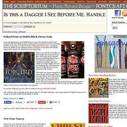
They’ve got all the usual flavors like Ginger Ale, Cola and Root Beer and some more unusual flavors, including Black Cherry. The labels are printed on transparent plastic slip-ons which are surprisingly effective at emulating the old-fashioned look of being directly screen printed on the bottles. The labels are great examples of retro design, and though I may be a bit biased, the coolest by far is the Black Cherry soda label which uses our Folkard font to great effect. Fonts In Use. Speak Up. HELLO (AND, WELL, GOODBYE)After nearly seven years of blogging, Speak Up has ceased publication.
While this may not be a remarkable amount of time in the world of print and online publishing, the intensity with which we — founders, authors and readers alike — undertook it made it seem as it had been decades. For a thorough description on the reasons to close Speak Up, you may read this post, so as not to take much more space here. This web site is a bare-bones version of the archives for quick and easy perusal of more than 1,600 posts — a replica of Speak Up, as it was on closing day, can be found here, and at any point you can add “as-it-was/” after “speakup/” to the URL to see the original version.
Comments on both sites have been closed. To the right you will see all of our categories with a brief description of what you may find. Below are some highlights from our time spent blogging. On snot and fonts. Africa: ⦿ Africa ⦿ Berber ⦿ Coptic ⦿ Egypt ⦿ Hieroglyphics ⦿ Mauritius ⦿ Morocco ⦿ Other ⦿ South-Africa ⦿ Tunisia.
Typography Daily. 100 Best type. Typothèque. Every year we make a limited edition of the pocket-size calendar and sketchbook.
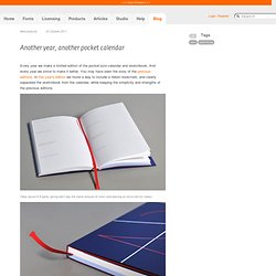
And every year we strive to make it better. You may have seen the story of the previous editions. In this year's edition we found a way to include a ribbon bookmark, and clearly separated the sketchbook from the calendar, while keeping the simplicity and strengths of the previous editions. Clear layout in 8 parts, giving each day the same amount of room (and leaving an extra slot for notes). Otastar binding with sewn sections. 12 different pre-printed grids for sketching and designing type—plenty of space to make personal notes and keep life organised. Chronologie. Typographic Marks Unknown. Typographica. Design et typo.
I love typography. But will it fly?
Perhaps the most difficult part in compiling this list is not what to include, but what to leave out. There are, then, many other typefaces that should be in this list, but aren’t. Perhaps some of your favourites from 2009 coincide with mine; perhaps they don’t — I’d love to hear about them in the comments below. Fonts, Typography, Lettering, Design. SymbolAssist: More Symbols, Less Work // Plasticmind Blog - StumbleUpon. After seeing the nifty characters TwitterKeys made readily available for posting into your Twitter and IM conversations, I got inspired to dig around the 65,000+ Unicode characters and find some more gems.
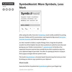
As I did, I started to realize a couple of things. First, a huge list of symbols wouldn’t be all that helpful. Second, these symbols are useful for more than just jazzing up your Twitter conversations (✌ @plasticmind). So the idea of an organized character map tool that actually let you click a symbol to copy it to your clipboard began to percolate. Too often I’m opening up Word or trying to find a page on Google with the symbol I need. The result is SymbolAssist, a browser-based character map that saves you time by letting you click-to-copy symbols to your clipboard. What’s Inside. Typophile. Veer. MyFonts. WhatTheFont!
Foundry.