Gulp-cordova-build-android. Build the cordova project for the Android platform.
Build the cordova project for the Android platform. Installation. Ma première application Android avec Cordova. Having previously written a tutorial to demonstrate the ease of creating an application Firefox OSArticle on Firefox OS with web technologies, I'll do the same for Android.
To allow this technical prowess (an Android without Java application), we will use the application open source Cordova. In this article, we'll port my app to web failure on the Google Play Store . If you are interested in web development on Android, you have heard from PhoneGap. Cordova is a project made with Adobe which provided the source code to the Apache Foundation. The idea is simple: compile a shell using a module "webview" charging our application. PhoneGap still exists and can be used via an offer "cloud" to generate its applications for Android and iOS, Windows Phone, BlackBerry... For information, it also allows to compile to desktop platforms: Windows 8 and Ubuntu. The address: Developing GNU/Linux, I'll give the instructions for installation on Ubuntu. In a terminal: sudo apt-get install nodejs nodejs-legacy npm. Choosing the Right Font: A Guide to Typography and UX - Anyone who took Graphic Design 101 knows that serifs help readability and black is the best color for text.
But, wait! We also know that type for the web is different from type for print. A lot of design experts insist that sans serif, grey text is easiest to read—and much more beautiful, too. And then there’s mobile to consider. If your font choices work well for your desktop site, is it safe to assume they’re fine for your mobile site, too? The purpose of any text on your website or app is to help your users accomplish their goals. Unfortunately, there are a lot of conflicting opinions out there about typography for web and mobile, and there isn’t one strict set of rules that apply in every case. But there are several things you can do to make sure the fonts you choose for your website or app are working with you and your users, not against you. While every designer should strive to create something beautiful and remarkable to look at, don’t forget the main goal of your text.
Choosing the Right Font: A Guide to Typography and UX - Make Your Mockup in Markup. We aren’t designing copies of web pages, we’re designing web pages.
Andy Clarke, via Quotes on Design The old way I used to think the best place to design a website was in an image editor. I’d create a pixel-perfect PSD filled with generic content, send it off to the client, go through several rounds of revisions, and eventually create the markup. Does this process sound familiar? Du zoning au mockup, itinéraire d'une maquette web. Du zoning au mockup, itinéraire d’une maquette web, en passant par le moodboard, le wireframe, les style tiles et le prototype… Il n’est pas toujours évident de s’y retrouver dans le vocabulaire, nouveau et souvent anglophone, de la conception web.
Nous sommes nombreux [**] à avoir déjà vécu une situation d’incompréhension à cause de ce vocabulaire. Les termes « zoning » et « mock-up », en particulier, ont des significations différentes selon les personnes [**] et prêtent au quiproquo, quand ils ne sont pas carrément considérés comme synonymes de « wireframe »… Pour mieux s’y retrouver, commençons par mettre les bons mots sur les choses.
Inspiration. Créer un site responsive - La maquette. [Total : 3 Moyenne : 5/5] Vous souhaitez réaliser un site responsive ?
Que ce soit pour un projet en code html/css pur ou bien pour créer un thème sur mesure pour WordPress, Joomla, Drupal ou autres… C’est ici que ça se passe. Pour cette première étape de la création d’un site responsive « from scratch » (depuis zéro), nous allons commencer par l’étape de la création des maquettes graphique. C’est l’essence même de la qualité du résultat final, donc autant faire les choses proprement et ne pas se compliquer la vie. 20 Mobile User Interface Design for Your Inspiration. Designers of mobile interfaces are becoming more prominent in today’s faced-paced web space.
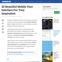
While mobile-optimized sites may lighten the burden on a site developer, some prefer building a full featured app instead. App designers and developers are in high demand now particularly in user interface. UI design focuses on user experience and interaction, and while being easy-to-use is important, an attractive yet still practical design is essential to the success of an app. Today I’d like to show you some mockups, sketches, buttons, tables, splash screens, and many more examples of iPhone app (UI) designs for your inspiration. If you’re familiar with iPhone or iPad designing, you’ll recognize all these terms above.
Recommended Reading: Design Killer Mobile App Websites: Tips And Examples 1. iOS 7 UI Components by GraphicBurger 2. 3. 4. 5. 6. iOS7 inspired UI kit by Kreativa Studio 7. iPhone Chat App by Ramotion 8. 9. 10. Sidebars - Mobile Design Patterns. Prototyper vos applications : la méthode en 5 étapes. Dans ces quelques lignes je vais vous exposer ma méthode de travail de designer pour prototyper mes applications.