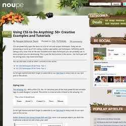

Tutorials. Using CSS to Do Anything: 50+ Creative Examples and Tutorials. Apr 21 2008 CSS can powerfully open the doors to a lot of rich and unique techniques.

Today we are presenting a round-up of CSS coding, creative approaches and techniques. Definitely worth taking a very close look at! We also included some basic techniques you can probably use in every project you are developing. This is just the third article in this series , the forth part will be coming soon, stay tuned and Enjoy! You can also take a look at other 2 articles in this series : So let’s get started and don’t forget to subscribe to our RSS-Feed to keep track on our next post in this series. Styling Lists The Amazing <li>- With a little CSS, the <li> becomes one of the most powerful and versatile tags in a web designer's arsenal. Better Ordered Lists (Using Simple PHP and CSS)- Here is an example where you ditch the traditional ordered list and create your own! Live DemoView it Here Forms and Form Elements Footers New ideas for Image Replacement Image Sprite CSS image techniques Navigation Drop Caps. Just-add-water CSS Animations. 10 Examples of Beautiful CSS Typography and how they did it...
Lately I have been very interested in how far we can take Typography only using CSS.

Sure you can use images or sIFR to produce some very beautiful typography, but there is something unique and special about using only CSS. It is incredibly useful too, if you know the extent you can take CSS you end up with much more flexible websites— especially ones driven by a CMS. Think about how difficult sIFR or images get when you want to replicate that typography or typeface over 100 pages powered by a CMS. If you can get beautiful type via CSS it makes this situation very easy and with out compromise. There are a lot of great sites out there that have beautiful Typography using only CSS, however simply looking at them is only half of the picture. 1. Coudal Partners small headline Larger Headline You may be surprised to find out that the serif font used is… *gasp* times new roman! 2 + 3. Human Sexuality and the Nuptial Mystery Headline Example 3. Seed Conference On Friday, June the 6th 2008.
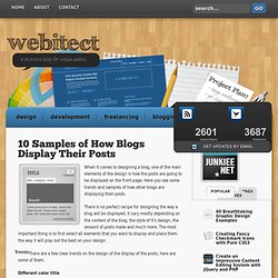
10 Samples of How Blogs Display Their Posts. When it comes to designing a blog, one of the main elements of the design is how the posts are going to be displayed on the front page.

Here you see some trends and samples of how other blogs are displaying their posts. There is no perfect recipe for designing the way a blog will be displayed, it vary mostly depending on the content of the blog, the style of it’s design, the amount of posts made and much more. The most important thing is to first select all elements that you want to display and place them the way it will play out the best on your design. There are a few clear trends on the design of the display of the posts, here are some of them. Different color title A lot of blogs are using a different color on the text of the title of each post, that way it draws the attention of the viewer to the title and it’s also easier for the user to distinguish when a new post is starting to show.
10 best WYSIWYG Text and HTML Editors for Your Next Project. Allowing users, and clients to format their text without delving into code has long been on developers’ priority lists, but these days, providing this usability is far easier than it once was. Here are 10 WYSIWYG editors that are commonly used, and are worth a look in if its something you need for a project. 1. NicEdit Demo | Download NicEdit is an alternative to some of the larger, more complex WYSIWYG editors out there, with its small download size. 2.
Demo | Download TinyMCE is an open-source JavaScript HTML WYSIWYG editor. 3. Demo | Download CKeditor is the new FCKEditor that proved to be the market leader previously. Create a Sticky Note Effect in 5 Easy Steps with CSS3 and HTML5. Diseño web adaptable con CSS Media Queries. Desde la llegada de Internet a los móviles y tablets, son muchas las soluciones que se han propuesto para adaptar nuestros diseños web a las resoluciones de estos dispositivos.

Actualmente la solución más extendida es el uso de un diseño alternativo para la versión móvil, asociado a un subdominio m. (m.facebook.com, m.gmail.com, m.marca.com, etc) o anteriormente a un dominio .mobi. Sin embargo, en los últimos meses se está imponiendo el uso de las Media Queries de CSS3 y ya podemos encontrar numerosos ejemplos de páginas web que utilizan este método. Es una firme candidata a convertirse en un estándar web. Su único inconveniente es que necesitamos cargar una librería Javascript para utilizar esta clase en versiones anteriores a Internet Explorer 9 (sino se mostrará el diseño tradicional).
Cómo funciona Este sistema se basa en limitar un conjunto de propiedades CSS para que sólo tengan efecto en las pantallas con un ancho mínimo determinado.