
10 Fun Tools To Easily Make Your Own Infographics. People love to learn by examining visual representations of data. That’s been proven time and time again by the popularity of both infographics and Pinterest. So what if you could make your own infographics ? What would you make it of? It’s actually easier than you think… even if you have zero design skills whatsoever. Below are my two favorite infographic-making web 2.0 tools that I highly recommend. Click the name of each tool to learn more! Visual.ly One of the more popular ways to discover infographics, Visual.ly actually just launched a design overhaul of their website. Graphic Organizers. Radicalcartography. David McCandless. Visual Storytelling: New Language for the Information Age. Upload & Share PowerPoint presentations and documents.
About slidestaxx. Infographics & Data Visualizations. Create interactive infographics - Infogr.am. 9 Powerful Free Infographic Tools To Create Your Own Infographics - DATA VISUALIZATION.
Infographics. Gallery. Mind map. A mind map about educational technology A mind map is a diagram used to visually organize information.
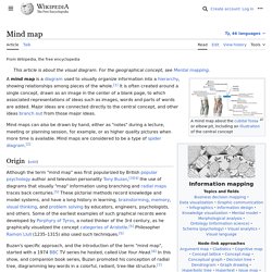
A mind map is hierarchical and shows relationships among pieces of the whole.[1] It is often created around a single concept, drawn as an image in the center of a blank page, to which associated representations of ideas such as images, words and parts of words are added. Major ideas are connected directly to the central concept, and other ideas branch out from those major ideas. Mind maps can also be drawn by hand, either as "rough notes" during a lecture, meeting or planning session, for example, or as higher quality pictures when more time is available.
Visualize Everything: 32 Free Tools To Create Different Diagrams. With so many things to know and techniques to learn it often becomes hard for designers and developers to keep up with their projects and manage their work.
While you could start every project by doing the same things again and again, the smart designers and developers know the importance of a well-developed workflow. One of the things that can accelerate and enhance your workflow is the tool known as online pattern generator. Check the table of Contents to see everything that’s included in this inspirational article. Table of Contents: Backgrounds & Patterns Generators Online pattern generator can be extremely handy for creating small details or saving time writing code. Map Maker. Google Map Maker officially closed on March 31, 2017, and many of its features are being integrated into Google Maps.
Since 2008, the Google Map Maker community has edited and moderated millions of features to improve the Google Maps experience. INFOGRAPHIC: Social Media: The New News Source. La filosofia spiegata con la grafica. Prendere un concetto complicato, ricco di sfumature, denso di significati, e tradurlo in immagine: è quello che ha provato a fare Genis Carreras, giovanissimo (classe 1987) designer catalano che vive a Londra.

È nata la serie “Philosophy Posters”, quindici lavori grafici all’insegna del minimalismo che con talvolta un solo simbolo traducono concetti come razionalismo, esistenzialismo, nichilismo, relativismo in oggetti visivi. Uno sfondo piatto, tre brevissime righe di spiegazione sotto il titolo principale e il gioco è fatto. Chissà se renderebbe lo studio di liceali e universitari alle prime armi meno respingente. Exploratree - Exploratree by FutureLab. Livehoods – Use-based urban analytics. In conceptualizing and exploring the city we rely a range of smaller areas—neighbourhoods, boroughs, wards and districts—in order to make urban space intelligible.

While we can readily discuss how neighbourhoods are shaped by physical geography (topography, adjacency to lakes or rivers, etc.), ordinance (zoning, access to public transit) and economics (real estate prices, average resident income), machine learning does not really spring to mind when we are considering how we might define ‘a neighbourhood’. Livehoods is a new project hatched within the School of Computer Science at Carnegie Mellon University that leverages 18 million Foursquare check-ins to draft up new urban ‘activity zones’ based on the patterns of frequent visitors. The venture essentially asks how does a location-based service reflect our sense of place within the city? Livehoods.org | School of Computer Science at Carnegie Mellon University. Sketchnotes. With New Tool, Visual.ly Wants To Replace PowerPoint With Infographics. "Before PowerPoint, you had to go find a designer to create a custom presentation," says Stew Langille.
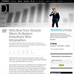
"Even though everyone hates PowerPoint now, it was really helpful when it first came out. " Now Langille’s startup, Visual.ly, is attempting to do for infographics what Microsoft did for presentations. Today, the company launched a new platform to allow virtually anyone to create data visualizations. By tapping into data APIs--from Facebook Insights, Twitter, Data.gov, and so forth--Visual.ly enables users to plug predetermined datasets into premade designs, offering a stable of templates and themes that will continue to grow thanks to the startup’s in-house team and community of roughly 4,000 freelance designers.
Over 100 Incredible Infographic Tools and Resources (Categorized) This post is #6 in DailyTekk’s famous Top 100 series which explores the best startups, gadgets, apps, websites and services in a given category.

Total items listed: 112. Time to compile: 8+ hours. Follow @DailyTekk on Twitter to make sure you don’t miss a week!