
A World of Terror. Oranges and Blues — BoxOfficeQuant. When I launched this site over two years ago, one of my first decisions was to pick a color scheme – it didn’t take long.

Anyone who watches enough film becomes quickly used to Hollywood’s taste for oranges and blues, and it’s no question that these represent the default palette of the industry; so I made those the default of BoxOfficeQuant as well. But just how prevalent are the oranges and blues? Some people have commented and researched how often those colors appear in movies and movie posters, and so I wanted to take it to the next step and look at the colors used in film trailers.
Although I’d like to eventually apply this to films themselves, I used trailers because 1) They’re our first window into what a movie will look like, and 2) they’re easy to get (legally). After sampling, I created the chart below to represent the distribution of those colors, so we could truly see how often they appear.
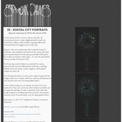
Notes: MOVIESOUND. EE - Digital City Portraits. EE - Digital City Portraits Special commission by EE for the launch of 4G For the launch of 4G services in eleven UK cities, EE commissioned me to create a digital portrait for each city, formed from millions of bits of data as people talked and interacted about the biggest events of the day.

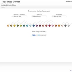
Based on the same mathematics that create the head of a Sunflower, time explodes outwards from the centre with each point representing one minute giving a possible 4320 points – the number of minutes in three days – to cover the day before, during and after the launch of 4G. The three days worth of data was searched for various keywords that were hot talking points at the time, including Skyfall, Hurricane Sandy, money, together with localised subjects for each city. Even though each piece uses the same system to generate the images, each one is unique, both from a density of data point of view but also from what was being talked about. Visual. The Startup Universe displays and explores the relationships between startup companies and their founders and investors (Venture Capitalists) since 1990.

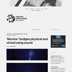
Startups are grouped into 19 categories, based on the type of products or services they deliver. Each category is represented by an unique color. In addition to that, startups are visually sized according to the amount of financing they have raised, with each individual round displayed as well. Startups are positioned within the main interface on a horizontal interactive timeline, based on the year they were founded. OpenStack Stats. Kit FUI - Noteloop. The Conversation Prism by Brian Solis and JESS3. Andes. User632. 'Murmur' bridges physical and virtual using sound / @chevalvert @v3ga #raspberrypi. Created using Raspberry Pi and openFrameworks, Murmur is a device that enables the communication between public and the projection by simulating the movement of sound waves, building a luminous bridge between the physical and the virtual.

The device was designed to collect the murmurs of the public. Referred to “echo’s room”, making reference both to the audio effect achieved and to Greek mythology, it represents not only the key technique of the Murmur device, but also its magical aspect, turning sound waves into light waves. The project is a collaboration between Chevalvert, 2Roqs, Polygraphik and Splank. Project Page. Eurovision tracker. Stupid Calculations. An Interactive Look at Connected Devices in 2020 [INFOGRAPHIC] Whether it’s the Internet of Things and the rising connectivity among devices, or the use of wireless connections for machine-to-machine applications, you might be considering how this technology affects you and your organization.
![An Interactive Look at Connected Devices in 2020 [INFOGRAPHIC]](http://cdn.pearltrees.com/s/pic/th/interactive-infographic-58744487)
It’s important to know the sharing of valuable data by devices is expected to become an almost $1 trillion industry by 2020 , according to a report by the Carbon War Room. And in the next seven years, we’ll be measuring the growth in connected devices in more than just dollars. The following is a glimpse of what this technology might mean for your business in the future: That’s a lot of devices. And a lot of potential. PageOneX. HERE IS TODAY. Trends Map. ConnectedPRC. TweetMap ALPHA. Arms Trade. How Much Data is Created Every Minute? Data Visualization Network of Resources. Studying rapidly evolving user interests. The Story of Sushi. 2012-11. TornadoTracks_4fbd458d255c5.
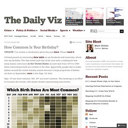
Comandante Tom Trending. OECD – Your Better Life Index. Daily chart: America’s presidential race. Threadwatch. RSA Animate - The Power of Networks. Help Remedies - What's wrong U.S.? How Common Is Your Birthday? UPDATE: I’ve written a clarification about this post here.

Please read it. A friend posted an interesting data table on my Facebook wall yesterday, which was my birthday. The data listed each day of the year with a ranking for how many babies were born in the United States on each date from 1973 to 1999. Some interesting trends are evident in the data. Apparently, people like to make babies around the winter holiday season because a large proportion of babies are born in September (ours is due Sept. 24, btw). Sept. 16 was most common. Data source: NYTimes.com, Amitabh Chandra, Harvard University. The Historical Evolution of Europe's Borders. I+D Comunicación & Network Thinking. Easel.ly. Stats.minecraft. Datavisualization.ch Selected Tools.