
West Web Valley sur Twitter : "En synthèse et en image,ça donne ça dans @LeTelegramme #WestWebFestival #web #numerique #startup #battle. Sur le Web, l'article journalistique a-t-il encore un sens ? Cet article, dont vous commencez la lecture, fait-il partie d’un genre en déclin, une forme bientôt « optionnelle » du journalisme, un « produit dérivé » ou un luxe dans la manière dont les médias nous informent ?
Tel est l’avis du professeur de journalisme et blogueur Jeff Jarvis. Une position qui suscite un débat soutenu parmi les passionnés de l’information en ligne aux Etats-Unis. Selon Jarvis, les articles ne sont plus une forme nécessaire pour la couverture des événements. Ils le sont encore pour les journaux imprimés, mais pas pour « le flux qui ne commence jamais et ne se termine jamais du numérique ». Jeff Jarvis appuie sa démonstration sur plusieurs exemples : Que devient l’article dans ce contexte ?
Parmi les réactions suscitées, celle de Ben Ilfeld, fondateur du site Sacramento Press va encore plus loin : « L’article n’est pas l’unité de base de la narration, du reportage, de la vente ou de toute autre chose. Le groupe Le Monde renouvelle son abonnement à l'AFP. HTML5 Frameworks and Useful Apps for Mobile Web Development. During the past two years the acceleration of touch screen devices such as iOS or Android based platforms has compelled developers and web designers to rethink the structure of their own webapps for the new “touch experience” introduced by the iPhone in 2007.
Mobile web apps offer abundant advantages over native apps; and although they may encounter some design, development and deployment challenges, they are a powerful cross platform, scalable and an affordable solution. Mobile apps are all the rage, and there are a myriad of start-ups aimed towards the iPad, and countless entrepreneurs are busy hacking together the next killer iPhone app. Basically, every big company has released an app of some type. With the ever increasing introduction of Android phones, developers are competing to port their software and it seems that the innovative possibilities behind them are endless and only limited to the imagination. Lungo.jS : HTML5 Mobile Framework 2. 3. 4. 5. 6. 7. 8. 10 Best Online HTML5 Tools For Designers. HTML5 is a new language for structuring and presenting content on the web.
It boasts many great features that make incorporating video, audio, fonts, drag & drop, web graphics & animations into your web pages very easy. HTML5 is backwards compatible so don’t worry about your old designs in HTML 4 or XHML1 they will look just the same as they used to! HTML5 is all over the web already and experts are enhancing it everyday to provide Web Designers & Developers with amazing new features. So here are 10 Awesome Online HTML5 Tools For Web Designers that can prove to be really helpful for all the web designers. Check them out. Online 3D Sketch Tool Advertisement You must have guessed what this tool does. Online Sprite Box Tool. 7 Best Practices for Improving Your Website's Usability. The Web Design Usability Series is supported by join.me, an easy way to instantly share your screen with anyone. join.me lets you collaborate on-the-fly, put your heads together super-fast and even just show off.
Writing content for web users has its challenges. Chief among them is the ease with which your content is read and understood by your visitors (i.e. its readability). When your content is highly readable, your audience is able to quickly digest the information you share with them — a worthy goal to have for your website, whether you run a blog, an e-store or your company's domain. Below are a handful of dead-simple tips and techniques for enhancing the usability and readability of your website's content. These tips are based on research findings and suggestions by well-regarded usability experts such as Jakob Nielsen. 50 Fresh Free HTML5 and CSS3 Website Templates. Case Study: Huffington Post. 10 Creative Adobe Illustrator Tutorials. This post put together some handy creative Adobe Illustrator Tutorials, mostly about retro poster style.
Check out new tricks that you can learn and apply it to your own designs. These tutorials are the best from great sites such us Digital Arts online, Veerle's blog, Vectortuts+, Vectips, Pixel 77, Computer Arts magazine and GoMediaZine. 5 Beautiful Landing Pages That Prove Great Design Still Sells. Have you ever pulled up a landing page that made you want to gag?

Probably more than once, right? When it comes to designing landing pages, most people seem to believe ugly converts better. If it doesn’t have a gigantic red headline, lots of yellow highlights, and a blinking “BUY NOW!” Button, then it can’t possibly be converting anyone, right? Actually, no. Find a Job in Social Media, Communications or Design. If you're seeking a job in social media, we'd like to help out.
For starters, Mashable's Job Lists gather all our resource lists, how-tos and expert guides to help you get hired. In particular, you might want to see our articles, How to Leverage Social Media for Career Success and How to Find a Job on Twitter. But we'd like to help in a more direct way, too. Mashable's job boards are a place for socially savvy companies to find people like you. Designing With Tablets in Mind: Six Tips to Remember. 27 Examples of Color Usage in Web Design. Here on WDL, we’ve discussed how colors can be used to invoke various emotions.
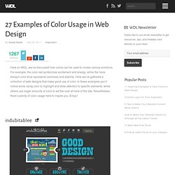
For example, the color red symbolizes excitement and energy, while the more tranquil color blue represents calmness and stability. Here we’ve gathered a collection of web designs that make good use of color. In these examples you’ll notice some using color to highlight and draw attention to specific elements, while others use larger amounts of color to set the over all tone of the site. Nevertheless, there’s plenty of color usage here to inspire you. Consulting stratégies innovantes - Conseil en stratégie / stratégie océan bleu / Blue Ocean Strategy. Design Inspiration: 7 Galleries of Excellent Ecommerce Sites. This post originally appeared on the American Express OPEN Forum, where Mashable regularly contributes articles about leveraging social media and technology in small business.
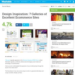
Have you ever contemplated the expansion of your small business through the launch of an online store? The first phases of any new venture, big or small, is to generate initial ideas and scope out what's already out there. 20 webdesign efficaces pour présenter une application mobile - webdesign-inspiration. Webdesign : ce que les couleurs et les polices disent sur vous.
21 Fresh Examples of CSS Web Design from 2011. Advertisement Creativity has no boundaries.
Designers are looking attractive and decent ideas for their clients. As a designer 2010 and 2011 has been rich on creative, beautiful and unusual design concepts. Photoshop : 6 tutoriaux pour réaliser le design de votre blog ou de votre site. 25 raisons pour lesquelles on va quitter votre site en 10 secondes. Une feuille de styles de base pour le Web mobile - Journal du Net Développeurs. L’outil pour définir ses personas E-commerce. Anatomie d’un courriel Apple.
Design Tutorials and Templates. Images gratuites. LogoTemplater.com - We create free blank logos templates designs.