
Closing the Gender Gap. Add this infographic to your site.
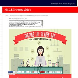
<a href=" src=" width='500'></a><br/><a href=' Online</a> Closing the Gender Gap: The Rise of Women in STEM In the last century, women have aggressively pursued education and careers outside the home. Though women have come a long way in their post-secondary education and career fields, there are still gender gaps in many areas in the workforce. One of the most significant gender gaps is in the STEM area; science, technology, engineering, and math. There are needs and opportunities for women in the STEM fields, especially civil engineering. The number of women who are earning or have earned a doctorate’s degree in the science and engineering fields has increased, men are still earning more doctorates than women are. As there are in many fields across the board, women continue to be underpaid when compared to men of similar education, experience and positions.
Between 2010 and 2014 there was a 7% increase in the average growth of engineering jobs. Telling a Story with Data. Cross posted to Langwitches Blog by Silvia Rosenthal Tolisano 6th graders, under the facilitation of their Math teacher, Laurel Janewicz, have learned to take data, analyze the data and tell a story with it.
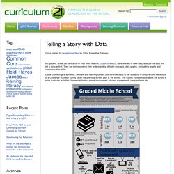
They are demonstrating their understanding of Math concepts, data graphs, misleading graphs and communication skills. Laurel chose to give authentic, relevant and meaningful data (not invented data) to her students to analyze from the results of a Challenge Success survey taken the previous school year at the school. The survey compiled data about the school’s extra curricular activities, homework habits, parent involvement, student engagement, sleep patterns etc. Laurel’s plan was to have students analyze the data and then create different types of graphs to be able to communicate their findings in a presentation. Laurel also made connections to standards clear: Laurel, in her own words, lists some of the observations and comparison from teaching the same unit in previous years.
Blooms pyramid teaching-with-technology. If the World Were 100 People [Infographic] London-based designer Jack Hagley has created an infographic based on the simple premise of: what the world would like if it were represented by 100 people.
![If the World Were 100 People [Infographic]](http://cdn.pearltrees.com/s/pic/th/infographic-twistedsifter-99496786)
The statistics cover a broad range, including: gender, age, race and religion. You can find the original source of the data used here. Hagley specializes in infographics. To see more be sure to check out his website for more interestingness. Prints of the above infographic are also available here. [via Washington Post] What The Internet Thinks About - Interactive Infographic. What if you saw the Internet’s most-read stories all at once?
You would see a picture of what the Internet thinks about – this (click on each story). How do we know all this? The data comes from the largest index of links on the Internet (after Google) by Ahrefs. What Does the Internet Say About Us? If the Internet is the largest collection of information, it likely reflects what matters to us, humans, the most. Articles that are not as personal, are either useful, like the article that advises on how to extend your Android phone’s battery life, or entertaining, like the article that shows how we sound when we use #hashtags.
If we were to condense all these articles into a recipe for a great article, it would be personal, useful, and entertaining. How Did We Get The Data For each top English-language media website in the world, we found the most shared articles using Ahrefs Content Explorer (You can explore these yourself by clicking on the names of publications under the bubbles. Credits. 14 Bloom's Taxonomy Posters For Teachers.
Bloom’s Taxonomy is a useful tool for assessment design, but using it only for that function is like using a race car to go to the grocery–a huge waste of potential.
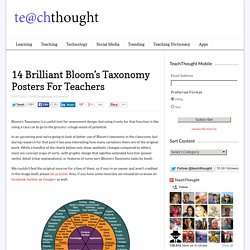
In an upcoming post we’re going to look at better use of Bloom’s taxonomy in the classroom, but during research for that post it became interesting how many variations there are of the original work. While a handful of the charts below only show aesthetic changes compared to others, most are concept maps of sorts–with graphic design that signifies extended function (power verbs), detail (clear explanations), or features of some sort (Bloom’s Taxonomy tasks by level).