
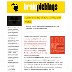
Timeline of History. Graph Commons - Home. 100 Diagrams That Changed the World. Since the dawn of recorded history, we’ve been using visual depictions to map the Earth, order the heavens, make sense of time, dissect the human body, organize the natural world, perform music, and even concretize abstract concepts like consciousness and love. 100 Diagrams That Changed the World (public library) by investigative journalist and documentarian Scott Christianson chronicles the history of our evolving understanding of the world through humanity’s most groundbreaking sketches, illustrations, and drawings, ranging from cave paintings to The Rosetta Stone to Moses Harris’s color wheel to Tim Berners-Lee’s flowchart for a “mesh” information management system, the original blueprint for the world wide web.
It appears that no great diagram is solely authored by its creator. Most of those described here were the culmination of centuries of accumulated knowledge. Most arose from collaboration (and oftentimes in competition) with others. Christianson offers a definition: Une visualisation des lieux de la vie intellectuelle depuis 2.000 ans. Vendredi 1er août paraît dans la revue Science une fascinante étude sur l’histoire intellectuelle de Amérique du Nord et de Europe depuis 2000.

L’équipe du Center for Complex Network Research de l’université Northeastern a comparé les lieux de naissance et de décès de plus de 150.000 intellectuels et artistes, obtenus grâce à plusieurs bases de données. L’évolution entre les lieux où naissent les individus et ceux où ils meurent (ce qui implique qu’ils y ont passé une partie de leur vie adulte et de leur carrière) permet de situer des «hubs» majeurs de la vie culturelle à travers l’histoire. Billion Dollar-o-Gram 2013. An update of one of our first data-visualizations: the Billion Dollar-o-gram.

(See if you can find the little easter-egg in the data-viz) This is Visual Journalism [45. Welcome to the first part of our picks of impressive print infographics featured here on Visual Loop, during 2013.

As we explained here and here,these compilations are not an award, or anything like that. Instead, just a personal selection, picked among the hundreds we brought to you on a regular basis. We started this weekly round-up of visual journalism back in February 2013, and it is by far the most challenging one of all of our compilations. Why? Well, simply because, despite all the ‘crisis’ in the print media industry, infographics in newspapers and magazines are far more popular than interactive ones.
Also, it’s important to notice that only a very small fraction of the infographics published in major news outlets gets to our hands, either by submissions from the infographic designers themselves, or by getting published in the Internet by the newspapers and magazines, usually on their online galleries. Sorting algorithms visualization. Visual News - The Cure For Eyeball Boredom. Design vs. Emergence, Visualization of Knowledge Orders - Detail - Places and Spaces. Best of the visualisation web… July 2012 (part 2)
Outils de visualisation. Jean-louis zimmermann / Stock Photos Nos stratégies d'apprentissage s'élaborent en interaction permanente avec notre environnement.
HINT.FM / Fernanda Viegas & Martin Wattenberg. The time project. Sweet Home 3D. ReacTj ReacTable Trance live performance @ submixpro studio Torino 02. Visualisation/illustration scientifique.
Réalité augmentée. Dataviz. Carto / maps / plans. Visual Gadgets. Mind mapping. 3-Visualizations & mapping. Ideas, issues, knowledge, data - visualized! Journalisme graphique. VizWorld.com - Visualization, Computer Graphics, and Animation. SocialFlow Company Blog. Twitarium. Company Blog - Breaking Bin Laden: visualizing the power of a single tweet. A full hour before the formal announcement of Bin-Laden’s death, Keith Urbahn posted his speculation on the emergency presidential address.

Little did he know that this Tweet would trigger an avalanche of reactions, Retweets and conversations that would beat mainstream media as well as the White House announcement. Keith Urbahn wasn’t the first to speculate Bin Laden’s death, but he was the one who gained the most trust from the network. Why did this happen? Before May 1st, not even the smartest of machine learning algorithms could have predicted Keith Urbahn’s online relevancy score, or his potential to spark an incredibly viral information flow.
While politicos “in the know” certainly knew him or of him, his previous interactions and size and nature of his social graph did little to reflect his potential to generate thousands of people’s willingness to trust within a matter of minutes. At SocialFlow we’ve analyzed the effects of timing and topicality within social streams. Gilad & Devin. VisualizingEconomics — Making the Invisible Hand, Visible. Le Tumblr d'Owni. Visual.ly - Create, Share, Explore Great Visualizations.
20 Great Visualizations of 2011. As the popularity of visualizations grows, so does their range and quality.
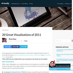
Here’s a list of 20 of the best Static Visualizations, Interactive Visualizations, and Information Videos from 2011. (Note: while they are numbered for your convenience, the entries are not ranked.) Static Visualizations Often, static infographics are created without much thought, just as fodder to get clicks on the web. These eight, however, are well-considered visualizations that do a fantastic job of conveying information.1. 2. 3. 4. 5. 6. 7. 8. Interactive Visualizations Interactives are in a different league from static infographics. 9. Visually. A Periodic Table of Visualization Methods. Visualizing.org. Chris Harrison's Visualization Projects.