
W.E.B. Du Bois’s Little-Known, Arresting Modernist Data Visualizations of Black Life for the World’s Fair of 1900. On a recent research visit to the Emily Dickinson museum and archives in Amherst, I chanced upon a most improbable discovery of forgotten, pioneering work by another titan of culture. When thirty-one-year-old W.E.B. Du Bois (February 23, 1868–August 27, 1963) heard that the World’s Fair to be held in Paris in 1900 would include a special exhibition on the subject of sociology, he saw in it an opportunity to open the world’s eyes to what had been occupying him for nearly a decade — “the American Negro problem.”
In The Autobiography of W.E.B. How to make infographics: a beginner’s guide to data visualisation. As a growing number of international NGOs are using infographics, charts and interactive maps to share success and highlight disaster, how can organisations with less resources create high quality visualisations without having to pay to outsource them?
We’ve put together a beginner’s guide for visualising development data. Organising your data The first thing you need to do is have a clear idea of the data you want to visualise. Are you trying to highlight a particular disparity between money spent in one place and another? LeTemps.ch. Immersion: a people-centric view of your email life. A visual and interactive experiment on the Parisian underground network. Open Data. Accueil - data.gouv.fr. 24 heures de trafic aérien au-dessus de l'Europe...en 2 minutes. 14 World-Changing Data Visualizations, From the Last 4 Centuries - Wired Science. This illustration from 1863 shows how storms and cyclones form where warm tropic air meets cold polar air.

It was made by Robert FitzRoy, the grandfather of the modern weather service and captain of the HMS Beagle during Darwin's famous travels. British Library This visualization, specially commissioned this year for the exhibit, illustrates the genetic similarities between humans and five other animals (chimpanzee and dog are shown here). See the full diagram. Data Addict. Votre quartier mis à nu grâce à «l'open data» Le site «We are data» cartographie des données ouvertes de Paris en temps réel (données des réseaux sociaux, des caméras de surveillance).

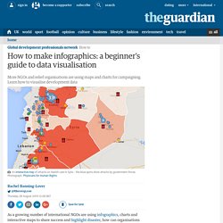
Lundi 14 janvier, on célébrait l'ouverture du laboratoire communication et politique dans les locaux de l'Institut Pratique de Journalisme (IPJ). À cette occasion, Marie Coussin et Alexandre Léchenet, journalistes spécialisés dans les techniques multimédias, ont donné une conférence. Visualisation des tweets #amcsti2012. Virtual Water - Discover how much WATER we EAT everyday.
The good news is that each one of us can also make the world a little more water secure, ready to face the needs of our peak population future.
How? The answer lies in our shopping baskets. The amount of meat in our diet is crucial! The average daily water consumption of a meat-eating person is 5000 litres of water per day. The average for a vegetarian is 2500 litres. Population Pyramids of the Whole World from 1950 to 2100 — PopulationPyramid.net.
2013 Longlist. Wow.

Another bumper crop of entries into our dataviz awards. Big thanks and respect to everyone who entered. The quality and variety of work has been jaw-dropping. We’ve spent weeks pouring over the hundreds of entries from around the world. Information Is Beautiful. Million Lines of Code. Live data visualization sites are awesome! : visualization. Internet-usage-of-the-world-based-on-time-of-day_2.gif (GIF Image, 800 × 449 pixels) DataParis - Des données sur Paris et les Parisiens localisées par le biais du réseau métropolitain. A New Video Shows the Anthropocene Unfolding Over History. Today about 360,000 new people, give or take a few thousand, will enter the world.

Significantly fewer than that will shuffle off it, which is why we’re adding about 200,000 people a day. Global population has already passed 7 billion, and we’re well on our way to 9 billion or more by the middle of the century. Tennis: data-visualisez un match. World of 100 – Le monde est un village de 100 personnes. SIMILE Widgets. Concours de dataviz Google : élection 2012. Jo Wood, Information Science - Home Page. Experiments in Bicycle Flow Animation. Oceaniaeuropeamericasafricaasia. Visualising Data.
Best of the visualisation web… April 2012 (part 1) Visualisez la puissance des bombes nucléaires… Aaah, le nucléaire…

IMPURE. 10 Things You Can Learn From the New York Times’ Data Visualizations. The Malofiej 20 awards, known as the Pulitzers of the infographics world, recognize the finest infographics published across the globe.
This year, more than 1,500 print and online submissions competed for the prestigious awards. HINT.FM / Fernanda Viegas & Martin Wattenberg. Martin Wattenberg (wattenberg) sur Twitter. Fernanda Viegas (viegasf) sur Twitter. TimeFlow Analytical TimelineVisual timelines for investigation · FlowingMedia/TimeFlow Wiki.
Many Eyes. The color of data — Visual Hint. The Art Of Reproduction by fernanda and martin The web can seem like the perfect museum, holding all the world’s art.

Martin Wattenberg: Data Visualization: Art, Media, Science. Wind Map. An invisible, ancient source of energy surrounds us—energy that powered the first explorations of the world, and that may be a key to the future.

This map shows you the delicate tracery of wind flowing over the US. The wind map is a personal art project, not associated with any company. We've done our best to make this as accurate as possible, but can't make any guarantees about the correctness of the data or our software. Please do not use the map or its data to fly a plane, sail a boat, or fight wildfires :-) If the map is missing or seems slow, we recommend the latest Chrome browser. Surface wind data comes from the National Digital Forecast Database. If you're looking for a weather map, or just want more detail on the weather today, see these more traditional maps of temperature and wind. DATAVISION - David MCCANDLESS. How to Use Maps in Data Visualization. Maps are probably the biggest subsection of visualization types. There are many variations on map types, each with its own strengths. These variations can be combined with each other, and many can be tweaked even further to produce new types of maps.
Here’s an overview of some of the common types and what they are good for.Choropleth maps are one of the most frequently used maps in infographic style visualizations. As the name suggests, color is the important part to these maps. A color scale is assigned to categorical or numerical data, and the value for each region is used to color the region. (source) Cartograms alleviate the area issues involved with choropleth maps, but they have their own problems. (source) Proportional Symbol maps are another method used to alleviate the region area issues in choropleth maps. The Sexperience 1000 - Sexperience. Welcome to The Sexperience 1000, an interactive journey through the sexual experiences and preferences of one thousand British individuals. What’s the favourite sexual position of iPhone users in the North? Do country music lovers over 55 prefer to do it in the dark? Explore the 20 questions of our survey and discover what the great British public get up to between the sheets… Filter Filter by region, age, etc. and compare to yourself.
Track. Touch. We asked hundreds of people how much they like being caressed on various parts of their body, and how exciting it is to touch different places on their lovers. Their answers, a total of 33,871 ratings covering 707 points on male and female bodies, provide a collective portrait of desire. In Skin to Skin, compare men and women, touching and being touched. In Sorting out Desire, explore an atlas of excitement. Development Timelines: a data application. World Renewables in Primary Consumption. Gheat - heatmaps for Google Maps. Google Maps gives you API for adding additional map layers. This software implements a map tile server for a heatmap layer.
Gheat for ... Gheat for App Engine. Public Data Explorer. Banque mondiale, indicateurs de développement dans le monde - Google Public Data Explorer. Airspace: Europe. Ten Years Later. The Fortune 500. Fathom. The Open Data Movement. Visualizing Data. Data visualization. Data Visualization. Datablog.owni.fr. Les data en forme. Chaque semaine, les data-journalistes d'OWNI dressent un panorama du meilleur de la donnée sur le web : des cartes, des jolies couleurs, un florilège de signifiants dans ce monde brutal de bits.
Tu n’es pas sans savoir, lecteur, que cette succession infinie de bits qu’on appelle un peu partout la “data” – qui vient du latin, pas de l’anglais, ne sois pas bougon – est une passion sans égale chez OWNI. Du coup, étant donné qu’il est assez vraisemblable que c’en soit une pour toi aussi, même naissante, nous nous permettons de te communiquer quelques éléments de veille sur le sujet ; à défaut de pouvoir être traitée de manière exhaustive sur le rythme hebdomadaire auquel nous voudrions t’habituer, cette veille suscitera chez toi, lecteur, tout l’émoi qu’elle mérite. Du moins l’espérons-nous. L’avenir est dans les cartes. Les data en forme. Les data en forme. Les data en forme. La veille des journalistes de données d'OWNI vous fait cette semaine jouer au Rubik's Cube, classer les gouvernements ou encore faire le marathon de New York. Comble du luxe, vous pourrez même comparer la Bible et le Coran... Qu’il ait été pour vous un cauchemar ou une fascination, vous avez forcément été confronté à un moment de votre vie à ce casse-tête addictif : le Rubik’s Cube.
Les Data en forme. La corruption dans le monde, la suprématie des fourmis et un peu de Chopin pour apaiser la terre. The Week In Data. We’ve all been amazed, at one time or another, by pictures of Earth as seen from space. Particularly amazing are those images that allow us make out the contours of our continents by the lights of our megacities at night. Born of human beings’ domination and influence over their environment, this glittering vision of the world is part of the anthropocene. It inspired the Canadian anthropologist Felix Pharand-Deschenes of the Globaia.org site to create some magnificent visualizations of Earth using public data: cities, roads, railways, airlines, power lines, Internet cables… Moved by our moving. Les data en forme. Premier épisode 2012 de la veille hebdomadaire des journalistes de données d'OWNI. The secrets to successful data visualization. Effective data visualization is about more than designing an eye-catching graphic.
It's about telling a clear and accurate story that draws readers in via powerful choices of shapes and colors. These are some of the observations you'll find in the insightful new book Visualize This: The Flowing Data Guide to Design, Visualization, and Statistics (Wiley) by Nathan Yau, the blogger behind the popular site Flowing Data. On his blog, Yau analyzes a wide variety of graphs and charts from around the world--and often sparks online discussions and debates among designers. For a brief introduction to his book's key points, check out this video from Yau's publisher, below. Data Visualization, Infographics, and Statistics. If the world lived in a single city. The Best Data Visualization Projects of 2011.
Money Chart. A visualization of US debt (credit card bill) stacked in 100 dollar bills. World Clock. You are the Nth person on Earth.