
Lessons in Conveying Complex Ideas with Simple Graphics from the World's Best Information Designers. By Maria Popova What Frank Zappa’s life has to do with e-waste, whale songs, and the black market for body parts.
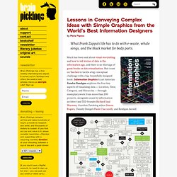
Much has been said about visual storytelling and how to tell stories of data in the information age, and there is no shortage of great books on data visualization. But count on Taschen to tackle a big conceptual challenge with a big, beautifully designed book: Information Graphics by art historian Sandra Rendgen explores the four key aspects of visualizing data — Location, Time, Category, and Hierarchy — through exemplary work from more than 200 projects, alongside essays by information architect and TED founder Richard Saul Wurman, Guardian Datablog editor Simon Rogers, Density Design’s Paolo Ciuccarelli, and Rendgen herself. 'Geek Love,' The New York Times, newspaper article, 2008 Exposed to Dungeons & Dragons Early in Life. 'Medallandssandur,' a blend of the sound specters form sonar and whale song.
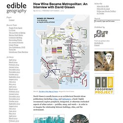
Design: Torgeir Husevaag. 'The Very Many Varieties of Beer,' poster, 2010. ABS Spotlight : Spotlight. How Wine Became Metropolitan: An Interview with David Gissen. IMAGE: The Metro Wine Map of France, designed by David Gissen.
David Gissen is usually known as an architectural theorist whose publications (including a blog, and Subnature, a book I highly recommend) explore peripheral, denigrated, or otherwise overlooked aspects of urban nature — puddles, smog, and weeds — in order to re-imagine the relationship between buildings, cities, and the environment. IMAGE: “Reconstruction of Midtown Manhattan c.1975,” and “Urban Ice Core/Indoor Air Archive,” two speculative proposals by David Gissen that reconstruct New York City as the world centre for intense indoor air-production and consider how that atmosphere might be archived. In Gissen’s own projects, he proposes a new kind of architectural preservation and reconstruction that engages with the intangibles of the urban environment. IMAGE: From “Museums of the City” by David Gissen, project rendered by Victor Hadjikyriacou. IMAGE: The 2009 Morgon by Marcel Lapierre, photo via.
Gissen: Exactly. Did You Know? "We are living in exponential times" (A Must Watch, Really) 60 Creative Examples Of Infographics. <A HREF=" Widgets</A> Collected by noupe Today we have an exciting and enticing post which covers handy and innovative infographics.
Infographics is basically derived from two words: ‘information’ and ‘graphics’, and it stands for the graphical representation of data and information. have been often used in modern maps to incorporate variety of information, for instance for network designs, destination points, and local landmarks. Let’s take a look at some creative examples of beautiful infographics. Stunningly Creative Infographics The Most Dangerous Cities for Walking What People are Doing Online Glass Half Empty: The Coming Water Wars Which Countries Have the Most Vacation? Bank Infographic Where Will the Next Volcano Erupt? On Driving: Automobile History The Current State of Twitter Software Wars Who Has Given the Most to Haiti The Social Media Effect An Infographic Guide to Buying Your Own Island SSSMOKIN! The Most Prescribed Psychiatric Drugs The Rise of Walking and Biking Resume Infographic. DJDESIGNERLAB - Find All Your Design Inspirations From This Laboratory.
Information graphics or infographics are graphic visual representations of information, data or knowledge.

These graphics present complex information quickly and clearly, such as in signs, maps, journalism, technical writing, and education. With an information graphic, computer scientists, mathematicians, and statisticians develop and communicate concepts using a single symbol to process information. Today information graphics surround us in the media, in published works both pedestrian and scientific, in road signs and manuals.
They illustrate information that would be unwieldy in text form, and act as a visual shorthand for everyday concepts such as “stop” and “go”. Bus Ride 37 Mintutes An Information graphic of a 37minutes bus ride in singapore. Seeking Refuge Infographic Bicicelitte Digital Nostalgia Exploding Internet Italians social condition – Poverty – Adaptation – Inadaptado. 94 Incredible Infographics - From Alien Investigations to Social Media Beefs. 5 years of infosthetics. The 22 Best Infographics We Found In 2011. 2011 was a huge year for infographic design. Large companies embraced data renderings as a business strategy like never before, whether it was to promote their brand (GE) or bolster their bottom line (the New York Times).
Nowhere was that more evident than at Facebook. Timeline, the site’s most ambitious redesign to date, brought the central tenet of data viz--organizing unwieldy bits and bobs into a compelling, visual narrative--to millions of people around the world. As infographics go mainstream, infographic designers grow bolder. Some of the most tantalizing projects we came across this past year stretched our understanding of what a data visualization can be: It can be a set of interactive commuter-train maps plotted not according to distance but time. We can’t wait to see where the discipline goes next.