
Webpages as graphs - an HTML DOM Visualizer Applet. Infographic: The History Of Web Browsers. Graph Visualization for the Web. Visualizing Economics. Visualized: Over 4 Million Micro-Loans Fly Around the Globe. Kiva is a company that facilitates micro-loans between people from all over the world; incidentally, nothing to do with the Finnish KiVA.

With the help of this non-profit, anyone can donate as little as $25 or as much as the sum of any single loan — you can read the stories of many different people seeking financial support across the globe; there are students, farmers, entrepreneurs and those looking to improve their physical living conditions. The Challenge: Visualize Your Taxes. Visualize Your Taxes: The Finalists. Impure Blog. Access Info Europe. What is Your Water Footprint? World carbon dioxide emissions data by country: China speeds ahead of the rest. World carbon dioxide emissions by country: click image for graphic and download World carbon dioxide emissions are one way of measuring a country's economic growth too.
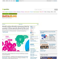
And the latest figures - published by the respected Energy Information Administration - show CO2 emissions from energy consumption - the vast majority of Carbon Dioxide produced. A reduction in global greenhouse gas emissions is not only the goal of environmentalists but also of pretty much every government in the world. Currently 192 countries have adopted the Kyoto protocol. One fo the aims is to reduce greenhouse gas emissions by 55% of the 1990 levels by 2012 collectively forcountries starred on this list.
World Bank Dataviz. Infographic: What Your State Is Best (and Worst) at Environmentally -... Strangely "Digital" Agricultural Landscapes Seen From Space #Inspiration. On daily basis we come across images that are built using various code techniques, whether this be pixelation, glitch, particle fields, swarms, reaction diffusion, looking that these images on Wired Science, it’s amazing to see the similarities between the works we create and the environment we inhabit.
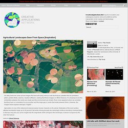
Even more apparent when we consider that they bare no correlation to one another and the large gap in scale that exists between them. Likewise, the images below appear strangely “Digital”… Agriculture is one of the oldest and most pervasive human impacts on the planet. Estimates of the land surface affected worldwide range up to 50 percent. But while driving through the seemingly endless monotony of wheat fields in Kansas may give you some insight into the magnitude of the change to the landscape, it doesn’t compare to the view from above. more on Wired Science. Think Quarterly. Immaterials: Light painting WiFi. The city is filled with an invisible landscape of networks that is becoming an interwoven part of daily life.
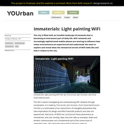
WiFi networks and increasingly sophisticated mobile phones are starting to influence how urban environments are experienced and understood. We want to explore and reveal what the immaterial terrain of WiFi looks like and how it relates to the city. Immaterials: light painting WiFi film by Timo Arnall, Jørn Knutsen and Einar Sneve Martinussen. This film is about investigating and contextualising WiFi networks through visualisation. It is made by Timo Arnall, Jørn Knutsen, Einar Sneve Martinussen. Investigating WiFi. VisualMiscellaneumTypesofInformationL.gif (Image GIF, 762x1000 pixels) Make People Fall in Love with Your Data: A Practical Tutorial for Data Visualization and UI Design: Strata 2011 - O'Reilly Conferences, February 01 - 03, 2011. Part 1 – Visualization Principles and Best Practices Overview People think visually.
However, most of the tools that today’s information workers use actually confuse our natural visual interpretation skills. In the first part of our tutorial, we will share practical guidance that makes data presentation more effective, engaging, and valuable. Some of the topics we’ll be discussing include information layout and workflow, information visualization, chart selection, and styling. What is Data Visualization? Information aesthetics - Information Visualization & Visual Communication. Infographics & Visualizations. Create, Share, Explore. Data visualization. S Best Photos by BigSee. Chris Harrison. Vincent van Gogh paintings as pie charts.
The Work of Jonathan Harris. Interaction Design for Data Visualizations. Interactive data visualizations are an exciting way to engage and inform large audiences.
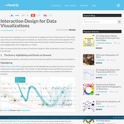
They enable users to focus on interesting parts and details, to customize the content and even the graphical form, and to explore large amounts of data. List of data journalism tools. Graph Visualization for the Web. Gapminder: Unveiling the beauty of statistics for a fact based world view. Portal:Cytoscape - OpenTutorials. How to become a data visualization ninja with 3 free tools for non-programmers. Interactive maps and visualizations. Free Data Visualization Software. How to become a data visualization ninja with 3 free tools for non-programmers.
Interactive information visualization toolkit. Aaron Koblin: Artfully visualizing our humanity. David McCandless: The beauty of data visualization. Demo: Stunning data visualization in the AlloSphere. OpenTutorials. The Best Tools for Visualization. Better World Flux - where progress flows.
Introduction to Circos, Features and Uses // CIRCOS Circular Genome Data Visualization. Gource visualisation tool. Gource is a software version control visualization tool.
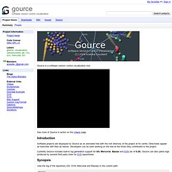
See more of Gource in action on the Videos page. Introduction Software projects are displayed by Gource as an animated tree with the root directory of the project at its centre. Directories appear as branches with files as leaves. Developers can be seen working on the tree at the times they contributed to the project. GGobi data visualization system. 75+ Tools for Visualizing your Data, CSS, Flash, jQuery, PHP. Most people would agree that the old adage “A picture is worth a thousand words” is also true for web based solutions.
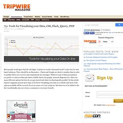
There should be no discussion – Charts and Graphs are ideal to visualize data in order to quickly deliver an overview and communicate key messages. Partiview. Documentation | Uses | Binaries | Source Code | GeoWalls & Domes | Publications | Licensing | Mailing List | Misc. | Links Partiview is free, open-source software from the National Center for Supercomputing Applications (NCSA) at the University of Illinois Urbana-Champaign.
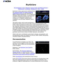
It is an industrial strength, interactive, mono- or stereoscopic viewer for 4-dimensional datasets. It is written in C++/OpenGL and has been compiled to run on Linux, Windows, OS X, and Irix. The prime author and current maintainer is Stuart Levy (slevy {at} ncsa.uiuc.edu), research programmer at the NCSA. Other contributors to the source code include Steven Marx, from the American Museum of Natural History/Hayden Planetarium (AMNH), who added improvements to the user interface, developed the Mac OS X port, and worked on a fish-eye projection of Partiview.
Documentation. The Opte Project. Visual Understanding Environment. Physics Simulations and Artwork. Here is a 3D view of a hydrogren atom in the 4f state.
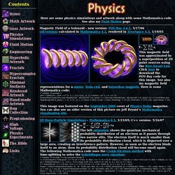
The left image was made in C++ using a technique described by Krzysztof Marczak to make it volumetric like a cloud of smoke. The right image was made in Mathematica by adding 2D cross-sectional layers. The animations were made in POV-Ray using DF3 density files. The right animation shows what a "12o" orbital might look like. POV-Ray has a built-in internal function for the 3d orbital: // runtime: 4 seconds camera{location 16*z look_at 0} #declare P=function{internal(53)}; #declare P0=P(0,3,0,0); box{-8,8 pigment{rgbt t} hollow interior{media{emission 0.5 density{function{(P(x,y,z,0)-1.2)/(P0-1.2)} color_map{[0 rgb 0][1 rgb 1]}}}}} Links Atomic Orbital - time-dependant hydrogen atom simulation, by ?
The Popular Science Archive Explorer. A visual exploration on mapping complex networks. Envisioning life. Data Visualization: Modern Approaches - Smashing Magazine. About The Author. Many Eyes. Data Visualization, Infographics, and Statistics. JESS3™ Datavisualization. Ideas, issues, knowledge, data - visualized! DataArt - Visualisations.
HINT.FM / Fernanda Viegas & Martin Wattenberg. Visualizing.org. Celebrating Excellence in Data Visualization and Information Design. Chart Porn. 50 Great Examples of Data Visualization. Wrapping your brain around data online can be challenging, especially when dealing with huge volumes of information.
And trying to find related content can also be difficult, depending on what data you’re looking for. But data visualizations can make all of that much easier, allowing you to see the concepts that you’re learning about in a more interesting, and often more useful manner. Below are 50 of the best data visualizations and tools for creating your own visualizations out there, covering everything from Digg activity to network connectivity to what’s currently happening on Twitter. Music, Movies and Other Media. Data Visualization. Graphical visualization of text similarities in essays in a book. Pulse of the Nation: U.S. Mood Throughout the Day inferred from Twitter. S Best Photos by BigSee.