
Object Constancy. The chart shows multiple slices of a dataset, transitioning smoothly when the age bracket changes.
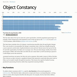
The x-axis rescales to accommodate the change in maximum value, while bars reshuffle along the y-axis to preserve sorted order. Graphical elements enter and exit: Hawaii enters the top ten for the 65 and older age brackets, but fades out in younger ones. The axis ticks change suitably, from whole percentages to fifths. X-Value Mouseover. DavaViz for Everyone: Responsive Maps With D3. I spent an hour this weekend updating this site to Bootstrap 3, making the site responsive (and mobile first!)
By default. That means the next step is to make visualizations that can handle a browser of any size, too. Let's make maps and charts that resize automatically and work everywhere. D3 actually makes this fairly easy. Svg - d3 - trigger mouseover event. Mouseenter. Mouseenter. Paths – SVG 1.1 (Second Edition) Contents.

Svg - Aligning text inside circular arc d3js. d3 Treemap with Title Headers. Svg - D3 JS upside down path text. d3 Examples. Creating Animations and Transitions With D3. For the ambitious, this is a great intro to creating your own animations and transitions in d3.js.
If you get in over your head, drop by the Visually Marketplace to hire one of our talented developers. In interactive visualisation, there is the word reactive. Well, maybe not literally, but close enough. Creating Animated Bubble Charts in D3 - Jim Vallandingham. Update: I moved the code to its own github repo - to make it easier to consume and maintain.
Update #2 I’ve rewritten this tutorial in straight JavaScript. So if you aren’t that in to CoffeeScript, check the new one out! Recently, the New York Times featured a bubble chart of the proposed budget for 2013 by Shan Carter . Building a Bubble Cloud - Jim Vallandingham. For the 2012 Republican and Democratic national conventions, Mike Bostock , Shan Carter , and Matthew Ericson have created a series of visualizations highlighting the words being used in the speeches of both gatherings.
The world’s top 50 billionaires: A demographic breakdown. Top 50 Billionaire Breakdown If you asked anyone to picture the wealthiest person in the world at any given time, you could bet on some common denominators: probably a man; probably somehow attached to the words “multinational” or “conglomerate”; probably on a yacht off a private island.

With Slate’s Top 50 Billionaire Breakdown, we attempt to visualize the richest of the rich by paring them into demographic categories: age, location, industry, source of wealth, education, and religious affiliation. Vis. Stephen Boak — Easy as (a) Pie. Through my work at Boundary I’ve started playing with the D3 visualization library, trying to build some interesting visualizations for our real-time network monitoring dashboard.
I’ve really been enjoying D3 and Mike Bostock, the creator, has been extremely helpful to me and lots of others in the d3-js Google Group. Since the library is new, I hope the series of experiments I post here can be helpful in spreading some knowledge and awareness of the library. DataMaps. Let’s Make a Map. In this tutorial, I’ll cover how to make a modest map from scratch using D3 and TopoJSON.
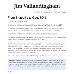
I’ll show you a few places where you can find free geographic data online, and how to convert it into a format that is both efficient and convenient for display. I won’t cover thematic mapping, but the map we’ll make includes labels for populated places and you can extend this technique to geographic visualizations such as graduated symbol maps and choropleths. Without further ado, here’s the map: Shown are the four constituent countries of the United Kingdom: Scotland, Northern Ireland, Wales and England. From Shapefile to GeoJSON - Jim Vallandingham. A method for editing, merging, simplifying, and converting Shapefiles to GeoJSON D3.js supports cartographic visualizations by being able to display lines, polygons, and other geometry objects .
It uses GeoJSON as the storage format for this type of visualization. Likewise, map tiling libraries like Leaflet can use GeoJSON to create map layers . Mapping with D3. Trying out D3's geographic features. Hover over a county: There's nothing special about this map. How to Make Choropleth Maps in D3. Even if you think you don’t know what a choropleth map is, chances are you’ve seen one. And come November 2012, you’ll see plenty: one iconic example of a choropleth map is a map of the United States, laid out in red and blue, showing the results of a presidential election. Choropleth maps can be simple, like in the example above, where the color of the state indicates whether the state goes in one direction (Democrat) or the other (Republican).
The states can also be colored on a scale to indicate data, with a color like blue representing a low number and red representing a high number, leaving a number in between to be purple. These simple visualizations make large amounts of data easy to understand at a glance, allowing insights that would take much longer if you’re looking at a table of numbers. But the process of making these maps is not easily apparent.
Simplifying and cleaning Shapefiles. How to Make an Interactive Network Visualization. Networks! They are all around us. The universe is filled with systems and structures that can be organized as networks. Over 1000 D3.js Examples and Demos. d3.legend example. d3.legend d3.legend is a quick hack to add a legend to a d3 chart. Simply add a g and .call(d3.legend). Lazy Scale Domain. d3.js [vanilla/mbostock]: axes examples - reduced. Axis Component. Ordinal Brushing. Automatic Text Sizing. Scatterplot: Social trust vs ease of doing business. Simple Scatter Chart Example. Index.html# scatterchart.js# Life Expectancy.
US energy use since independence. Simple D3JS Dashboard. Index.html# Parallel Sets. Titanic Survivors Explanation For each dimension (Survived, Sex, Age and Class), a horizontal bar is shown for each of its possible categories. Small Multiples with Details on Demand - Jim Vallandingham. Histogram. Pie Chart Update, I. Zoomable Icicle. Force Layout Multiples (Independent) Force-multi-foci with convex hulls. Multi-Foci Force Layout. Multi-Foci Force Layout. Home · mbostock/d3 Wiki. Xml - SQL Server SELECT to JSON function. D3 Workshop. Vis. Manipulating data like a boss with d3. Manipulating data like a boss with d3. How Selections Work. D3.js Tutorials, Screencasts and a Newsletter. Setup. Last updated 2014 February 22. Adding an SVG Element. Basic Example In the last example you added a p HTML element to the DOM.
Interactive Data Visualization for the Web. Copyright © 2013 Scott Murray Printed in the United States of America. O’Reilly books may be purchased for educational, business, or sales promotional use. On the tenth day of Xmas, get dirty with data using d3.js. Color scales. Thinking with Joins. D3.