
CSS Mask-Image & Text. I recently wrote about Controlling Web Typography and focused on CSS pseudo selectors & down-to-the-letter control.
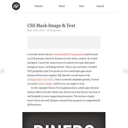
As a web designer, I want the same level of control over type that print designers have, including texture. There are currently 2 webkit CSS properties that I’ve grown to love and hope gain more traction & browser support. My favorite would have to be background-clip:text, but it currently degrades poorly. A close second is mask-image, which you can apply to text. In the example below I’ve implemented a subtle grey flecked texture effect over the white text.
Dinero Is not spanish for dinner Here’s the CSS code with all the structural bits trimmed out: In most cases, I prefer subtle amounts of texture / graphic applied to text. As you use and join the chorus to get CSS3 properties more widely accepted, don’t forget about background-clip:text and mask-image. Font sizing with rem. Determining a unit of measurement to size our text can be a topic of heated debate, even in this day and age.
Unfortunately, there are still various pros and cons that make the various techniques less desirable. It's just a matter of which less-desirable is most desirable. There are two main techniques that are extolled: Size with pxSize with em Let's review these two approaches before I reveal the magical third. Sizing with px In the early days of the web, we used pixels to size our text. I, personally, have been of the camp that px-based layouts provide the consistency I prefer and users have enough tools available to adjust their view that accessibility is less of a concern.
Sizing with em That whole inability to resize text in IE has been a continuing frustration. The technique modifies the base font-size on the body using a percentage. The problem with em-based font sizing is that the font size compounds. Sizing with rem But what pitiful browser support do we have to worry about? How to Create Inset Typography with CSS3. In this tutorial, we’ll create inset type, a popular text treatment, using CSS.
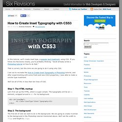
If you follow Six Revisions closely, you’re probably thinking: "Jacob already wrote a Photoshop tutorial on how to do that. " That is correct, but this time we are going to do it using only CSS. I set out to recreate the How to Create Inset Typography in Photoshop tutorial, and after experimenting with some fresh and new CSS3 properties, I was able to make a similar type treatment.
We’ll do all of this in less than ten lines of CSS. Step 1: The HTML markup Let’s first set up the HTML, which is super simple. <div id="insetBgd"><h1 class="insetType">Inset Typography</h1></div> Step 2: The background The first bit of CSS we want to do is the background. Next, we are going to use CSS3 gradients. We want the background to have a gradient going top to bottom, from #003471 to #448CCB.
The code to do this is: Step 3: Define the font stack and styles Next, we want to define our preferred font. Step 4: The inset styles.