
Visual Complexity. 9 Ways to Visualize Proportions – A Guide. With all the visualization options out there, it can be hard to figure out what graph or chart suits your data best.
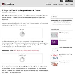
This is a guide to make your decision easier for one particular type of data: proportions. Maybe you want to show poll results or the types of crime over time, or maybe you're interested in a single percentage. Here's how you can show it. We all know about the pie chart. The circle represents the whole, and the size of wedge represents a percentage of that whole. V.Cerf veut standardiser la migration des données du web. 15 Awesome Free JavaScript Charts / JavaScripts / SPLASHnology - InShare11 Plotting your data can serve as a replacement to tabular data, and is also a great way to add practical graphics to your web page or application.
There are many ways you can plot data, but here I have included 15 Awesome Free JavaScript Charts In Your Sites/Blog Pages which serves as a easy Charting solution. Hope you like it. 11 Ways to Visualize Changes Over Time – A Guide. Deal with data?
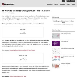
No doubt you've come across the time-based variety. The visualization you use to explore and display that data changes depending on what you're after and data types. Maybe you're looking for increases and decreases, or maybe seasonal patterns. This is a guide to help you figure out what type of visualization to use to see that stuff. Let's start with the basics: the line graph. Chart Wars: The Political Power of Data Visualization - informat. Dossiers - Lorsque la carte géographique rencontre la carte des. Une société de la requête (2/4) : Comprendre la nouvelle économi. Par Hubert Guillaud le 16/12/09 | 4 commentaires | 2,122 lectures | Impression Suite à la publication de l’article de Geert Lovink sur la société de la requête et la googlisation de nos vies, celui-ci a organisé mi-novembre 2009 une conférence sur ces sujets, visiblement très riche.
Le blog de comptes-rendus a servi de trame pour essayer d’en rendre un aperçu – notez que toutes les vidéos des présentations sont également accessibles en ligne. Nous sommes tous les ouvriers de Google ! La conférence a été introduite par l’économiste Yann Moulier-Boutang, qui avait coordonné cet été un passionnant numéro de Multitudes sur la question, une revue dont il est le directeur. Yann Moulier-Boutang est l’auteur du Capitalisme cognitif et prépare un livre sur les rapports entre la finance et le capitalisme intitulé L’abeille et l’économiste.
5 Best Data Visualization Projects of the Year – 2009. SIMILE Widgets. 28 Rich Data Visualization Tools - InsideRIA. Highcharts - Interactive JavaScript charts for your webpage. Flot - Project Hosting on Google Code. A PHP Charting library. Cartographer.js – thematic mapping for Google Maps. Best of FlowingData: November 2009. Interaction Design/User Experience » Blog Archive. I recently met Anu Määttä, a developer from Finland, who was able to connect me with Smári McCarthy(Iceland) and Petri Kola(Finland) who were able to report of projects, companies and intiatives from Iceland and Finland working with government data.
How to Open your Data. How to Open your Data. Open Data is Civic Capital: Best Practices for "Open Govern. By Joshua Tauberer ( who runs the congressional transparency website www.GovTrack.us.
Thanks to Gunnar Hellekson (RedHat, Inc.) for help with the initial version, and to all others who provided feedback. Originally published May 19, 2009. This is version 1.5 dated January 29, 2011. See the Document History at the end for a list of changes since the original. Government data, also called "public sector information" internationally, is a valuable resource to society when it is public and open. This is not a new idea, and already many government entities have begun to embrace these ideas. "The power of digital information to catalyze progress is limited only by the power of the human mind.
It is perhaps easier to imagine how government scientific data can improve lives than government records: government funded research in the life sciences helps us to cure disease, for instance. Comprehensive Knowledge Archive Network - Tags - eutransparency. Downloads. Gapminder Slides Download Gapminder’s slides, free to modify and use in any way you like!

Here are the slides used in our public presentations and TED talks. Gapminder Tools Offline Handouts & Lesson plans (PDF) Interactive presentations (Flash, PowerPoint etc.) Life expectancy is a very important measure when we compare the health of different countries. Use this animated presentation when you lecture about HIV. 15 Beautiful Examples Of Infographics For Your Inspiration Today I have compiled a showcase of 15 Beautiful Examples Of Infographics For Your Inspiration. Infographics are basically a graphical representation of data. In other words, a fun graph. Here are 15 of the best ones I could find. These are truly inspirational. gRaphaël—Charting JavaScript Library.
Visualizing Music. New Hans Rosling video, using GapMinder (Must see!) Chris Jordan's TEDTalk 2008 - Visualizing Our World [video] Linked, open, semantic? « paul walk's weblog. During an interesting session called the 'Great Global Graph' at the CETIS conference this week I formed the opinion that, in the recent rush of enthusiasm for 'linked data', three 'memes' were being conflated.
These next three bullets outline my understanding of how these terms have been used in recent discussions, including the CETIS session: Open data: I see this as something expressed as a philosophy or, in more concrete terms, as a policy, such as that espoused by the UK Government. There are aspects of public ownership in this, but also a philosophical approach based on 'openness' and a rejection of the economic idea of value in scarcity of information. I think that specific technology does not come into this really: for example one concrete realisation of this policy in the UK is the Freedom of Information Act under which it is perfectly permissible for a data owner to supply data in any reasonable format and medium.
Option 3 seems increasingly viable. Comments Thanks again. Yeah. Interesting, Easy, Beautiful, True? I’ve been doing a few interviews to promote my book, The Visual Miscellaneum, and a question keeps coming up.
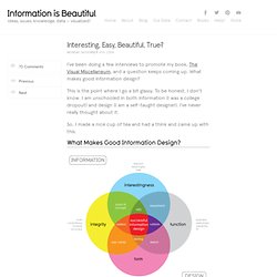
What makes good information design? This is the point where I go a bit glassy. To be honest, I don’t know. The Visual Miscellaneum. Would you consider pre-ordering my book?
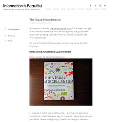
That way I can get it into more bookshops. And we can spread the good news about the amazing ALL-GRAPHIC FUTURE OF CIVILISATION THAT AWAITS US! It’s out in the US 10th November. And in the UK on the 4th February. JavaScript InfoVis Toolkit - Interactive Data Visualizations for.