
Image. Grilles. Showcase. Media_queries. Formulaires. Grilles. Jquery/js. Infos/articles. Responsive google maps. Remember the days we used to put a static image of a roadmap on a website, usually accompanied by silly directions in case you came from the North, South or Mars?
It was only some time later, when the web matured and google stopped being just a search engine, that a new corporate ‘how to get here / where are we located’ toy was born. Google invented google maps, pretty soon yahoo followed and Microsoft, well… they tend to do everything the rest does, it only takes them a little longer. Forget yahoo and bing!
Maps, only if your a fanboy you’ll use them and even then you’re not sure how long they will be around (- cf. yahoo & geocities). Google maps was and is the way to go. Anyway, let’s focus on what this is all about! Nowadays static maps (drawn by the guy who works at the ‘art department’) aren’t really used anymore. Fast forward to… now! When we’re developing websites we mostly use google maps somewhere. So what is the Maps scrollbar of death™ exactly? Simple solution Plugin solution.
Multi-Device Layout Patterns. Through fluid grids and media query adjustments, responsive design enables Web page layouts to adapt to a variety of screen sizes.
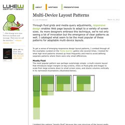
As more designers embrace this technique, we're not only seeing a lot of innovation but the emergence of clear patterns as well. I cataloged what seem to be the most popular of these patterns for adaptable multi-device layouts. To get a sense of emerging responsive design layout patterns, I combed through all the examples curated on the Media Queries gallery site several times. I looked for what high-level patterns showed up most frequently and tried to avoid defining separate patterns where there were only small differences. Mostly Fluid The most popular pattern was perhaps surprisingly simple: a multi-column layout that introduces larger margins on big screens, relies on fluid grids and images to scale from large screens down to small screen sizes, and stacks columns vertically in its narrowest incarnations (illustrated below).
Column Drop Layout Shifter. Reverie: Versatile HTML5 WordPress Framework. Responsive IMGs — Part 1 « Cloud Four. In my post “Where are the Mobile First Responsive Web Designs”, I noted that one of the first things I look for when trying to determine whether or not a responsive web design is “mobile first” is whether or not it has a strategy for handling the IMG tag.

A recent Smashing Magazine round up of responsive web design techniques included several new approaches for handling IMG tags which makes it the perfect time to dig into this problem and the potential solutions in more depth. Why IMG Tags Suck for Responsive Web Design If you want your site to load as quickly as possible, you do not want to deliver larger files than are needed. Many responsive web design sites provide mobile devices images at sizes appropriate for desktop and ask the mobile device to resize the image. In my research, I found nearly 80% decrease in file size by delivering images at the actual size they were going to be used on a mobile device.
So what’s the problem with the IMG element in responsive designs?