
BgStretcher jQuery Plugin Allows to Add Background Image to Page and Proportionally Resize it to Fill Entire Window Area. — ajaxBlender.com. Framework: jQuery Listed in: Effects bgStretcher 2011 (Background Stretcher) is a jQuery plug-in which allows you to add a large image (or a set of images) to the background of your web page and will proportionally resize the image(s) to fill the entire window area.
The plug-in will work as a slideshow if multiple images mode is used (the speed and duration for the slideshow is configurable). bgStretcher 2011 has tons of new features suggested by our users. We appreciate all your feedback, and you will see below that we have implemented many new features and functions requested. Please continue to help us improve it by leaving suggestions in our comments area or you may contact us directly. Unobtrusive script, simple to setupWorks with all modern browsersSupports single and multiple images 1. 2. 3. And if you want to initialize plugin for custom div use next: 4. <body><div class="classname-of-div"> Your content goes here...
That’s it ;) Click the Demo button to see it in action. Tested in: 28 High-Quality jQuery Plugins For Building Responsive Websites. Home » Extras » 28 High-Quality jQuery Plugins For Building Responsive Websites There is always a new challenge for web designers and developers.
One of the latest is definitely responsive web design; the art of serving the same web page to multiple devices which look good on all of them. It is a getting-popular approach. As always, there are questioned parts (like the increasing number of screen sizes and the difficulty in setting breakpoints) but these are minor and creating a responsive website is nothing difficult. Thanks to talented people out there that there are great resources simplifying development of such websites. For jQuery users, there are a good number of responsive design plugins and here is a carefully collected and well-categorized list to bookmark and hit back when you are about to design responsively : ). Layout & Tools Response JS It also offers useful methods for easily testing screen properties that are important for creating responsive websites. FitVids.js - Rendez vos vidéos responsive avec jQuery. Fitvids.js est une librairie Javascript permettant de rendre vos vidéos redimensionnables automatiquement en fonction de la taille du navigateur (Responsive Webdesign).
La mode actuelle est clairement au "Responsive webdesign". (Pour la traduction française, le débat est lancé sur la Fanpage de la Ferme, webdesign ajustable ou réactif remportent le vote). SlabText - a jQuery plugin for producing big, bold & responsive headlines. SlabText – a jQuery plugin for creating big, bold & responsive headlines. I’ve been wanting to attempt a port of Erik Loyer’s slabtype algorithm for quite some time now and seeing Paravel’s fittext jQuery plugin, in combination with a gloriously hassle-free lunch hour gave me the impetus to attempt it.
This is the result – resize the browser viewport to see the effect in action. So what does the script do again? Put simply, the script splits headlines into rows before resizing each row to fill the available horizontal space. The ideal number of characters to set on each row is calculated by dividing the available width by the pixel font-size – the script then uses this ideal character count to split the headline into word combinations that are displayed as separate rows of text. Many, many more examples can be viewed further down the page. Calculated and preset word combinations This can be achieved by presetting the word combinations (using <span class="slabtext"> wrappers) within the markup [1] . The following word combinations are calculated by the script. 25 jQuery Plugins to help with Responsive Layouts.
The most popular topic of discussion at the moment is undoubtedly responsive layouts in web design.
Without going into it too much, a responsive layout allows you to offer a specific and optimised screen size based on whatever device (mobile, tablet…) the visitor uses. You would typically use Media Queries to resize the overall layout, but what about all of those individual elements and features that make your page unique? Navigation, forms, images, sliders, carousels… they all need to be optimised as well. That is were this post comes in, by highlighting 25 jQuery plugins that will help you optimise and resize those trickier web elements.
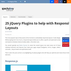
Response.js Response JS is a lightweight plugin that gives you the tools for producing performance-optimized, mobile-first responsive websites. Response.js.