
The Shapes of CSS. Learn Development at Frontend Masters CSS is capable of making all sorts of shapes.
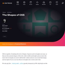
Squares and rectangles are easy, as they are the natural shapes of the web. Add a width and height and you have the exact size rectangle you need. Add border-radius and you can round that shape, and enough of it you can turn those rectangles into circles and ovals. We also get the ::before and ::after pseudo elements in CSS, which give us the potential of two more shapes we can add to the original element. Square Rectangle Circle Oval Triangle Up Triangle Down Triangle Left Triangle Right Triangle Top Left Triangle Top Right Triangle Bottom Left Triangle Bottom Right Curved Tail Arrow via Ando Razafimandimby Trapezoid Parallelogram Star (6-points) Star (5-points) via Kit MacAllister Pentagon Hexagon Octagon Heart via Nicolas Gallagher Infinity via Nicolas Gallagher Diamond Square via Joseph Silber Diamond Shield via Joseph Silber Diamond Narrow via Joseph Silber Cut Diamond via Alexander Futekov Egg Pac-Man Talk Bubble TV Screen Lock.
Replacing the -9999px hack (new image replacement) IN THE BEGINNING was FIR, AKA Fahrner Image Replacement (note that one of the following links returns a 404): The Daily Report’s 2003 redesign uses (and our book explained) an image replacement technique intended to combine the benefits of accessibility with the power of graphic design.
We christened this method Fahrner Image Replacement (FIR) in honor of Todd Fahrner, who first suggested it to us. Douglas Bowman’s tutorial popularized the technique, which was first developed by C. Z. Robertson in 1999. Preceding web type by a decade, Fahrner gave us the ability to use fonts other than Verdana and Georgia on web pages (i.e. to set type in Photoshop and export it as an image —an ancient web design practice) but to conjure these images of text via semantic HTML markup (the words the text pictured, set in appropriately structural HTML elements). -9999px So popular was this method, we made a tee shirt out of it, and it sold, baby, it sold.
Adventures In The Third Dimension: CSS 3D Transforms - Smashing Coding. Advertisement Back in 2009, the WebKit development team proposed a new extension to CSS that would allow Web page elements to be displayed and transformed on a three-dimensional plane.
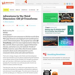
This proposal was called 3D Transforms, and it was soon implemented in Safari for Mac and iOS. About a year later, support followed for Chrome, and early in 2011, for Android. Outside of WebKit, however, none of the other browser makers seemed to show much enthusiasm for it, so it’s remained a fairly niche and underused feature. That’s set to change, though, as the Firefox and Internet Explorer teams have decided to join the party by implementing 3D Transforms in pre-release versions of their browsers.
That being the case, this is an ideal time to get ahead of the curve and start learning about the possibilities and potential of adding an extra dimension to your Web pages. The Third Dimension To use 3D Transforms in CSS, you’ll need to know about axes (that’s the plural of axis, not the plural of axe). Seven things still missing from CSS. Experimental CSS3 Animations for Image Transitions. Today we want to share some experimental 3D image transitions with you that use CSS3 animations and jQuery.
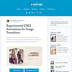
We'll be using CSS3 3D Transforms for Webkit only. View demo Download source Today we want to share some experimental 3D image transitions with you that use CSS3 animations and jQuery. We’ll be using CSS3 3D Transforms for Webkit only. Check out the Photo Transitions at the Safari Technology Demos site, some of which we got inspired by. The images used in the demo are by Joanna Kustra.
Please note that the 3D effects will only work in Webkit browsers. How it works Given a set of images, we’ll add the first image to the wrapper with the class te-cover. The main idea is to always show the regarding image using te-cover. Demos. Parallaxing CSS3 backgrounds - December 21st, 2011. Some Lesser Known Features of LESS. For the last year or so, LESS has gained a lot of traction in the front-end development community, particularly among designers.
LESS extends CSS with dynamic functionality and organizational features, which provide a lot of power and efficiency to designers and developers. However, it's not the only CSS pre-processor player out there. The other major one is Sass, which is very similar, and both are solid options to consider. Many of the review articles out there do a good job of providing an in-depth look at syntax and general usage, but I'd like to take a different angle—highlight one difference that isn't written about all that much, and present a few features of LESS that have have proved very valuable on recent projects.
No Barriers One difference that isn't discussed much is that the barrier of entry is very low for LESS. . * Note the rel attribute of the link tag. BOOM! Live Browser Updates <script type="text/javascript" charset="utf-8"> less.env = "development"; less.watch();</script>