
Bob Dylan Subterranean Homesick Blues - A HAND LETTERING EXPERIENCE. How to Make Any Font a Handmade Font. Design and technology are getting more and more refined, allowing graphic designers to streamline and speed up their process.
However, people are still enamored with handmade art, lettering and illustration. I have deep respect for those fantastic artists who can create beautiful works with a pen, pencil, brush, or piece of chalk. To me, handmade art is both appealing and inspiring. : DD Tutorial: From Start to Finish. As the blog has picked up over the past few months, I’ve received tons of messages asking for advice and tips on how to create hand-drawn type designs.
So I thought it would be fun to give you guys an inside look as to how a Daily Dishonesty goes from a sketch to published piece on the blog. Enjoy! 1. I always start with a pencil sketch in my grid paper journal. 2. 3. 4. 5. 6. 7. 8. A Crash Course in Typography: Pulling It All Together. Apr 18 2011 In the first three parts of this series, we covered a lot of information about the anatomy of a typeface, and what kinds of things to look for when actually combining two fonts.
Here, we’ll tie it all together. Below are guidelines for combining fonts for paragraphs and headlines, as well as for other common type elements, like pull quotes and by-lines. A Crash Course in Typography: Principles for Combining Typefaces. Apr 11 2011 When combining typefaces, there are a couple of important principles you’ll need to keep in mind, namely contrast and mood.
Effectively combining typefaces is a skill best learned through practice, and trial-and-error. Once you’ve mastered the principles covered here, you’ll have the tools you need to try out combinations while making educated guesses about what will and won’t work together. Here, we’re mostly covering combining two typefaces, as you would for body copy and headlines. A Crash Course in Typography: Paragraphs and Special Characters.
Apr 04 2011 Body copy makes up the majority of many websites. Headlines and other bits of typography are often considered more fun to design, or more artistic, but without a good design for your body copy, your overall project will suffer. Body copy design requires you to consider two separate parts: character styles, and paragraph styles. Proper use of special characters can greatly increase the level of professionalism in your designs. And good paragraph styling can make a huge difference in readability, and therefore the amount of time someone is willing to spend reading your copy. Using Special Characters. A Crash Course in Typography: The Basics of Type.
Mar 28 2011 Typography could be considered the most important part of any design.
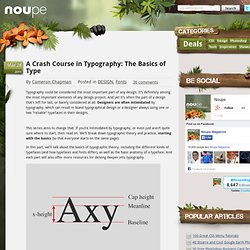
It’s definitely among the most important elements of any design project. Learn. Make the World a Pretty Place by Jamie Bartlett. UPDATE: I loved how the lettering turned out for this project so I added to my print shop!
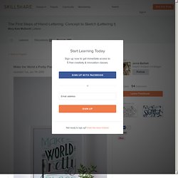
For this project I chose the quote "make the world a pretty place. " It's a fun light hearted phrase I made up. After brainstorming words that related to my phrase I jumped on the computer and started researching and finding images that visualy represented it. I want it to be fun, happy, beautiful and creative. Podcast - Tangible insights on creativity & business in the design industry every Wednesday & Friday. Lettering Made Simple: Efficient Methods for Custom Type.
Welcome to my lettering class!
This class is great for the designer or illustrator trying to improve their lettering technique, as well as students new to design in general. I will arm you with tools for efficiency, quality, and style in creating your own custom lettering. You will learn to manipulate an existing font into an interesting lettering piece. Lettering for Designers: One Drop Cap Letterform at a Time. Thoughts. I gave a talk at the AIGA national conference this year in Las Vegas, and with all short form talks I feel compelled to write out my thoughts in advance in the form of an essay (and then improvise quite a bit when I’m on stage).
Here’s a transcript of the talk (minus my ice breaker jokes) for those that couldn’t attend or for those who did and want to relive it for some reason. I live in the Bay Area and am surrounded by tech culture. Ben Barry, when working at Facebook in The Analog Research Lab he helped create, made a poster that stated what was a pretty common belief in tech: “Move Fast and Break Things”. Workers in tech don’t usually feel like they have the ability to focus on craft—especially when it comes to visual design.
When you're constantly iterating, constantly pushing new versions out, you can’t invest time in seemingly unnecessary details that will be lost in tomorrow’s update. Designing type systems. I remember a conversation from back in my student days where my typophile friends and I debated what the ultimate typeface of the twentieth century was, a typeface that summed up all of the era’s advancements and knowledge into a coherent whole, one that would be a reference for years to come.
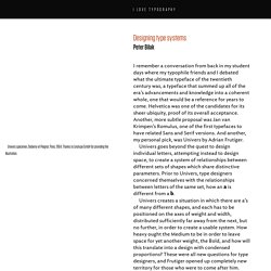
Helvetica was one of the candidates for its sheer ubiquity, proof of its overall acceptance. Another, more subtle proposal was Jan van Krimpen’s Romulus, one of the first typefaces to have related Sans and Serif versions. And another, my personal pick, was Univers by Adrian Frutiger. Univers specimen, Deberny et Peignot, Paris, 1964. Thanks to Linotype GmbH for providing the illustration. Univers goes beyond the quest to design individual letters, attempting instead to design space, to create a system of relationships between different sets of shapes which share distinctive parameters. Education. A 20 Minute Intro to Typography Basics.