
8-bit vs 16-bit - What Color Depth You Should Use And Why It Matters. When going into an edit process there is much confusion about what color depth should one use.

Some pieces of knowledge are more relevant than others and some are not relevant at all. Either way, the selection of color depth in which you edit will have a huge impact on the final editing result. The purpose of this article is to try and clear up the confusion about bit depth and give you advice on what bit depth to choose when you edit and output your images. RAW, 8 bit, 16 bit, and 32 bit explained - All. After alot of confusion about the 8bits/channel, 16bits/channel, 32bits/channel, and RAW color modes in photoshop, I finally figured it out, and decided to make an illustration to show how I've understood it.
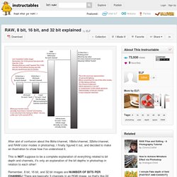
This is NOT suppose to be a complete explanation of everything related to bit depth and channels, it's only an explanation of the bit depths in photoshop in relation to each other! Remember, 8 bit, 16 bit, and 32 bit images are NUMBER OF BITS PER CHANNEL! There are basically 3 channels in an RGB image, so that's like 24 bit, 48 bit, 96 bit respectively. That is because one term describes the number of bits per channel, while the other describes the number of bits per pixel. 32 bit often refers to 24 bit, though 32 bit is actually 8 bits per channel, with an extra "alpha" channel (for transparency). Understanding DPI. January 23, 2009 at 5:01 pm Michael Niggel DPI is a seemingly simple concept, but there is widespread misconception on what it actually is, and where and how it matters.

Everything Photographers Need To Know About Color Space & How It Can Impact Your Prints. Roy G Biv–quick show of hands if you’re familiar with the term.

Even if it doesn’t ring a bell at first glance, once you realize you’re looking at a mnemonic and not some random guy’s name, it starts getting a little more obvious: Red, Orange, Yellow, Green, Blue, Indigo, and Violet. Yes, those are the colors of the rainbow, but more importantly they’re also the referred to as the visible electromagnetic spectrum. Okay, let’s try another one. CONVERTING COLORS IN ADOBE ACROBAT PRO Print Production> Convert Colors Step-by-Step Tudorial to Profiles Conversions PDF. The following two examples will further prove my theory that Acrobat "Assumes" its default Working Profile for Untagged elements within a PDF.

I really like using ProPhoto and Whacked RGB images in my color-management tutorials because they are so obvious when the wrong profile is Assigned or Assumed or ignored or improperly Converted. Set Acrobat Working RGB to "ProPhoto RGB" go to Acrobat> Preferences> Color Management for this screenshot and make the change (then Quit Acrobat and reopen my original PDF): You should now see huge color changes in the right column below — Acrobat is no longer Assuming sRGB on Untagged images because you changed its Working RGB to ProPhotoRGB — however — notice that the Untagged ProPhotoRGB now "matches" the Tagged set!
Color Management for Photographers. Color Management Tips for Photographers. Preserve the Colors of your Images Recently Ron sent me an email and hinted me towards the fact that I missed the last mile on my workflow tutorials.

I was asked to give some more insight into the process of preparing images for web viewing and/or printing. In this tutorial I am going to cover some of the basics of color profiling and in the next tutorial I am going to talk a bit about resizing and compression of images. After all you want your images to look good without annoying your viewers (and your wallet) by large data transfers. As you can see this site has a reasonable amount of graphics, but (hopefully) still loads fairly quickly. Part of the reason (besides a good host) is that I optimize my images for online viewing. Color Profiles and Management. Schewe Photo -sRGB VS ProPhoto RGB.
A lot has been written about using sRGB (or Adobe RGB) VS using ProPhoto RGB.

Often, it is assumed that the purpose of PP RGB is to use a wider gamut of color-meaning more saturated color-but it can also be argued that it's useful for making sure that whatever the actual saturation an image may have remains unclipped. For it is a fact that many colors that a camera can capture (and even some colors that today's printers can print) fall outside the gamut of Adobe RGB, let alone sRGB. So, as a little test, I offer the following; an image whose gamut of colors is not great yet has colors that are clipped when converting from the raw file to sRGB.
I've provided a link to the original raw file (shot with a 1D MII Canon and whose DNG was output from Lightroom 1.0 as a DNG). The image above was processed from Lightroom with minimal settings adjusted (see the DNG settings) into a 16 bit sRGB tiff file before being saved from Photoshop CS3 using Save For Web at High Quality JPG. Schewe Photo -sRGB VS ProPhoto RGB. Digital Imaging Basics Lesson Plan. In this course Graeme Cookson takes you through some of the essential concepts that help you to grasp how digital imaging works.

Why should you care? Well because if you want to be a photographer that can compete with the best in the world, understanding how digital images work is critical. CHROMiX ColorThink. Starten met kleurmanagement voor betere afdrukken. Starten met kleurmanagement voor betere afdrukken. Welcome to Bruce Lindbloom's Web Site. Werken met kleurruimten; sRGB, AdobeRGB en ProPhotoRGB. René Damkot schreef op vrijdag 12 november 2010 om 21:38.

Kleur, resolutie en meer. KLEURBEHEER voor PRINT en WEB: sRGB, AdobeRGB, ProPhotoRGB. Gelezen op internet:

The Great sRGB Versus Adobe RGB Debate. The Great sRGB Versus Adobe RGB Debate As more and more photographers dip there toes in the developing trays of the digital darkroom (to stretch an analogy perhaps further than necessary), the choice of color space becomes a more frequent topic of conversation. Webinar: The Perfect Exposure and Perfect Color Toolkit. Code couleur. Digital Photography Best Practices and Workflow. Theories and Harmonies of Color. Intro to Color Theory. Intro to CMYK & Printing. Assigning, tagging, converting, and embedding ICC profiles in Photoshop - The Color Space.
Fun with ICC Profiles... Okay, "fun" is a relative term... The question I'm asked most often is, "Do these socks make me look fat? " Another question that I'm often asked, but is not nearly as weird is, "What's the difference between assigning, tagging, converting and embedding an ICC profile in Photoshop? " I'm glad you asked.
Here is the answer.... Assigning a ProfileWhen you assign a profile in Photoshop, you are telling the program the meaning of the RGB or CMYK values. TaggingTagging a file with an ICC profile is pretty much the same thing as Assigning a profile. Converting Converting lets you convert a file from it's profile space (or if the image is untagged, the current working space) to any other profiled color space. Kleurmodellen tutorial, RGB en CMYK kleuren. Kleurmodellen Photoshop tutorial, RGB, CMYK en Lab kleuren model. Welkom bij het NIDF. A Guide to Preparing Files for Print. With this guide, we are going to examine ways to prepare files for print, covering applications in the Adobe Creative Suite. The examples used are for InDesign, but can apply to Photoshop and Illustrator. This is a basic guide aimed to help people just starting out in the print design business or are looking to learn more about preparing files better to send to press. Understand the Basics With most print jobs, you should have specifications to adhere to.
These specs work for preparing advertisements, brochures, business cards, and other printed mediums. 'The Sound of Color' Graphic Uses Daft Punk and Beyonce Albums to Help You Pick Paint For Your Home. We’ve all been there, a house with walls to paint and no design degree or aesthetic abilities to save our life (just me?). Does painting a wall red mean you’re an angry schmuck? Does blue mean you’re a chipper bird? Luckily, the folks at Kelly-Moore Paints have come up with some thought-provoking graphics that aim to inspire color choices based on your favorite music. The pieces come together through a project titled The Sound of Color.
Kleurmodellen tutorial, RGB en CMYK kleuren. RGB vs. CMYK in Photoshop CC. Share this Episode Autoplay End of Video Show End Screen Default Quality Adjust your embed size below, then copy and paste the embed code above. Community Translation. Kleurmodellen tutorial, RGB en CMYK kleuren. Fogra 27 of 39? CMYK to CMYK? Assigning, tagging, converting, and embedding ICC profiles in Photoshop - The Color Space.
Photoshop CS6 - Color Management. The first and most obvious change since CS5 is the UI. However, color management remains very similar in both look and feel to versions dating back as far as CS2, which is a good thing because existing users will be up and running fairly quickly. It's for this reason that the essay is, for the most part, simply an update of earlier versions rather than a complete rewrite. The one exception being the changes introduced to the new Print dialog.
The Confusion of Unsynchronized Adobe Color Settings. The Confusion of Unsynchronized Adobe Color Settings Adobe lets you select color profiles and related settings in Photoshop and other Creative Suite products. But what you choose in one place can impact how things work elsewhere. In such cases, Adobe tries to alert you about potential issues by warning you that "your Creative Suite applications are not synchronized for consistent color.
"