
Untitled. In the second half of the 18th century, we have seen that the composition of copybooks had started to change into more severe and practical publications.
Most copybooks contained lines of writing for the pupil to copy again and again, flourishes and ornamentation had become very marginal – when they were present at all… This trend continued in the 19th century : most children who went to school learned to read and write, the art of writing was no longer as exclusive as it was 100 years before, and potential employers were much more impressed by an efficient handwriting than by elegant flourishes. Less time was necessary to learn a proper handwiting style, which left more time for other important subjects.
But this doesn’t mean that everyone was able to write well, or even fast… Writing masters were no longer needed, but penmanship teachers found a way to keep publishing successful books on handwriting. United Kingdom LANGFORD (Richard), German Text copies, 1812. France Italy Germany Spain. LupferOrnamental. (*Portrait and bio taken with permission from Michael Sull’s Spencerian Script and Ornamental Penmanship, Volume I.)
Earl A. Lupfer (1890-1967) Born in Irvona, Pennsylvania, Earl Lupfer spent nearly his entire working career at the Zanerian College of Penmanship. He studied at the Zanerian as a pupil in 1908-1909. His skill at ornamental penmanship was far above his fellow pupils, and Mr. Return to the Penmen Archives. Engraver's Script Instruction [Archive] - The Engraver's Cafe - The World's Largest Hand Engraving Community. View Full Version : Engraver's Script Instruction arcangel6 Hi,
![Engraver's Script Instruction [Archive] - The Engraver's Cafe - The World's Largest Hand Engraving Community](http://cdn.pearltrees.com/s/pic/th/instruction-engraving-125245685)
I Love Typography » Blog Archive Krul & the untold history of the ‘Amsterdamse Krulletter’ — I Love Typography. In a way, my research into the ‘Amsterdamse Krulletter’ (Amsterdam’s Curly Letter) began eight years ago as I was walking down the streets of what is possibly the city’s most beautiful district, the Jordaan.
As every local knows, this area hosts quite a few of the old, traditional pubs that the locals call ‘bruin cafés’ (brown cafés). In urban environments, type designers are always looking at letters, and especially at hand-painted ones. It didn’t take me very long to notice that many of the pubs in the area had their windows painted in a very interesting and beautifully executed script. Later I discovered they had been painted throughout other parts of Amsterdam too, notably also in the De Pijp area. Upon closer inspection of the letters painted on the windows and wooden panels, it was obvious that the style was very consistent. I started asking Dutch colleagues about this pub lettering tradition, but no one had much information about its authors or origins. Krul fonts on MyFonts. Barbara calzolari.
Engraver's Script Instruction. Hi,Charles P.
Zaner (1864-1918) life ended tragically on Sunday evening, December 1, 1918, when his car was struck by a train that gave no warning of its approach at night. He was 54 years old and at the height of his career. His wife survived the event but his sister-in-law did not. The image below taken from my collection shows Zaner at the wheel of the car in which he would lose his life. It is believed that the image was taken shortly before that fateful night. How to Write Copperplate. Handwriting/Lettering Max Goldt's L'Eglise des Crocodiles. Joe vitolo. Des mots bleus: des voeux à l'anglaise (25/01/2013) A vous tous je souhaite une très belle année 2013 !
Le stage sur les majuscules anglaises remonte à deux mois déjà. Et je ne me suis pas entraînée autant que j'en avais l'intention. Comme les adresses sont prétexte à multiplier les majuscules, j'ai calligraphié les enveloppes pour l'envoi de mes voeux en anglaise. Engrossers script by IAMPETH. 20 + CALLIGRAPHY ALPHABET SPECIMENS.
On my journey to learn calligraphy and develop my own hand I have read many, many books.
I have taken a private lesson with a master calligrapher, but regrettably it was terrible timing for me with work + moving and I was only able to get in the one lesson. Gallery. 20 + CALLIGRAPHY ALPHABET SPECIMENS. Caligrafiando... on Pinterest. How to Write Copperplate. Letterology: Artful Lettering. Using Pelikan 4001 Brilliant Black fountain pen ink and a Soennecken 70# writing pad, we see graphic designer/calligrapher Frank Ortmann skillfully render some fine-looking letters for the cover artwork of Max Goldt, L'Eglise des Crocodiles in 2011.
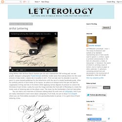
First we look over his shoulder to see him pencil in some slanted guidelines for the letterforms with the use of a simple handmade guide. After he carefully pencils in each letter of his layout, he selects an antique extra fine pen nib used for copperplate writing and inks in his letters while applying various degrees of pressure to control the thickness of each stroke. Lastly he scans the image and does the final edit in Photoshop to create the lovely work of lettering seen on the album cover. The music by the Zonnhaider's Club isn't bad either. "A Tutor To Penmanship" - 1695. Handwriting/Lettering Max Goldt's L'Eglise des Crocodiles.