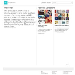

AIGA Design Archives. Vignelli Associates (1962-2008) 50 Books/50 Covers of 2010 The 50 best-designed books and book covers published between January 1 and December 31, 2010.View Collection Chermayeff & Geismar (1960-2006) AIGA 365: Design Effectiveness (2011) Push Pin Graphic (1957-1980) 50 Books/50 Covers of 2009 The 50 best-designed books and book covers designed and/or produced in North America between January 1 and December 31, 2009.View Collection 50 Books/50 Covers of 2008 The 50 best-designed books and book covers designed and/or produced between January 1 and December 31, 2008.View Collection Fifty Books of the Year (1930) Communication Graphics (1969) Just Type Work published in 1978-1982 that relies solely on type or handlettering as illustrative elements.View Collection Graphic Explanations: Charts, Diagrams, Graphs and Maps Print charts, diagrams, graphs and maps designed to aid the reader's comprehension of complex information, published in the United States or Canada in 1978-81.View Collection Packaging.

Inspiring Creativity : InSource. As in-house creative leaders, we’re charged with inspiring our teams to be and stay creative. This can be daunting when there are many revisions, only one client, only two fonts to choose from (y’know: Book and Italic, or if you are lucky one serif and one sans serif) and the color palette is limited to three choices. So with all of this potential monotony, how do we inspire our teams to find and maintain creativity? Through two simultaneous routes to creativity: good management and changing your routine. Good management means clarity and trust. In this category, here’s how to inspire creativity: 1. 2. 3. Now, for the change factor—this is really about getting your team out of their heads and the corporate brand and thinking differently—most of which can take your team “away from it all” even as they’re sitting in their cubicles. 1. 2. 3. 4. 5. 6.
Noting the limitations of being an in-house creative team is important in that we don’t want to deny our reality. Category: Articles. Common elements used in interface button design. Buttons and navigational elements are quite possibly the most commonly used interface objects in both desktop and mobile design.

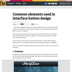
They pull an interface together, allowing users to get from A to B in a single click. Most importantly, a button has to look good. It has to scream “Click me! ,” or else it simply won’t be as effective as it needs to be. Buttons are commonly used to “”Search,” “Submit,” “Send,” “Buy” and “Upload.” In this article, we’ll look at seven common button elements in modern interface design: textures, patterns, 3-D, pixel-perfect strokes, indented backgrounds, glows and highlights. You’ll find 35 fantastic examples of these techniques as well as a handful of mini-tutorials for Photoshop. 1.
Using texture is a great way to add some depth to buttons and make them stand out a little from the rest of the interface (and ultimately making them more clickable). ShelfLuv uses texture throughout to add dimension to its interface, especially in the button and text field areas. 2. 50 Clever Logos. I know everybody and their brother does logo roundups so you’re probably sick of them, but I don’t believe I’ve ever done one and there is a particularly impressive brand of logo design that I wanted to point out.

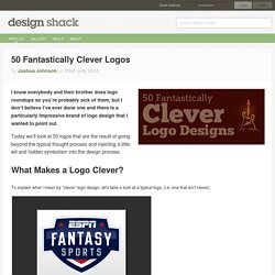
Today we’ll look at 50 logos that are the result of going beyond the typical thought process and injecting a little wit and hidden symbolism into the design process. What Makes a Logo Clever? To explain what I mean by “clever” logo design, let’s take a look at a typical logo, (i.e. one that isn’t clever). The logo above is a nice piece of work. The colors are perfect, the lettering is masculine, the overall feel is athletic and the glossy effect works well.
However, my favorite type of logo design is that which takes the assignment one step further. These types of logos make you smile at the brilliance of both the idea and the execution and have several layers of meaning that can hit you in waves. Visual Double Entendres Lion Bird Chad 2010 I love this one. Spartan DesignTent. 30 Portfolios to Inspire You. Portfolios can be designed in several forms, specially those related to design, photography and other creative professions.

The most traditional ones show pro eminent typography to attract attention and explain what is that the client/user is reading/seeing. The most contemporary one can show huge background images with a couple icons to help you navigate, while others can show minimal and clean design with some links to take you where you want. One way or the other, portfolios are your way to present yourself and your work to your audience and clients, and they are always a good source of inspiration. Jessica Hische Yaron Schoen Jarad Johnson Brandon W. Yuna Veronika Goldberg Louise O’Reilly Ed Nacional Apo Holger Huber Rodrigo Breckenfeld Yvan Rodic Pelicanfly – Sam Quayle Rickard Sund Jérôme Détraz Wake Up Mr Singh – Karan Singh Adrian Kenny MWM Graphics – Matt W. Fool’s errand – Greg Creative Dreams – Naveen Martin Karásek Sumit Paul Twoto – Patrick Decaix Aiala Garcia Elliot Lepers Made by Richard Lena.