

Email news letter. Templates. Photoshop Vector Pie, Donut, Bar and Line Chart SVG Generator. Learn how to use web fonts in your email marketing. If you’re sporting some technical know-how about web fonts, then read on as we go a bit more in-depth on the topic.
How to embed web fonts in email If you’re still reading you must know your web font stuff and you know a thing or two about coding so let’s talk about how to embed web fonts in your emails. It’s surprisingly easy to serve up web fonts in your HTML email. There are three approaches, all with slightly different levels of support in different email clients. @import @import url(' Currently, the @import method is not supported in AOL using IE11 and Android 2.3.
The <link> method is fully supported among the email clients listed above. @font-face Think of the @font-face method as a direct-to-the-source sort of method of importing your web fonts. In the example above the WOFF font format has been imported, which is considered to be the most widely supported of font formats for email. Find the font you’re after and add it to your selection by hitting the little “+” symbol. Licensing. Webfont support in email. While trying to find out which webfont services are compatible with email, one type foundry mentioned that their license only covers certain font formats.
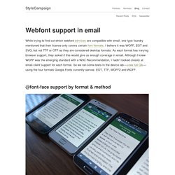
I believe it was WOFF, EOT and SVG, but not TTF or OTF as they are considered desktop formats. As each format has varying browser support, they asked if this would give us enough coverage in email. Although I knew WOFF was the emerging standard with a W3C Recommendation, I hadn’t looked closely at email client support for each format. So we ran some tests in the device lab — view full QA — using the four formats Google Fonts currently serves: EOT, TTF, WOFF2 and WOFF. @font-face support by format & method Using the Google font Orbitron, we tested each format with @font-face directly in the head, via @import and <link>.
Using web fonts in email. Article first published in December 2012, updated April 2019 Web fonts on websites give designers undeniably better creative options.
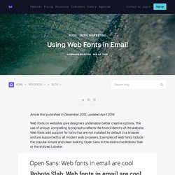
The use of unique, compelling typography reflects the brand identity of the website. Web fonts add support for fonts that are not installed by default in a browser and are supported by all modern web browsers. Examples of web fonts include the popular simple and clean looking Open Sans to the distinctive Roboto Slab or the stylized Lobster: However, when it comes to email, support for web fonts for email is very limited, and incorporating them into your designs can present some interesting challenges. Bulletproof background images. Understanding Media Queries in HTML Email. Email designers have long sought to build campaigns for every device.
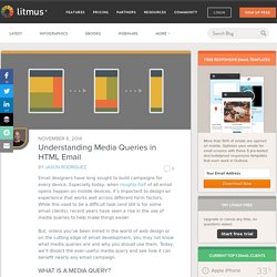
Especially today, when roughly half of all email opens happen on mobile devices, it’s important to design an experience that works well across different form factors. While this used to be a difficult task (and still is for some email clients), recent years have seen a rise in the use of media queries to help make things easier. But, unless you’ve been mired in the world of web design or on the cutting edge of email development, you may not know what media queries are and why you should use them. Today, we’ll dissect the ever-useful media query and see how it can benefit nearly any email campaign. What is a media query? Media queries are a component of cascading style sheets (CSS), the language used to style websites and email campaigns.
A media query consists of three parts: the media type, an expression, and the style rules contained within the media query itself. The benefits of media queries A quick example. Handlebars.js: Minimal Templating on Steroids. TemplateBuilder 2.0. Override Gmail's Mobile Optimized Emails. Many emails are designed with a large screen in mind.
Text that looks great on a large screen can be difficult to read on a mobile device, though. If Gmail deems that the font-size of any text in an email is too small to be legible, it will increase the size and flag the message with this notice: That’s pretty nice. What could have been illegible is made legible, eliminating the need to pinch and zoom our screens. It can also be a little frustrating. A legitimate argument could be made that Gmail should simply support media queries if it wants to improve legibility. Let's take a look at what triggers this functionality and a few methods for overriding it.
What triggers the font-size bump-up? Gmail appears to search specifically for elements in the email that are wider than the screen being used to view the email. If the table element is within the bounds of the screen, then Gmail will display the email as it was designed. Three ways around this. Things I've Learned About Responsive Email Design. This is the third post in a series of things I’ve learned about email, including sending emails and building HTML email templates.
I’ve spent the last few years designing developer tools, 2 of those years having been Design Lead at Mailgun by Rackspace, the email service for developers. Here’s a brain dump of things I’ve learned about responsive email design. Sidenote: If it's HTML Email Templates you're looking for, I've put together a bundle of fully responsive templates for startups, developers and marketers. Includes notifications, a monthly newsletter, a welcome email and more. Visit HTMLemail.io to preview and download them. GitHub - leemunroe/grunt-email-workflow: A Grunt workflow for designing and testing responsive HTML email templates with SCSS.