
Typographie sur le web – Nous ne sommes pas tous des pharmaciens. Étiquettes : écriture web, lisibilité, typographie Nous lisons, nous ne décryptons pas.

N’est pas Champollion ou Indiana Jones qui veut. Voilà pourquoi votre site doit être « lisible » : je vous explique. D’abord, cette assertion « nous lisons » n’est pas totalement vraie lorsque nous rentrons dans le champ du web. Nous scannons dans un premier temps le contenu, histoire de voir si celui-ci nous interpèle. Nous lisons des lettres. Dites-vous qu’un fond neutre vaut mieux qu’un panorama fleuri. Des dinosaures à Google Font En effet, outre les considérations purement techniques (avec ou sans empattements ?) Celles à éviter sur le champ : un site internet ne pourra jamais crier de professionnalisme s’il utilise les typos qui sont sensées imiter l’écriture manuelle (un Comic sans MS est bon pour une présentation de cinquième primaire sur les dinosaures).
Vérifiez bien donc que votre typo est complète. Les autres erreurs à ne pas commettre L’arc en ciel en niveaux de gris. UMEGuide/DesigningForFingerUIs. Designing for finger-driven UIs: Fingers The minimum size of buttons and other interface elements is determined by the size of an adult finger.
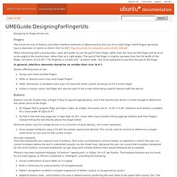
Adult fingers generally have a diameter of 16mm to 20mm (0.6" to 0.8") When interacting with a touchscreen, users will prefer to use the pad of their finger rather than the very tip (the finger will be at an acute angle to the touchscreen, rather than at a right angle). The pad of the finger is slightly narrower than the full width of the finger: 10-14mm (0.4-0.55"). In general, interface elements should be no smaller than 1cm (0.4"). Factors affecting ease of use: Young users have smaller fingers Older or heavier users may have larger fingers Older, distracted, or disabled users may not have the motor control necessary to hit a small target Unlike a mouse cursor, the finger will obscure part of the screen while being used to interact with the device Buttons.
Readability: the Optimal Line Length. Having the right amount of characters on each line is key to the readability of your text.
It shouldn’t merely be your design that dictates the width of your text, it should also be a matter of legibility. The optimal line length for your body text is considered to be 50-60 characters per line, including spaces (“Typographie”, E. Ruder). Other sources suggest that up to 75 characters is acceptable. So what’s the downsides of violating this range? Too wide – if a line of text is too long the reader’s eyes will have a hard time focusing on the text.
It turns out that the subconscious mind is energized when jumping to the next line (as long as it doesn’t happen too frequently, see above bullet point). In order to avoid the drawbacks of too long and too short lines, but still energize your readers and keep them engaged, we suggest keeping your text within the range of 50-75 characters per line. Here at baymard.com we use FF Tisa Pro in size 18 for our articles. Typographic Design Patterns and Best Practices. Advertisement Even with a relatively limited set of options in CSS, typography can vary tremendously using pure CSS syntax.

Serif or sans-serif? Large or small font? Line height, spacing, font size and padding… The list goes on and on. To find typographic design patterns that are common in modern Web design and to resolve some common typographic issues, we conducted extensive research on 50 popular websites on which typography matters more than usual (or at least should matter more than usual). We’ve carefully analyzed their typography and style sheets and searched for similarities and differences. Ultimately, we identified 13 general typographic problems and issues related to typographic design and tried to find answers to them through our research: How popular are serif and sans-serif typefaces in body copy and headlines?
We ended up with solid data, which we evaluated and prepared for this article. 1. Two thirds of the websites we surveyed used sans-serif fonts for body copy. 2. 3. 4.