
Dessine-moi un arbre, ou comment faire un plan de site. Étiquettes : gestion de projet, webdesign Arborescence, plan du site, structure de l’information, … une des premières étapes de la construction ou la refonte d’un site Internet consiste à ranger, structurer, hiérarchiser l’information.
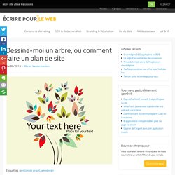
Comment? L’arborescence permet de représenter les différentes informations que comportera le site, sous la forme d’un schéma. Ce schéma en arbre présente les différentes pages qui composent le site de manière structurée et hiérarchique, voire relationnelle. Designing for Mobile, Part 2: Interaction Design. My first mobile phone, a Nokia 5110 (purchased in 1998!)
, offered very few features: I could call, text or play Snake. What’s more, these interactions were completely controlled by the manufacturer. With the advent of smartphones, touch screens, and “app stores,” however, the opportunities for designers are now innumerable. It’s incumbent upon us to familiarize ourselves with the conventions of this still-relatively-new medium.
Welcome to Designing for Mobile, Part 2: Interaction Design. Part 1 concluded with an exploration of information architecture in the mobile context. Most modern, mobile devices employ touch screens; which provide their own set of opportunities and constraints. Designing for mobile ergonomics requires that we pay attention to device dimensions as well as the pragmatic concerns of touch screens. Hit areas, or “areas of the screen the user touches to activate something” require adequate space for the user to accurately (and confidently) press. Main navigation. Designing for Mobile, Part 1: Information Architecture. Around 1993, my dad brought home a large, brick-shaped mobile phone.
We were all incredibly excited by the new technology, even though none of us thought it would have a massive impact on our lives. I actually still thought of it as a gimmick, a few years later, when some of my friends decided to purchase them. Today there are six-billion mobile subscribers in the world – meaning if there were one mobile per owner then 87% of the world’s population would have one. And considering that fewer than three billion people use a desktop computer, that’s quite a big difference. Mobile devices are clearly here to stay, and along with them come a whole host of new constraints (and opportunities) for our designs.
How is mobile different? The first thing we need to understand about mobile design is that it’s different – and not just with regards to size. Physicality and specifications How, where and when Because we have constant access to our mobile devices, we tend to use them more frequently. Mobile Application Architecture Whitepaper. Mobile Application Architecture Why Go Mobile?
With the proliferation of affordable, handheld computing devices, there are few reasons not to. Your competitors probably are and you should too. Here are a few reasons why- Eliminate Paper-Oriented Processes Keep Employees On The Road Information Anywhere Extend Business Processes To A Mobile Workforce This whitepaper addresses challenges of mobile system development and some of the architectures used to implement real mobile systems. Mobile Architecture Overview Most mobile systems extend an existing business system or interface with an existing system. An existing system A middleware application A handheld application The reason a middleware application is usually needed is to provide data transformation, apply business logic, and be a central point of communication for the devices. The architectures shown here are real-world architectures from actual projects. Mobile Challenges Interfacing Disparate Technologies Device Configuration. Utilisabilité de la structure de navigation et architecture de l'information.
Utiliser Testapic permet de tester et valider votre architecture de l’information (AI).
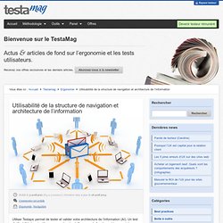
Un test d’utilisabilité de votre IA vous permettra de vérifier que cela fonctionne bien avant de navigation conception et la mise en page. Les tests de Testapic sont un outil pour tester votre IA comme un arbre hiérarchique sans les distractions de l’esthétique et les aspects de navigation alternatif. Avec Testapic, il est pratique d’éprouver votre IA pour chaque projet.
Testapic vous donne des résultats puissants très simples à mettre en place. Vous voulez savoir si une structure de votre nouveau site va fonctionner?