
Digital Dashboards and Data Visualization by ComponentArt. Data Visualization, Infographics, and Statistics. Data Visualization Review: Gephi, Free Graph Exploration Software. I do not often get to play with networks, yet I find them fascinating and full of knowledge gathering potential.
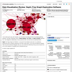
The data visualization works of Moritz Stefaner, Jer Thorp, and Mark Lombardi captivate me. I am intrigued by relationships, how we perceive them, and how we can understand them. Gephi, the "Open Graph Viz Platform", is not just for the hobbiest node nerd. It is a hardcore, professional tool for network researchers and other smarty pants. If you know the difference between Yifan Hu and Fruchterman Reingold, then you can use this tool effectively. So what is Gephi capable off? Gephi interface displaying airline traffic data. Pros — Options! Cons — Interface is a bit cluttered. Main interface displaying the Diseasome data. Review Overall, Gephi is a useful and interesting tool. There are some plugins available for Gephi that extend the functionality.
The only thing keeping Gephi from being a professional grade tool is its bugginess and lack of documentation. The Best Tools for Visualization. Visualization is a technique to graphically represent sets of data.
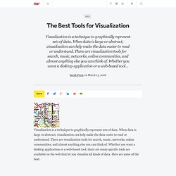
When data is large or abstract, visualization can help make the data easier to read or understand. There are visualization tools for search, music, networks, online communities, and almost anything else you can think of. Whether you want a desktop application or a web-based tool, there are many specific tools are available on the web that let you visualize all kinds of data. Here are some of the best: Visualize Social Networks Last.Forward: Thanks to Last.fm's new widget gallery, you can now explore a wide selection of extras to extend your Last.fm experience. Last Forward Friends Sociomap: Friends Sociomap is another Last.fm tools that generates a map of the music compatibility between you and your Last.fm friends.
Fidg't: Fidg't is a desktop application that gives you a way to view your networks tagging habits. Fidg't The Digg Tools: One more: Digg Radar. YouTube: Visualize Music. Many Eyes. Data Visualization and Visual Data Analytics Software. About. "Functional visualizations are more than innovative statistical analyses and computational algorithms.

They must make sense to the user and require a visual language system that uses colour, shape, line, hierarchy and composition to communicate clearly and appropriately, much like the alphabetic and character-based languages used worldwide between humans. " Matt Woolman Digital Information Graphics Goal VisualComplexity.com intends to be a unified resource space for anyone interested in the visualization of complex networks. The project's main goal is to leverage a critical understanding of different visualization methods, across a series of disciplines, as diverse as Biology, Social Networks or the World Wide Web. Not all projects shown here are genuine complex networks, in the sense that they aren’t necessarily at the edge of chaos, or show an irregular and systematic degree of connectivity.
How it started Complex Networks Complexity is a challenge by itself. About the author. Information aesthetics - Information Visualization & Visual Communication.