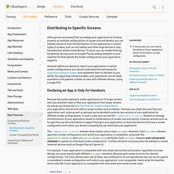

Distributing to Specific Screens. Although we recommend that you design your application to function properly on multiple configurations of screen size and density, you can instead choose to limit the distribution of your application to certain types of screens, such as only tablets and other large devices or only handsets and similar-sized devices.

Providing Resources. You should always externalize application resources such as images and strings from your code, so that you can maintain them independently.

You should also provide alternative resources for specific device configurations, by grouping them in specially-named resource directories. At runtime, Android uses the appropriate resource based on the current configuration. For example, you might want to provide a different UI layout depending on the screen size or different strings depending on the language setting. Once you externalize your application resources, you can access them using resource IDs that are generated in your project's R class.
How to use resources in your application is discussed in Accessing Resources. Grouping Resource Types You should place each type of resource in a specific subdirectory of your project's res/ directory. MyProject/ src/ MyActivity.java res/ drawable/ icon.png layout/ main.xml info.xml values/ strings.xml. Supporting Different Densities. This lesson shows you how to support different screen densities by providing different resources and using resolution-independent units of measurements.

Use Density-independent Pixels One common pitfall you must avoid when designing your layouts is using absolute pixels to define distances or sizes. Defining layout dimensions with pixels is a problem because different screens have different pixel densities, so the same number of pixels may correspond to different physical sizes on different devices. Therefore, when specifying dimensions, always use either dp or sp units. A dp is a density-independent pixel that corresponds to the physical size of a pixel at 160 dpi. For example, when you specify spacing between two views, use dp rather than px: When specifying text size, always use sp: Provide Alternative Bitmaps To generate these images, you should start with your raw resource in vector format and generate the images for each density using the following size scale:
80 Beautiful Typefaces For Professional Design. Advertisement You don’t like to scroll?

Be prepared. (We warned you.) Every now and again designers stumble upon the very same problem: the choice of a unique and beautiful typeface which manages to fulfill three basic tasks. Support the corporate identity, enrich the visual appearance and is compatible with the overall design. So which typefaces are “bulletproof”? Designing For Android. For designers, Android is the elephant in the room when it comes to app design.

As much as designers would like to think it’s an iOS1 world in which all anyones cares about are iPhones, iPads and the App Store, nobody can ignore that Android currently has the majority of smartphone market share2 and that it is being used on everything from tablets to e-readers. In short, the Google Android platform is quickly becoming ubiquitous, and brands are starting to notice. But let’s face it. Android’s multiple devices and form factors make it feel like designing for it is an uphill battle.
And its cryptic documentation3 is hardly a starting point for designing and producing great apps. Further Reading on SmashingMag: Link If all this feels discouraging (and if it’s the reason you’re not designing apps for Android), you’re not alone. This article will help designers become familiar with what they need to know to get started with Android and to deliver the right assets to the development team. Supporting Different Screens. Iconography. An icon is a graphic that takes up a small portion of screen real estate and provides a quick, intuitive representation of an action, a status, or an app.
When you design icons for your app, it's important to keep in mind that your app may be installed on a variety of devices that offer a range of pixel densities, as mentioned in Devices and Displays. But you can make your icons look great on all devices by providing each icon in multiple sizes. When your app runs, Android checks the characteristics of the device screen and loads the appropriate density-specific assets for your app.
Because you will deliver each icon in multiple sizes to support different densities, the design guidelines below refer to the icon dimensions in dp units, which are based on the pixel dimensions of a medium-density (MDPI) screen. Launcher The launcher icon is the visual representation of your app on the Home or All Apps screen. Sizes & scale Launcher icons on a mobile device must be 48x48 dp. Proportions Style. Dashboards. Google Play Install Stats The Google Play Developer Console also provides detailed statistics about your users' devices.

Those stats may help you prioritize the device profiles for which you optimize your app. This page provides information about the relative number of devices that share a certain characteristic, such as Android version or screen size. This information may help you prioritize efforts for supporting different devices by revealing which devices are active in the Android and Google Play ecosystem. This data reflects devices running the latest Google Play Store app, which is compatible with Android 2.2 and higher.
Platform Versions This section provides data about the relative number of devices running a given version of the Android platform.