

30 Clever, Creative Logos – DesignM.ag. Get the FlatPix UI Kit for only $7 - Learn More or Buy Now If you’ve browsed through any logo design galleries, you’ve probably noticed some that take a very creative approach. In this post we’ll feature 50 clever logos for your design inspiration. Uptown Cowbra Typeface Shy Child Mary and Andy Push the Bottle Cafe Click Iron Duck Threesome Pain White Crimson Sushi Wine Kingdom Strategical Office Solutions Natuur 2000 Shocked Broken Goggles Steers Restaurant American Culinary Foundation Egg Eco-Cities. 20 Weird Logos That Work (and Why They Do) Inspiration by Chris Spooner Logos are everywhere.

Because of this, only a few can rise among the noise — and often it’s the more unique logos that are most memorable. Sometimes to be unique, you’ve also got to be weird. In this post, we showcase twenty lovably strange logos that work. Society 27 The Society 27 logo by Pavel Pavlov makes use of the fantastic ambigram effect, which ensures the logo display exactly the same when viewed in an upside down position. London Symphony Orchestra The LSO logo uses a single flowing line to create the three initials of the London Symphony Orchestra. I love NY The simple yet highly recognisable mark of the I Love New York has been used to promote tourism in New York for years. 25 logos with hidden messages – Amazing Graphic Designing tricks! Revealing The Secrets – Fonts Of Famous Logos. If you ever wonder what font is used in Google or IBM or Ferrari logo you come to the right place.

You’ve seen these fonts so many times and now it’s time get to know their names and their authors. Designed by: Michael Hageman. Smart Logos with Hidden Symbolism. Logos can convey many ideas in one simple design and as designers we need to be fully aware of any hidden symbolism.
Logo Design Trends 2008. Take a look at the logo designs above.
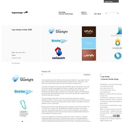
What's your first reaction? They bowl you over and leave you speechless - and somewhat confused don't they? These logos don't have beautiful shapes, shadows, mirrored reflections, warm colors, or icons that signify something; they look like the result of some kid playing around mindlessly. So why would anyone wish to have such a logo?
The explanation is simple: this type of logo design is very different and will definitely stand out by sheer reason of being totally different. The emergence of this trend can also be attributed to a mighty comeback of the 80's in fashion ,interior and industrial design. There are numerous articles that picked apart the London 2012 logo. 2011 Logo Trends. Last year was brighter.
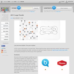
This year is lighter. In 2011 color is still prevalent, but tinted down. Where black has been used as the strong neutral, now brown or gray is in place. Blues and greens are softer, and pinks are starting to appear. Check out LogoLounge's yearly logo trends and matching examples from StockLogos where applicable. Gradients Not every trick in the designer’s palette has to be over the top: Subtlety can certainly play a role in the ongoing battle to capture the eye of the consumer. This direction allows designers to create a solution that visually coveys a message of motion or change in coloration but not through the vector shape or image. From a technical perspective, this presents a formula and reproduction challenge that must be monitored.
Juvi These are logos that look like Napster had his way with Hello Kitty: All are far too cute, with the smell of cigarettes on their breath. Society has become comfortable with the endorsement of anything bearing a smile. 2012 Logo Trends. We'll start this trends report—LogoLounge's 10th annual missive—with an admonishment that is repeated each year: If you're searching for how-to information, please stop reading now.
In addition, if you anticipate your reaction to reviewing these trends is to dismiss every one of them as yesterday's news, you also may as well walk away right now. There's plenty to be learned here, but you need to be looking for the right thing. After a decade of studying logos from around the world—32,000 alone for this report—I can say with absolute confidence that the true benefit of studying logo design trends is that they invariably identify trajectories. Once you can see the path a trend starts to take, once you can see its arc and velocity, it's very possible for you to know where to take it next. You get to steer. How To Identify a Trend As I review logos that are entered onto the LogoLounge site, three distinct categories start to emerge. Another category is on the opposite side of the universe. 33 Exceptional Logo Rebranding In 2008 For Your Inspiration - Opensource, Free and Useful Online Resources for Designers and Developers.
Nike logo is 40 years old. Funny how 40 years swoosh by: June 1971 is the date the Nike Swoosh was launched.
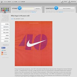
Designed by Carolyn Davidson for $35 - a "Bargain Brand," the Dept. of Nike Archives notes in its extraordinarily understated tabloid-sized newsprint history of the mark (produced for the "benefit of Nike employees"). What others might take an entire book (and many trees) to convey - explaining the origin and history of the Swoosh logo - the "DNA" accomplished in a mere 28 pages. Included are commentaries by designers and design critics, former employees and recollections by Phil Knight, the co-founder of Blue Ribbon Sports (BRS) that evolved into Nike. The origin of the mark goes like this: Knight wanted to differentiate BRS's custom product from the ones they were importing from Onituska in Japan: "...so Knight turned to a graphic design student he met at Portland State University two years earlier. " Well, the rest is history. Via.