

Responsive Tables by ZURB. Responsive Email Templates - ZURB Playground - ZURB.com. Transform Columns to Rows. Getting Started » Most responsive email layouts feature single fluid columns, whose contents adjust to the width of the device.
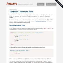
This experience may be underwhelming for desktop users who have more real estate for content. To illustrate how to create a more complex and interesting layout, for example columns that transform into rows for smaller screens, we’ll walk through the code in 3columns-to-rows.html, which works across all major email clients, including Outlook. Columns Container Table. A Beginner’s Guide to Zurb Foundation 3: The Grid. In the past, we’ve discussed Twitter Bootstrap quite a bit.

Much more so than its most worthy competitor: Zurb’s Foundation. Now on its third iteration, Foundation is a robust and responsive front end framework used by hundreds of developers every day. Over the course of several articles, we’re going to jump in and take a look at its various aspects from a complete beginner’s perspective. Today’s topic is my favorite part: the grid.
Follow along to see how it works! Grid Crazy If you’re a regular reader of Design Shack, then you probably already know that I’m a bit of a grid nut. The grid that comes built into Foundation is no exception to this rule. The Foundation Grid Like countless other grids, the foundation Grid is built on a twelve column system. What this means on a code level is of course that each column in the grid does not have a static width but is instead assigned using percentages. Responsive webdesign : adapter un site à toutes les résolutions. Le Responsive webdesign (conception adaptative ou réactive en français) représente un ensemble de méthodes et techniques permettant d’universaliser un site Web.
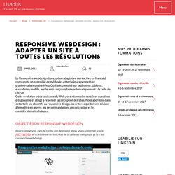
Qu’il soit consulté sur ordinateur, tablette, e-reader ou mobile, le site ainsi conçu s’adapte automatiquement à la taille de l’écran. Cette évolution très séduisante du Web pose néanmoins certaines questions d’ergonomie et oblige à repenser la conception des sites. Nous abordons dans cet article les objectifs du responsive design, les critères qui doivent décider à le mettre en œuvre, les recommandations de conception et les considérations techniques.
Objectifs du responsive webdesign Pour commencer, rien de tel qu’une démonstration. Entrons dans le vif du sujet. Les sites Web sont aujourd’hui consultés sur une multitude d’appareils ayant des résolutions différentes. Responsive Design › Build Layout. Responsive Web Design: What It Is and How To Use It. Advertisement Almost every new client these days wants a mobile version of their website.
It’s practically essential after all: one design for the BlackBerry, another for the iPhone, the iPad, netbook, Kindle — and all screen resolutions must be compatible, too. In the next five years, we’ll likely need to design for a number of additional inventions. When will the madness stop? It won’t, of course. In the field of Web design and development, we’re quickly getting to the point of being unable to keep up with the endless new resolutions and devices. Responsive Web design is the approach that suggests that design and development should respond to the user’s behavior and environment based on screen size, platform and orientation. The Concept Of Responsive Web Design Ethan Marcotte1 wrote an introductory article about the approach, “Responsive Web Design992,” for A List Apart.
Transplant this discipline onto Web design, and we have a similar yet whole new idea. Adjusting Screen Resolution. 5 Useful CSS Tricks for Responsive Design. Making the design to be responsive is very easy as shown in my Responsive Design in 3 Steps tutorial, but maintaining the elements to look aesthetically balanced on all breakpoint layouts is an art.
Today I’m going to share 5 of my commonly used CSS tricks along with sample cases for coding responsive designs. They are simple CSS properties such as min-width, max-width, overflow, and relative value — but these properties play an important part in responsive design. View Demos 1. Responsive Video (demo) This responsive video CSS trick was discovered by tjkdesign.com. 2. Max-width property allows you to set the max width of the element. Max-Width Container. Tablet Screen Dimensions for Responsive Web Design. I’m in the process of teaching myself responsive web design as I redesign my portfolio site.
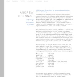
If you don’t know, responsive web design is the concept that a website layout should respond to the size of the screen it is being viewed upon. That is, a website will look different on (and be optimized for) a cell phone or iPad than it would on a traditional laptop or desktop monitor. If you’ve ever tried to view a regular, non-mobile website on your smartphone, you know what the significant difference in screen sizes can do to a website. The problem I’ve encountered, however, is that this is a relatively new area and I’m not finding a clear-cut “how to” guide anywhere for newbies like me.