
Mapping Poverty in America. State-By-State 'Fertility Friendliness' Rankings Show Wide Range. Roughly 11 percent of reproductive-age women in the United States have difficulty getting or staying pregnant, yet access to support and insurance coverage for fertility treatment varies wildly according to where they live.

A map released Monday highlights the disparities, ranking states' so-called "fertility friendliness" -- a measure of the insurance "climate" and the number of fertility specialists and support groups, relative to the number of women with infertility living there. Connecticut, Illinois, Maryland, Massachusetts and New Jersey were the only states to receive an "A" grade, according rankings compiled by Resolve: The National Infertility Association, in partnership with EMD Serono Inc., a biotech drug company that makes fertility treatments.
8 Maps That Will Change the Way You Look at Africa 1.
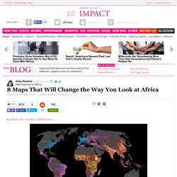
Where the world's 7 billion live This National Geographic map illustrates where and how the world lives. Not surprisingly, the areas with the highest income levels have greater life expectancy (77 for males, 83 for females compared to 58 and 60 in low income levels), access to improved sanitation (99 percent compared to 35 percent), among other human security factors.
The need for development is critical in sub-Saharan Africa, where nearly 1 billion people live, many on $995 or less a year. 2. Using data from the World Bank Development Indicators, this map from Global Finance shows us what the world will look like in 2015 if it were inflated to the size of their economic wealth. Here's 1 More Map That Should Outrage Southerners. The South is struggling in many ways.
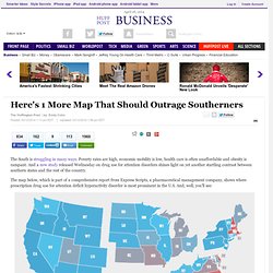
Poverty rates are high, economic mobility is low, health care is often unaffordable and obesity is rampant. And a new study released Wednesday on drug use for attention disorders shines light on yet another startling contrast between southern states and the rest of the country. The map below, which is part of a comprehensive report from Express Scripts, a pharmaceutical management company, shows where prescription drug use for attention deficit hyperactivity disorder is most prominent in the U.S. How much snow it typically takes to cancel school in the U.S. Americas-most-bible-minded-cities-infographic-2014-american-bible-society.png (PNG Image, 800 × 1035 pixels) World Map Of Incarceration Rates.
The U.S. as 11 Nations. For hundreds of years, this nation has been known as the United States of America.
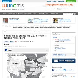
But according to author and journalist Colin Woodard, the country is neither united, nor made up of 50 states. Woodward has studied American voting patterns, demographics and public opinion polls going back to the days of the first settlers, and says that his research shows America is really made up of 11 different nations. "Yankeedom" in the Northeast and industrial Midwest was founded by Puritans and residents there have always been comfortable with a government that regulates and moderates. The communities of the Deep South in Mississippi, Alabama, Georgia and other states were founded by former West Indian plantation owners who wanted to recreate the society they were used to: government based on the sacrosanct rights of a few wealthy elite. Europe etymology maps 1. 40 Maps They Didn’t Teach You In School. By the time we graduate high school, we learn that they never taught us the most interesting things in there.
Sure, you might be able to name the European countries or point New York on the map, but does that give a you real understanding of how the world functions? To fill this gap, we have gathered a great and informative selection of infographical maps that they should’ve shown us at school: every single one of these maps reveals different fun and interesting facts, which can actually help you draw some pretty interesting conclusions. Show Full Text What makes infographical maps so engaging is how easy it becomes to conceive graphically presented information.
The best part, there are brilliant services like Target Map that “allow everyone (from individuals to large organizations) to represent their data on maps of any country in the world and to share their knowledge with the whole Internet Community.” 38 Maps You Never Knew You Needed. Strange Maps.
40 Maps That Will Help You Make Sense of the World. If you’re a visual learner like myself, then you know maps, charts and infographics can really help bring data and information to life. Maps can make a point resonate with readers and this collection aims to do just that. Hopefully some of these maps will surprise you and you’ll learn something new. A few are important to know, some interpret and display data in a beautiful or creative way, and a few may even make you chuckle or shake your head. If you enjoy this collection of maps, the Sifter highly recommends the r/MapPorn sub reddit.
You should also check out ChartsBin.com. 1. 2. 3. 4. Pangea was a supercontinent that existed during the late Paleozoic and early Mesozoic eras, forming about 300 million years ago. 5. 6. 7. 8. 9. 10. 11. 12. 13. 14. 15. 16. 17. 18. 19. World History TimeMap.