
Html5 & CSS3 layout tutorials and templates. Rounded corners and shadowed boxes. Rounded corners and shadowed boxes This page was inspired by one created by Arve Bersvendsen.
He has many more interesting CSS demos. CSS3 will have properties to make rounded borders, borders consisting of images and boxes with shadows, but with some work you can simulate some of them already with CSS2 — and without any tables or extra mark-up. Of course, rounded borders and shadows will be much simpler with CSS3. For example, to give a paragraph a thick red border with rounded corners, you would need just two lines of CSS3 similar to this: And to add a blurry drop shadow half an em below and to the right of the paragraph, just one line would be enough: (You can try here and here if it works already.) Five images on one element The main trick is to use generated content (':before' and ':after') to put four extra images on an element.
We create five PNG images and put them in the four corners and against the right edge of the element. Code Snippets - Code-Sucks.com. CSS Liquid Round Corners. There are many techniques available to give your square boxes that nice rounded look but I thought I’d concentrate this article on the basic techniques used to create this box.
We won’t be doing anything new or clever – just basic construction techniques that will produce a re-usable round box that you can then optimize and re-develop at your leisure. The first thing you need to know is that until css3 is fully supported then the only realistic way to do this at present is to use images. When you’re done with this article you will have a re-usable, cross-browser supported, semantically correct, liquid round box! Sound like fun? Let’s begin! Free Email Forms & Web Contact Forms - myContactForm.com. Top 10 CSS Table Designs. Advertisement Many companies try to create a great experience for customers.
But few are willing to make the changes required to deliver on that promise. In fact most don’t even realize just how bad their experience can be. This is why we made a new book called “User Experience Revolution,” a practical battle plan for placing the user at the heart of your company. Get the book now! Tables have got to be one of the most difficult objects to style in the Web, thanks to the cryptic markup, the amount of detail we have to take care of, and lack of browser compatibility. Further Reading on SmashingMag: Link. Web Templates, Flash Templates, Website Templates Design - Templ. Top 10 CSS buttons tutorial list.
Looking for CSS3 buttons?
Check out this post. Spend your time innovating, not rep. The Perfect 2 Column Liquid Layout (left menu): No CSS hacks. SE. Download this layout (20kb zip file).
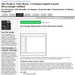
Percentage dimensions of the left menu layout All the dimensions are in percentage widths so the layout adjusts to any screen resolution. Vertical dimensions are not set so they stretch to the height of the content. Maximum column content widths To prevent wide content (like long URLs) from destroying the layout (long content can make the page scroll horizontally) the column content divs are set to overflow:hidden. 800 x 600 Left column: 162 pixels. The Holy Grail 3 column Liquid Layout. Pixel widths. Cross-Brows. Pixel dimensions of the holy grail layout In this layout the side column widths are in pixels and the centre page adjusts in size to fill the rest of the screen.
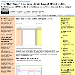
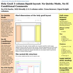
Vertical dimensions are left unset so they automatically stretch to the height of the content. Layouts that use pixel widths are great for images because you can make them fit perfectly within a column without gaps. The nested div structure I've colour coded each div so it's easy to see: The header, colmask and footer divs are 100% wide and stacked vertically one after the other. Try my Quirks-mode free and IE conditional comments free version of this layout. Holy Grail 3 column liquid-layout: No Quirks Mode, No IE Conditi.
No Quirks Mode My original Holy Grail 3 column liquid layout required the XML declaration for it to display correctly in older versions of Internet Explorer.
This version works without it and is thus never in quirks mode. It only requires one extra div to achieve this, a small price to pay for compatibility. No IE Conditional Comments This version of my Holy Grail liquid layout only has one stylesheet attached. In Search of the Holy Grail. I’m sorry.
Really. I didn’t name it. I don’t mean to overstate its importance or trivialize the other and rather weightier Holy Grails. Article Continues Below But the name’s out there, and we all know what it means. Three columns. Many articles have been written about the grail, and several good templates exist. A recent project has brought my personal grail quest to an end. Have a fluid center with fixed width sidebars,allow the center column to appear first in the source,allow any column to be the tallest,require only a single extra div of markup, andrequire very simple CSS, with minimal hacks patches.
On the shoulders of giants#section1 The technique presented here is inspired by Alex Robinson’s brilliant One True Layout. Another lead came from Eric Meyer’s adaptation that uses positioning to mix multiple unit types. Enough talk—let’s see some code#section2 The required HTML is intuitive and elegant. Joomla template generator and wordpress theme generator. 960 Grid System. Generate a variable 960.gs valid css/ xhtml grid system.