
Stylesheets / CSS-Eigenschaften / Positionierung und Anzeige von Elementen. Allgemeines zur Positionierung und Anzeige von Elementen Ab der CSS-Version 2.0 gibt es verschiedene Eigenschaften, um Elemente einer WWW-Seite exakt im Anzeigefenster des WWW-Browsers zu positionieren und die Position von Elementen untereinander genau zu kontrollieren.
Dazu gehören Angaben zum absoluten und relativen Positionieren von Elementen, Angaben zur Ausdehnung von Elementen, Angaben zum Umfließen von Elementen und Angaben zum Überlappen und Anzeigen von Elementen. Absolutes und relatives Positionieren von Elementen bietet Ihnen die Möglichkeit, das Erscheinungsbild von Web-Seiten stärker medienorientiert zu gestalten. So können Sie für einzelne Bereiche festlegen, wo genau diese Bereiche beginnen sollen. Bereiche können sich überlappen usw. Layer ab. Das Positionieren von Elementen ist eine wichtige Voraussetzung für viele Anwendungsfälle von Dynamischem HTML. Position (Positionsart) Sie können für einen Bereich bestimmen, wie er positioniert werden soll.
Beispiel: Erläuterung: top, Float. Floating is often used to push an image to one side or another, while having the text of a paragraph wrap around it.
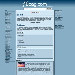
This type of usage is often referred to as text wrapping and resembles what you might see in many magazines that have articles which wrap around images of various shapes and sizes. Wrapping text around an image is easy when using the CSS Float attribute. You have a choice to either float the picture to the left or to the right and the rest is done for you. Below is an example of an image that is floated to different sides of a paragraph.
CSS Code: HTML Code: <body><img src="sunset.gif" class="floatLeft"><p>The images are contained with... Display: The images are contained within the paragraph tag. This second paragraph has an image that is floated to the right. If you were to simply float three images to the right, they would appear alongside one another. The images are appearing below one another because the CSS clear attribute was used with the value of "right". Style-sheet.de - Cascading StyleSheets im Praxiseinsatz. CSSeasy.com - Learn CSS the modern way. Why tables for layout is stupid: problems defined, solutions off. Tools - CSS Font Size Comparison.
CSS tutorial - Margin Collapsing. Many Web developers run into margin collapsing without realising what it is, or why it is happening. It takes place on virtually every Web page, and in most cases, it creates the desired effect without causing any undesired side effects. However, when it does cause a problem, it usually appears as strange gaps at the top of elements even when they have their top margins set to 0.
The typical response is to use an unrelated workaround of some kind, such as positioning everything. Understanding the cause allows more efficient workarounds to be used, especally those that actually deal with the root cause. Historically, margin collapsing only exists because older browsers like Netscape 3 used to do it before they had CSS, and when CSS was created, it had to describe that behaviour so it could be implemented in CSS. The box model The first thing you need to understand is the CSS box model.
Almost no elements have padding by default. Take the following HTML: Three elements Negative margins Step 1: