
A bit about the Pangram Pangram Foundry. Font Review Journal. Open Foundry / Fonts. Typefaces - Displaay Type Foundry. Christoph Dunst. Chapeau / Milieu Grotesque / Digital Typefoundry. Current Items • 1/4 Your cart is currently empty.
Billing Information • 2/4 Please enter your billing details. Invoice Details Licensing Information • 3/4 Please register your license information according to your usage. Review Order • 4/4 Please review your details before placing your final order. Invoice and Licensee Details Canada Email: Order Summary Subtotal (Excl. Shipping/Handling € 0. TYPECACHE.COM. Brand font licensing & custom fonts. F37 Judge Bold Compressed Judge Roy Snyder is one of the main judges in Springfield, or perhaps more specifically, Springfield County.
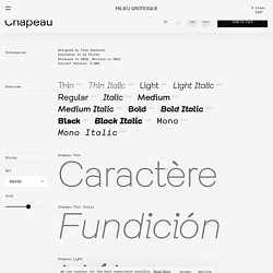
He was once known as a no-nonsense judge but over the years he has loosened up and become more lenient. His temperament seems to be milder than that of the Judge Constance Harm, who is more strict. Snyder has somewhat of a grudge against Lionel Hutz for repeatedly running over his son with his car. Klarheit Grotesk. Angular Cut “G”Small “a” OutstrokeSweeping “y”Alt.
Figure “4”Kurrent “KQRk”Alt. AmpersandAlt. Figure “7”Schoolbook + Rounded LigaBluntCollated Ligatures. TYPECACHE.COM. 46 results for "Switzerland" André Baldinger Designers: André Baldinger.
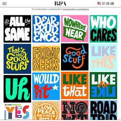
Eliott Grunewald. Identity Letters. Typefaces - VJ-TYPE. Bernstein & Andriulli - Illustrators - Adam Hayes - Typography & Lettering. Bernstein & Andriulli Illustrators // Adam Hayes // Typography & Lettering print // download Hero Spread Contact Sheet Enter your email address below.
Once your PDF is generated, we will send you a notification email with a link to download it. Facebook // Twitter // Tumblr // pinterest // Email * required fields Please login below to create your custom lightbox. I forgot my password. April 2019 Font Selection - Hrvoje Grubisic - Medium. Typography Inspiration | April 2019 Font Selection Hrvoje Grubisic Apr 14 · 3 min read April collection is here.
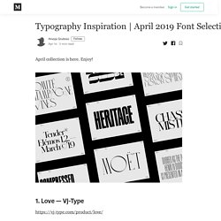
Enjoy! 1. 2. 3. 4. 5. Modern Cyrillic 2019: after 340 entries from 19 countries these are the winners in type design. The jury of MC2019 received 340 entries from 19 countries Modern Cyrillic 2019, the international type design competition organized by Paratype, has just announced its winners.
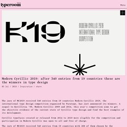
A sequel to Kyrillitsa ’99, Modern Cyrillic 2009 and 2014, this year's competition aims to get the objective evidence of the current state of Cyrillic type design and find the best examples of its development. Cyrillic typefaces created or released from 2014 to 2019 were eligible for the competition and participation in Modern Cyrillic was open to all and free of charge. The jury of MC2019 received 340 entries from 19 countries with 208 of them chosen by the selection committee. Eventually, 30 winners and 6 honorable mentions have been announced. Also, Modern Cyrillic 2019 asked the public to vote on their favorite typeface from June 20 until June 27 with three winners in this category.
Following are some of Typeroom's favorite entries. Winner, Curbe by Olga Pankova, 2019. Domaine Display fonts · Klim Type Foundry. Hewitt Beauty Interview · Klim Type Foundry. Mucho - Ibercamera : Oriol Miró. NBL — NB International™ Pro Edition. NB International™ Pro Edition (2018) Updated Edition incl.
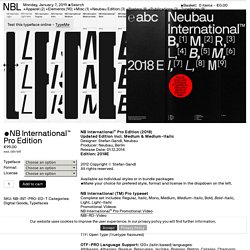
Medium & Medium-ItalicDesigner: Stefan Gandl, Neubau Producer: Neubau, Berlin Release Date: 01.12.2014 Edition: 2018E 2012 Copyright © Stefan Gandl All rights reserved. Available as individual styles or in bundle packages •Make your choice for prefered style, format and license in the dropdown on the left. DSType Foundry. Domaine Display Fonts · Klim Type Foundry. TIGHTYPE Typefaces. Founders Grotesk – Font Review Journal. Founders is certainly still a grotesque, mind you.
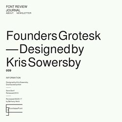
The low x-height, the double-storey “g”, the spurred “a” and the apertures that threaten to close off are all classic characteristics of the genre, yet it’s a very easy to use typeface with gorgeous proportions. It’s difficult to set a word in Founders and have it look bad, and it’s often used to drive publication and branding aesthetics all on its own. Founders is at once both familiar and unique, matter-of-fact and charming. Founders has grown into a robust family of widths and styles over the years, but this review will focus on the original version, and we can address the text, mono and condensed versions in separate reviews. It is difficult for me to think of a classic grotesque that’s as effortless as Founders. Grilli Type. Силламяэ город в Эстонии, один из основных промышленных центров в уезде Ида-Вирумаа.
Better Letters — Lettering Agents & Signwriting Contractors. Fontface Ninja. Lost Type Co-op. Fonts - Swiss Typefaces. Letman. Quality eBook, app, print and web fonts. Welcome to the Canada Type library of retail fonts.
Our library consists of exclusive revivals of some historical type designs, as well as our own exclusive originals. The Canada Type font packages are available for licensing and secure electronic delivery through this site. We stand behind the quality of our typefaces, and we offer unlimited free lifetime support and version upgrades to all our customers. Our end user agreement is one of the friendliest and most flexible in the industry. It includes usage for unlimited impressions, size, web, print and logo usage for any of your products. To view samples of our fonts, click on the corresponding squares to the right. Mårten Nettelbladt. Emtype Foundry. LucasFonts. Design beautiful typography with Typetester.
Village. Typefaces — Colophon Foundry. Commercial Type. Fonts — Typofonderie. 30 products found. Airco Designed between italic and script styles Buying Options Allumi Technology in mind. 27 fonts, 2 widths. Bold Decisions. Klim Type Foundry · Home. Textaxis.com. FontMoose Beta. How to Speak Typography: Terms You Should Know. If you are just beginning as a graphic designer, you should be knee-deep in typography, learning how to use it properly and how to speak about it using proper terminology. This is by no means an exhaustive list of typographic terms, but getting to know these and how to apply them will go a long way toward developing anyone as a typographer and designer.
Baseline The invisible line upon which the letters of a typeface rest. Letters with flat bottoms (E) are normally flush with the baseline, while curved characters normally descend below it (and also ascend above the cap height). Fonts by DSType - Type Foundries - HypeForType. How to Choose the Right Typeface for Your Website – ExpandTheRoom – Medium. 3. Solve for your project’s unique challenges. Each typeface has specific features to solve unique design challenges. Domaine Display – Klim Type Foundry. TYPECACHE.COM. Type Scale - A Visual Calculator.
Typography One — Use a Typographic Scale. Type Foundries Archive. Austin Font Combinations & Free Alternatives · Typewolf. Typografiebücher. Foundries. What type are you? Wenting Zhang's 100 days project. Typedia In a nutshell, Typedia is a community website to classify typefaces and educate people about them. Think of it like a mix between IMDb and Wikipedia, but just for type. Anyone can join, add, and edit pages for typefaces or for the people behind the type. The Type Directors Club The Type Directors Club is the leading international organization whose purpose is to support excellence in typography, both in print and on screen.
Touche, la robusta fuente geométrica con personalidad. How to Speak Typography: Terms You Should Know. Book Designer David Moratto, Book Design Glossary. The following will help you understand the three main structures that an interior book design is comprised of and terminologies that a book designer and a printer might use. Front Matter (components that may appear at the begining of a book before the first chapter) Body Matter (components that may appear in the work of a book) Back Matter (components that may appear at the end of the book after a work) The following are terms that a book designer and a printer might use: Table of Contents. Type foundry - high quality fonts for print and web.
Top 10 Most Popular Serif Fonts of 2015 → Typewolf. Butterick’s Practical Typography. Typographer's Glossary. Serif: Serif's are semi-structural details on the ends of some of the strokes that make up letters and symbols. A typeface that has serifs is called a serif typeface (or seriffed typeface). Some of the main classifications of Serif type are: Blackletter, Venetian, Garalde, Modern, Slab Serif, Transitional, and Informal. Fonts in each classfication share certain similiar characteristics including the shape or appearance of their serifs. Serif fonts are widely used in traditional printed material such as books and newspapers. Typography posters.
Commercial Type. HypeForType. Klim Type Foundry - Lettering & Logotypes. Under direction from Kevin Wilson & Mark Leeds. For Spark. Haettenschweiler - letrag. Creada por el equipo de diseño de la fundición Monotype en 1995, está basada en una tipografía más condensada aún llamada Schmalfette Grotesk, diseñada por Walter Haettenschweiler y que fue muy popular en la década de 1960.
Esta fue vista por primera vez en un espléndido libro llamado “Lettera” de Walter Haettenschweiler y Armin Haab. MilieuGrotesque – Typefoundry and Custom Font Solutions. Swiss Typefaces. Out Of The Dark · Digital Type Foundry. Out Of The Dark · Digital Type Foundry. MFRED Typeface For Sale, for Cancer Charity - Matt Willey. 10 Display Faces that Digital Forgot. Because of your enthusiastic response to my last column, I’ve moved up its sequel. In this installment, I’ll be looking at display and decorative faces that were somehow left in the archives when the winds of digital technology swept through the dusty vaults of yesteryear’s metal type foundries. Of all the thousands of typefaces that are created each year, the lion’s share are display and decorative faces.
That’s because these are easier to create than text faces (almost anything goes), and changing fashion demands novel looks at dizzying speeds. What I’ve looked for in assembling the faces shown here, though, are those with the key attribute of versatility, faces that can adapt themselves to a host of environments and situations. Once again, for lack of a better organizing principal, I’ll take these on in alphabetical order. Typo/graphic posters. Typography Served. Swiss Typefaces. Clarke – Ten Dollar Fonts.
Thinking with Type. The Printing House identity. Letman. Booklets/Pamphlets. A tutorial for good typography in InDesign - Setting up a baseline grid. Good clean typography is a fundemental skill of any designer. Most designers believe they have good typography but in my experience it is something which is developed through time and experience. I think we all begin our design lives with a desire to be outrageously creative, and only as we mature, begin realise that simplicity and structure is just as, if not more important. In this article, I will go through some simple steps to acheive good clean well structured typography in Adobe Indesign. The first step is to choose your typefont. In this case I have chosen a simple standard font of Helvetica Neue.
Next choose how many columns you want the page to be. So we have set up a grid vertically, the next step will be to set up a horizontal or baseline grid, which all our text will stick to. Start the grid at 10mm in accordance with your borders. Now we will add a heading. I shall now add an introduction paragraph in the exact same way. So thats it, I have waffled on long enough. Type-Finder. Village. Typotheque type foundry - high quality fonts for print and web. RP - Digital Type Foundry.
Optimo Type Foundry. Klim Type Foundry - Home. Independent Swiss Font Foundry. Commercial Type. Commercial Type. Colophon - Fonts. Type Foundries Archive. Swiss Typefaces. Swiss Typefaces. Swiss Typefaces.