
NEOTOKIO! / italian interactive design studio. How to mark up subheadings, subtitles, alternative titles and taglines. If you don’t already know, the hgroup element is obsolete in HTML5.
Advice is now provided in the HTML spec on how to mark up subheadings, subtitles, alternative titles and taglines using existing and implemented HTML features. Russian Translation of this article: Разметка для подзаголовков by Frontender magazine Advice for marking up subheadings and the like The important question for developers is: How do I mark up these buggers??? To answer this advice and requirements have been added to the HTML specification on how to mark up subheadings, subtitles, alternative titles and taglines: h1–h6 elements must not be used to markup subheadings, subtitles, alternative titles and taglines unless intended to be the heading for a new section or subsection. Note: Example below added 10/5/2013 In the following example the title and subtitles of a web page are grouped using a header element.
In the following example the subtitle of a book is on the same line as the title separated by a colon. Web Design est Typographie 95% By Oliver Reichenstein 95% of the information on the web is written language.
It is only logical to say that a web designer should get good training in the main discipline of shaping written information, in other words: Typography. Back in 1969, Emil Ruder, a famous Swiss typographer, wrote on behalf of his contemporary print materials what we could easily say about our contemporary websites: Today we are inundated with such an immense flood of printed matter that the value of the individual work has depreciated, for our harassed contemporaries simply cannot take everything that is printed today. It is the typographer’s task to divide up and organize and interpret this mass of printed matter in such a way that the reader will have a good chance of finding what is of interest to him.
With some imagination (replace print with online) this sounds like the job description of an information designer. Typography has one plain duty before it and that is to convey information in writing. Books. The 100% Easy-2-Read Standard. By Oliver Reichenstein Most websites are crammed with small text that’s a pain to read.
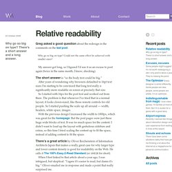
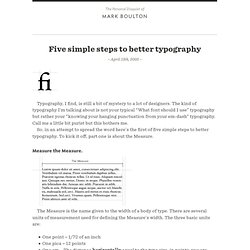
Why? There is no reason for squeezing so much information onto the screen. It’s just a stupid collective mistake that dates back to a time when screens were really, really small. So… Screen vs. magazine: 100% is NOT big; image by Wilson Miner. Don’t tell us to adjust the font size We don’t want to change our browser settings every time we visit a website! Don’t tell us busy pages look better Crowded websites don’t look good: they look nasty.
Relative readability / Wilson Miner. Why go so big on type?
There's a short answer and a long answer. Greg asked a good question about the redesign in the comments on the last post. Why go so big on type? Could not the same effect be achieved with smaller sizes? My answer got long, so I figured I’d use it as an excuse to post again (twice in the same month, I know, shocking). The short answer is “so the body text could be big.” After years of wondering why browsers defaulted to 16pt text sizes I’m starting to be convinced that long text really is significantly more readable on screen at precisely that size. So I started with 16px for the post text and worked out from there. With the previous design I increased the width to 1000px, which was great for the homepage. There’s a great article by Oliver Reichenstein of Information Architects Japan that makes a really great case for why larger type and lower content density is good for readability on the Web.
Actually it’s not that big, once you use it you start thinking “Damn. Conseils pour une meilleur typo. web - an. – April 13th, 2005 – Typography, I find, is still a bit of mystery to a lot of designers.
The kind of typography I’m talking about is not your typical “What font should I use” typography but rather your “knowing your hanging punctuation from your em-dash” typography.