
How UX Design Has Changed The World. Usability & UX Articles from Nielsen Norman Group. 10 Type Rules for an Excellent User Experience. When it comes to websites and apps, good typography is more than just a pretty typeface.
Letting has to be highly readable – and scannable – while providing a solid visual connection to the content. It’s a pretty tall order, but something most designers can do with a little practice. Today, we’re going to look at 10 “rules” you can follow to help create an awesome typographic user experience. (And each comes with an example of a website that’s nailed stellar typography.) Readability Rules The idea that you have to use a sans serif for web typography is dated, but the idea behind it is very important: Text must be easy to read. You’ll want to avoid typefaces that are difficult to read, often those in in the script, novelty or blackletter families. The most readable typefaces are scannable, and don’t draw a lot of attention to themselves. Leave Plenty of Room Between Lines of Type One of the keys to creating an experience users will love is line spacing.
Opt for Big Bowls and Rounded Letters. 5 Approaches To Creating Lightweight Personas. There is always time.
Understanding your audience is essential to building great products. “So who are we designing for?” That should be the first question of every single project. It should be followed by, “What are their motivations?” Or “What are their goals?” One cost-effective approach of modeling your audience is personas.Personas are user models derived from data to solve design questions. Well constructed personas work because they are a starting point to define the users the product owners should identify with.
Even at the beginning of the project, you can construct provisional personas because having something is better than having nothing. If you need help with persona templates, UX Booth has a really good guide. Pitch the client or your boss on spending some time performing customer visits. Confessions d'un serial product owner v1 fr. Confessions d'un serial product owner v1 fr. UX Design Blog and Resources to Follow Religiously. In this article, Chris Bank of UXPin – The UX Design App details some of his favorite product design blogs on the web, categorized by the type of content they contain.
Talent may be developed, and creativity may still be for the most part inspired, but thanks to the internet knowledge and advice are free of charge. Some of the best product design resources are only a click, tap or swipe away. With the brightest thought leaders in the design arena sharing their expertise, best practices and advice openly, via a plethora of product design blogs on the web, one has arguably all the resources necessary to be the next Jony Ive. The following are a sampling of some of the best UX design blogs that the web has to offer. 1. These blogs discuss techniques and guidelines that can be implemented to achieve design goals or objectives. 2. These blogs feature tips, tricks, and advice on how to build effective user interfaces. 4. These sites feature articles covering topics around design methodology. 24 beautifully-designed web dashboards that data geeks will love.
We live in a world of big (and little) data, and many people have to make sense of numbers as part of their job.
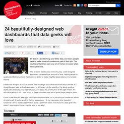
The trouble is that there can be a lot of friction involved when mining the data. This is where dashboards come into play: a well-designed dashboard can save huge amounts of time, helping people to quickly identify the numbers that matter, in order to make insightful observations or to compile reports. Dashboard design is a tricky business. The challenge is to communicate the key numbers in a straightforward way, while allowing users to drill down into the specifics. It is about avoiding clutter, about catering for personalisation, and about the prioritisation of the right metrics. I have a few ideas for web apps based around dashboards, so in part this post constitutes a kind of note to self. Toutapp Lancaster Bingo Company By Danny Amacher. Mobile Menu AB Tested: Hamburger Not the Best Choice?
UPDATE: A second larger test was undertaken after this test, read about it here.
(Hint: hamburger icon still didn’t work so well). Recently I’ve been reading books about quantum physics (clearly I’ve got too much time on my hands). I don’t profess to understand even a tenth of what I’ve read, but it’s fascinating (even if my friends shake their heads at the new levels of geekdom I’ve aspired to). The subatomic world seems to exist in a mystical state of uncertain probabilities – UNTIL it’s measured and observed. Exactly like user experience and usability.
We really have no idea at all how users interact with our websites. Until we measure and observe, our assumptions are based on uncertain probabilities. Previous Hamburger Icon Test I did a previous test that seemed to show that a bordered “hamburger” (aka sandwich) icon was used more than other options. The menu icon on the right was clicked more than the previous two. I then decided to test the hamburger icon against the word “MENU”.