
25 Tips from a black belt in Axure. I class myself as an expert in very few things.
UX design, usability testing and user research are some of the areas that I have significant expertise in (along with the complete works of Father Ted), another is prototyping with Axure. As they proudly state on their website, Axure is used by 80,000 design and business professionals and has probably become the number one prototyping tool of choice for UXers everywhere. Having used the tool for well over 5 years I now count myself as a bit of a black belt in Axure. As such I’d like to share some useful Axure hints, tips and advice. "User Research, Quick 'n' Dirty" Prevent Analysis Paralysis By Avoiding Pointless A/B Tests. Editor’s note: Robert J.
Moore is the co-founder of RJMetrics, a company whose software helps online businesses make smarter decisions using their own data. He also previously served on the Investment Team of Insight Venture Partners. Follow him on Twitter @robertjmoore. At RJMetrics, we believe in data-driven decisions, which means we do a lot of testing. However, one of the most important lessons we’ve learned is this: Not all tests are worth running. In a data-driven organization, it’s very tempting to say things like “let’s settle this argument about changing the button font with an A/B test!” The reason for this comes from how statistical confidence is calculated. In other words, the bigger the impact of your change, the sooner you can be confident that the change is not just statistical noise. If your site has millions of visitors per month, this isn’t a big deal. Consider a site that has 10,000 visitors per month and has a 5 percent conversion rate.
A/B Split Testing vs. Usability Testing - Which should you use? Full infographic featured below A/B testing is often spoken of as though in opposition to usability testing.
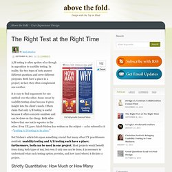
In reality, the two types of tests answer different questions and serve different purposes. Both have a place in a project; in fact, they often complement one another. It is easy to find arguments for one method over the other. Some swear by usability testing alone because it gives insight into the client’s needs. But Nielsen’s article hits upon something crucial that many other UX practitioners overlook: usability testing and A/B testing each have a place; furthermore, both can be used in one project. Strictly Quantitative: How Much or How Many A/B testing is in its wheelhouse when two designs or copy exist, both with obvious benefits, but with different focuses. Several true things about user testing. Semantic Foundry » Customer Research & LeanUX Persona Development. About the Author Will Evans is a misanthrope in the User Experience (UX) and design thinking communities.
He is fascinated by complexity theory, Lean, Kanban, and AgileUX. Previously, he led experience design for TheLadders in New York City. He has over 15 years industry experience in interaction design, information architecture, and user experience strategy. His experiences includes directing UX for social network analytics & terrorism modeling at AIR Worldwide, UX Architect for social media site Gather.com, and UX Architect for travel search engine Kayak.com. Interface Origami. In a previous post, I mentioned a way of thinking about interactions and interface within a framework of depth and space.
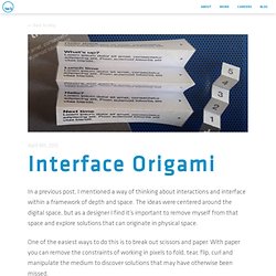
The ideas were centered around the digital space, but as a designer I find it’s important to remove myself from that space and explore solutions that can originate in physical space. One of the easiest ways to do this is to break out scissors and paper. With paper you can remove the constraints of working in pixels to fold, tear, flip, curl and manipulate the medium to discover solutions that may have otherwise been missed. To illustrate this, I created a few examples based on some familiar apps and others based on former concepts I’ve played around with in the past. Clear & Path Clear has an interesting interaction where you pinch two list items apart to make room for an additional item. Accordion By folding paper like an accordion, you could see how you might collapse some list items to display content underneath.
Fold & Peel.